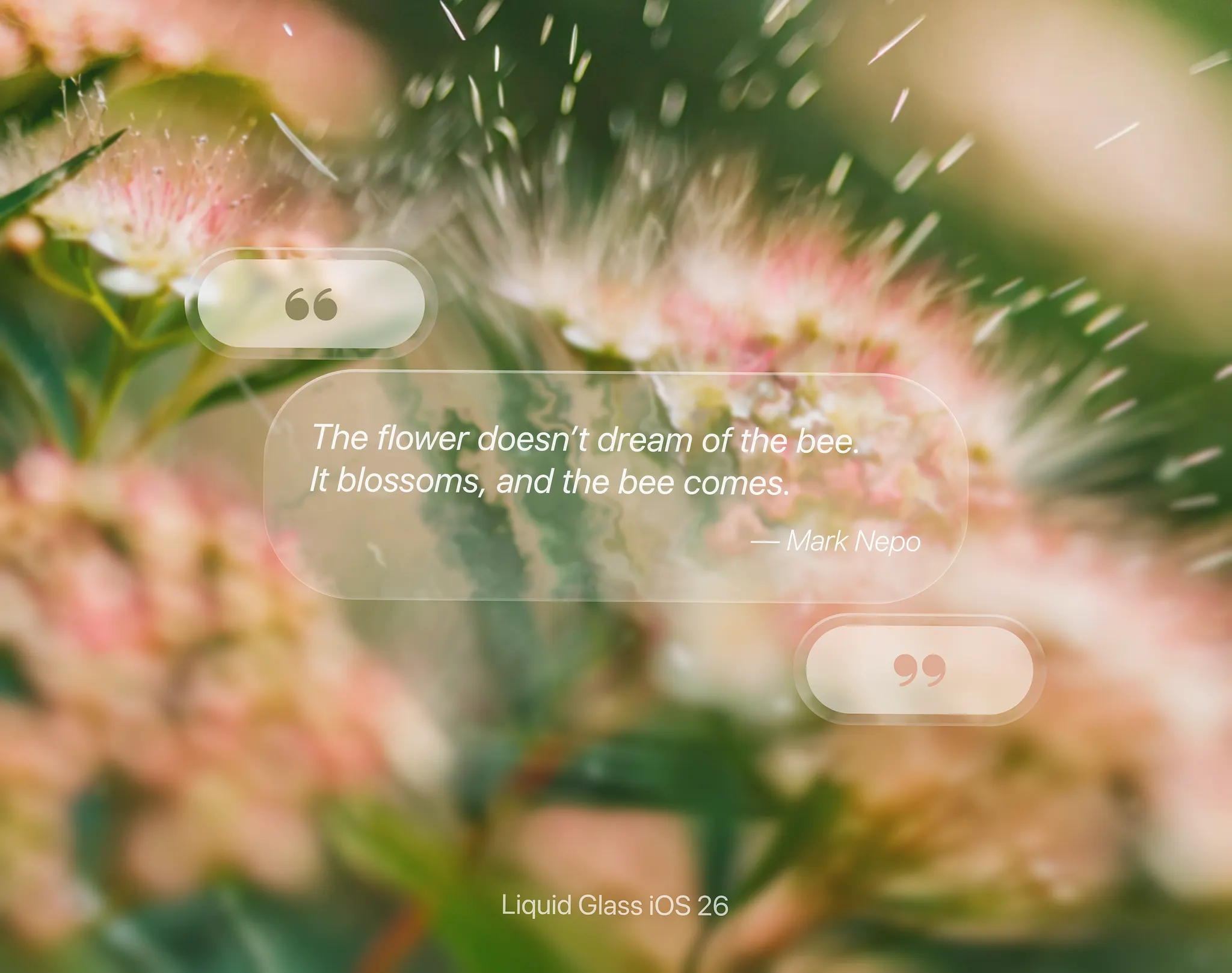
Liquid Glass iOS 26 Button UI
Shuvro Roy Suvashish
Shuvro Roy Suvashish
Varun Soni
Yana
Andrii Vynarchyk
Voicu Apostol
Mikołaj Gałęziowski
vaibhav aggarwal
Lukáš Miško
Avevn
Expert App Devs
Alexi Ermakov
Michael
Victoria®
Aleksei Vasileika
Kiarash Amalivand
Serhii Antoniuk
Piqo Studio
Tanvir Ahammed Tamim
Rakibul
Angel Zhelyazkov
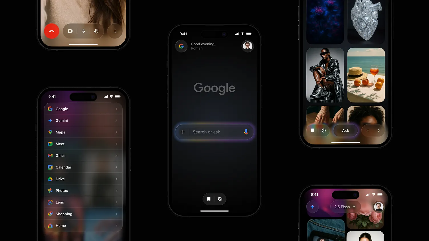
Roman Vorokhib
Liquid Glass Exploration - Sad to Happy
Michael Flarup
Hadi Altaf 🐲
Jack R.
nikhil dussa
Roobinium
Bato
Giorgi Jarmelishvili
AmazingUI