← Back to resources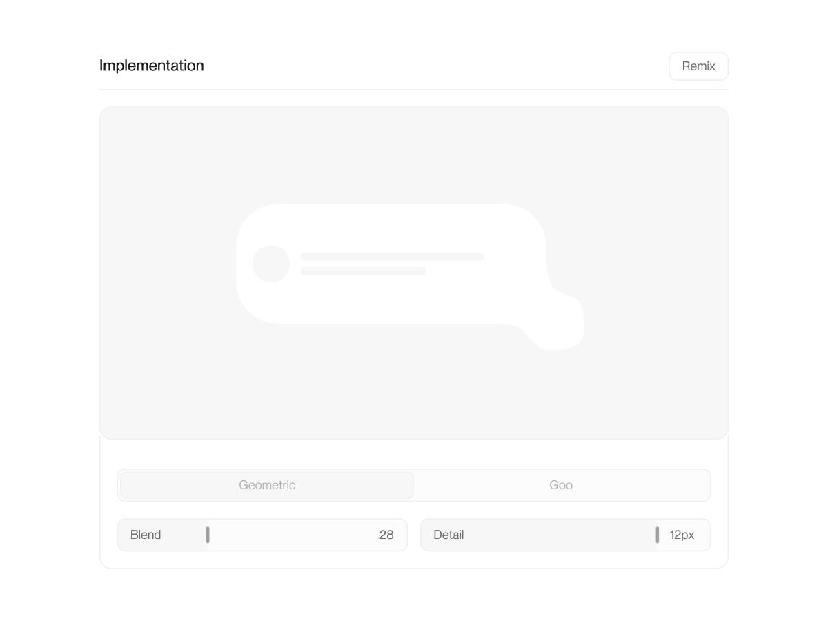
vault-liquid-ui
liquid ui in web,copy code here:
DevarlanJul 30, 2026
I love UI where two cards fuse and the corner between them bends inward, like they were poured together, so I built a tiny engine that just makes it from code instead of drawing it by hand. Drag the cards below to watch the join re-flow, and turn one knob to go from crisp joints all the way to soft gooey blobs.
You are given the complete source for a self-contained web visual: "Liquid UI".
What it is:
- I love UI where two cards fuse and the corner between them bends inward, like they were poured together, so I built a tiny engine that just makes it from code instead of drawing it by hand. Drag the cards below to watch the join re-flow, and turn one knob to go from crisp joints all the way to soft gooey blobs.
How to use this code:
- It is a React + TypeScript component tree (Next.js App Router) that renders to an HTML canvas; the entry point is the playground component.
- Drop the files into a project under the same relative paths, mount the playground component, and it runs as-is. No external assets beyond what's inline.
- To adapt it: change the resolved word/logo, the color controls, or the experiment parameters. Ask me to modify, explain, or port any part.
The full source follows, one file per block:
liquid/sdf.ts
// The signed-distance field that powers the liquid fusion.
//
// The whole "liquid UI" trick is one idea: don't stack shapes, take the UNION of
// their signed-distance fields with a SMOOTH minimum. A plain min() gives a hard
// union (shapes touch at a sharp seam); a smooth-min blends the fields near the
// seam, and that blend IS the concave (inverse) fillet where two cards meet. Turn
// the blend `k` up and the fillet grows into a full gooey neck — so a single knob
// spans "crisp inverse-rounded joint" -> "organic metaball melt".
//
// Everything here is CPU/TS (ported from the repo's GLSL: sdRoundBox + smin live in
// lego/shaders.ts, smin also in liquid-wipe/shader.ts). marching-squares.ts samples
// Field.eval over a grid to trace the fused outline into an SVG path.
//
// Convention: the field is NEGATIVE inside a shape, 0 on the surface, POSITIVE
// outside (standard SDF). The fused outline is the iso-contour at 0.

/** Signed distance from point (px,py) to an axis-aligned rounded box. `hw`,`hh`
 *  are half-extents, `r` the corner radius. Ported from lego/shaders.ts sdRoundBox. */
export function sdRoundBox(
  px: number,
  py: number,
  cx: number,
  cy: number,
  hw: number,
  hh: number,
  r: number,
): number {
  // clamp the radius so it never exceeds the box
  const rr = Math.min(r, Math.min(hw, hh));
  const qx = Math.abs(px - cx) - hw + rr;
  const qy = Math.abs(py - cy) - hh + rr;
  const ax = Math.max(qx, 0);
  const ay = Math.max(qy, 0);
  const outside = Math.hypot(ax, ay);
  const inside = Math.min(Math.max(qx, qy), 0);
  return outside + inside - rr;
}

/** Signed distance to a capsule (a line segment of radius `r`) from (ax,ay) to
 *  (bx,by). Used for explicit "bridges" that connect two cards with a pipe. */
export function sdCapsule(
  px: number,
  py: number,
  ax: number,
  ay: number,
  bx: number,
  by: number,
  r: number,
): number {
  const pax = px - ax;
  const pay = py - ay;
  const bax = bx - ax;
  const bay = by - ay;
  const denom = bax * bax + bay * bay || 1e-6;
  // projection of P onto AB, clamped to the segment
  const h = Math.max(0, Math.min(1, (pax * bax + pay * bay) / denom));
  const dx = pax - bax * h;
  const dy = pay - bay * h;
  return Math.hypot(dx, dy) - r;
}

/** Polynomial smooth-minimum (the fillet maker). k=0 → hard min (sharp seam);
 *  larger k → wider blend → bigger concave fillet / gooey neck. Ported from
 *  lego/shaders.ts (the mix() form — no derivative kink at the seam). */
export function smin(a: number, b: number, k: number): number {
  if (k <= 0) return Math.min(a, b);
  const h = Math.max(0, Math.min(1, 0.5 + (0.5 * (b - a)) / k));
  return b * (1 - h) + a * h - k * h * (1 - h);
}

// ── Shapes ───────────────────────────────────────────────────────────────────
export interface RoundBox {
  kind: "box";
  cx: number;
  cy: number;
  hw: number;
  hh: number;
  r: number;
}
export interface Bridge {
  kind: "bridge";
  ax: number;
  ay: number;
  bx: number;
  by: number;
  r: number;
}
export type Shape = RoundBox | Bridge;

export function shapeSD(s: Shape, px: number, py: number): number {
  return s.kind === "box"
    ? sdRoundBox(px, py, s.cx, s.cy, s.hw, s.hh, s.r)
    : sdCapsule(px, py, s.ax, s.ay, s.bx, s.by, s.r);
}

/** The whole group as one field: the smooth-union of every shape. `eval` returns
 *  the fused signed distance at (x,y). Proximity auto-fuse is automatic — two boxes
 *  close enough that their k-blend overlaps merge with a fillet, with no explicit
 *  connection. Add Bridge shapes for deliberate pipes between distant cards. */
export class Field {
  shapes: Shape[];
  k: number;

  constructor(shapes: Shape[] = [], k = 12) {
    this.shapes = shapes;
    this.k = k;
  }

  eval(x: number, y: number): number {
    const { shapes, k } = this;
    if (shapes.length === 0) return Infinity;
    let d = shapeSD(shapes[0], x, y);
    for (let i = 1; i < shapes.length; i++) {
      d = smin(d, shapeSD(shapes[i], x, y), k);
    }
    return d;
  }

  /** Axis-aligned bounds of the whole group, padded so the fused skin (which bulges
   *  OUTSIDE each box by up to ~k at the fillets) is fully contained in the sample
   *  grid. Without the pad the marching-squares grid would clip the blend. */
  bounds(pad = 0): { minX: number; minY: number; maxX: number; maxY: number } {
    let minX = Infinity;
    let minY = Infinity;
    let maxX = -Infinity;
    let maxY = -Infinity;
    const grow = pad + this.k; // the smin bulge reaches ~k past a box edge
    for (const s of this.shapes) {
      if (s.kind === "box") {
        minX = Math.min(minX, s.cx - s.hw - grow);
        minY = Math.min(minY, s.cy - s.hh - grow);
        maxX = Math.max(maxX, s.cx + s.hw + grow);
        maxY = Math.max(maxY, s.cy + s.hh + grow);
      } else {
        minX = Math.min(minX, Math.min(s.ax, s.bx) - s.r - grow);
        minY = Math.min(minY, Math.min(s.ay, s.by) - s.r - grow);
        maxX = Math.max(maxX, Math.max(s.ax, s.bx) + s.r + grow);
        maxY = Math.max(maxY, Math.max(s.ay, s.by) + s.r + grow);
      }
    }
    if (!isFinite(minX)) return { minX: 0, minY: 0, maxX: 0, maxY: 0 };
    return { minX, minY, maxX, maxY };
  }
}
liquid/marching-squares.ts
// Trace the fused outline of a Field into an SVG path.
//
// This is the one piece with nothing to reuse in the repo. We sample the field's
// signed distance on a grid, then run marching squares at the iso-contour 0 (the
// surface). Each grid cell looks at its 4 corners' inside/outside state (16 cases)
// and emits 0, 1, or 2 short edges; we place each edge endpoint by LINEAR
// INTERPOLATION along the cell edge (where the field actually crosses 0), not at
// the midpoint — that's what turns a blocky staircase into a smooth curve. Then we
// stitch the loose segments into closed loops and CHAIKIN-smooth them so the path
// reads as fluid, not faceted, and doesn't wobble frame-to-frame while morphing.
//
// Output: a single `d` string (possibly multiple subpaths if the group has
// disconnected islands). SVG path formatting matches squircle/superellipse.ts.

import { Field } from "./sdf";

const fmt = (v: number) => v.toFixed(2);

export interface MarchOptions {
  /** Grid cell size in the field's units (px). Smaller = crisper + slower. */
  cell?: number;
  /** Chaikin smoothing passes (0 = raw marching-squares polyline). */
  smooth?: number;
}

type Pt = { x: number; y: number };

// Marching-squares edge table. For each of the 16 corner-mask cases, which cell
// edges the contour crosses, as pairs [edgeA, edgeB]. Edges: 0=top,1=right,2=bottom,
// 3=left. Corner bit order: 0=TL,1=TR,2=BR,3=BL (bit set = INSIDE, field < 0).
// Cases 5 and 10 are saddles → two segments; we resolve them by the cell-center sign.
const EDGES: number[][][] = [
  [], // 0000
  [[3, 2]], // 0001 BL
  [[2, 1]], // 0010 BR
  [[3, 1]], // 0011 BL+BR
  [[0, 1]], // 0100 TR
  [[3, 2], [0, 1]], // 0101 saddle TL?/TR/BL
  [[0, 2]], // 0110 TR+BR
  [[3, 0]], // 0111 TR+BR+BL
  [[3, 0]], // 1000 TL
  [[0, 2]], // 1001 TL+BL
  [[3, 0], [2, 1]], // 1010 saddle
  [[0, 1]], // 1011 TL+BL+BR
  [[3, 1]], // 1100 TL+TR
  [[2, 1]], // 1101 TL+TR+BL
  [[3, 2]], // 1110 TL+TR+BR
  [], // 1111
];

// interpolate the 0-crossing along a cell edge between two corner samples
function lerpEdge(x0: number, y0: number, v0: number, x1: number, y1: number, v1: number): Pt {
  const denom = v0 - v1;
  const t = Math.abs(denom) < 1e-6 ? 0.5 : v0 / denom; // where field hits 0
  const tc = Math.max(0, Math.min(1, t));
  return { x: x0 + (x1 - x0) * tc, y: y0 + (y1 - y0) * tc };
}

/** Marching squares → array of closed loops (each a list of points). */
export function contour(field: Field, opts: MarchOptions = {}): Pt[][] {
  const cell = Math.max(2, opts.cell ?? 6);
  const b = field.bounds();
  const w = b.maxX - b.minX;
  const h = b.maxY - b.minY;
  if (w <= 0 || h <= 0) return [];

  const cols = Math.ceil(w / cell) + 1;
  const rows = Math.ceil(h / cell) + 1;
  if (cols * rows > 400_000) return []; // safety cap

  // sample the field once per grid vertex
  const val = new Float32Array(cols * rows);
  for (let j = 0; j < rows; j++) {
    const y = b.minY + j * cell;
    for (let i = 0; i < cols; i++) {
      val[j * cols + i] = field.eval(b.minX + i * cell, y);
    }
  }
  const at = (i: number, j: number) => val[j * cols + i];

  // collect loose segments (each: two points); we key endpoints to stitch them.
  const segs: [Pt, Pt][] = [];

  for (let j = 0; j < rows - 1; j++) {
    for (let i = 0; i < cols - 1; i++) {
      const x0 = b.minX + i * cell;
      const y0 = b.minY + j * cell;
      const x1 = x0 + cell;
      const y1 = y0 + cell;
      const vTL = at(i, j);
      const vTR = at(i + 1, j);
      const vBR = at(i + 1, j + 1);
      const vBL = at(i, j + 1);
      // inside = field < 0
      let mask = 0;
      if (vTL < 0) mask |= 8;
      if (vTR < 0) mask |= 4;
      if (vBR < 0) mask |= 2;
      if (vBL < 0) mask |= 1;
      if (mask === 0 || mask === 15) continue;

      // point on each edge (lazily)
      const edgePt = (edge: number): Pt => {
        switch (edge) {
          case 0: return lerpEdge(x0, y0, vTL, x1, y0, vTR); // top
          case 1: return lerpEdge(x1, y0, vTR, x1, y1, vBR); // right
          case 2: return lerpEdge(x0, y1, vBL, x1, y1, vBR); // bottom
          default: return lerpEdge(x0, y0, vTL, x0, y1, vBL); // left
        }
      };

      let cases = EDGES[mask];
      // saddle disambiguation via the cell-center sample
      if (mask === 5 || mask === 10) {
        const center = field.eval((x0 + x1) / 2, (y0 + y1) / 2);
        if (mask === 5) cases = center < 0 ? [[3, 0], [2, 1]] : [[3, 2], [0, 1]];
        else cases = center < 0 ? [[3, 2], [0, 1]] : [[3, 0], [2, 1]];
      }
      for (const [ea, eb] of cases) segs.push([edgePt(ea), edgePt(eb)]);
    }
  }

  return stitch(segs, cell);
}

// Stitch loose segments into closed loops by snapping near-equal endpoints together.
function stitch(segs: [Pt, Pt][], cell: number): Pt[][] {
  const eps = cell * 0.5;
  const key = (p: Pt) => `${Math.round(p.x / eps)},${Math.round(p.y / eps)}`;
  // adjacency: endpoint key -> list of {seg index, which end}
  const map = new Map<string, { seg: number; end: 0 | 1 }[]>();
  segs.forEach((s, idx) => {
    for (const end of [0, 1] as const) {
      const k = key(s[end]);
      const arr = map.get(k);
      if (arr) arr.push({ seg: idx, end });
      else map.set(k, [{ seg: idx, end }]);
    }
  });

  const used = new Array(segs.length).fill(false);
  const loops: Pt[][] = [];

  for (let start = 0; start < segs.length; start++) {
    if (used[start]) continue;
    const loop: Pt[] = [];
    let cur = start;
    let end: 0 | 1 = 0;
    let guard = 0;
    while (!used[cur] && guard++ < segs.length + 2) {
      used[cur] = true;
      const a = segs[cur][end];
      const bEnd = (end === 0 ? 1 : 0) as 0 | 1;
      const bPt = segs[cur][bEnd];
      loop.push(a);
      // find an unused segment sharing bPt
      const cands = map.get(key(bPt)) ?? [];
      let next = -1;
      let nextEnd: 0 | 1 = 0;
      for (const c of cands) {
        if (!used[c.seg]) {
          next = c.seg;
          nextEnd = c.end;
          break;
        }
      }
      if (next === -1) break;
      cur = next;
      end = nextEnd;
    }
    if (loop.length >= 3) loops.push(loop);
  }
  return loops;
}

// Chaikin corner-cutting: each pass replaces every point with two points 1/4 and
// 3/4 along its edges, rounding the polyline. Closed-loop variant.
function chaikin(pts: Pt[], passes: number): Pt[] {
  let out = pts;
  for (let p = 0; p < passes; p++) {
    const next: Pt[] = [];
    const n = out.length;
    for (let i = 0; i < n; i++) {
      const a = out[i];
      const b = out[(i + 1) % n];
      next.push({ x: a.x * 0.75 + b.x * 0.25, y: a.y * 0.75 + b.y * 0.25 });
      next.push({ x: a.x * 0.25 + b.x * 0.75, y: a.y * 0.25 + b.y * 0.75 });
    }
    out = next;
  }
  return out;
}

/** Full pipeline: field → contour loops → smoothed → one SVG path `d`. Coordinates
 *  are in the field's own space; the caller sets the SVG viewBox to match. Returns
 *  the path plus the bounds used, so the caller can size the <svg>. */
export function fieldToPath(
  field: Field,
  opts: MarchOptions = {},
): { d: string; minX: number; minY: number; width: number; height: number } {
  const b = field.bounds();
  const loops = contour(field, opts);
  const smooth = opts.smooth ?? 2;
  const parts: string[] = [];
  for (const loop of loops) {
    const s = smooth > 0 ? chaikin(loop, smooth) : loop;
    if (s.length < 3) continue;
    parts.push(
      `M ${fmt(s[0].x)} ${fmt(s[0].y)} ` +
        s.slice(1).map((p) => `L ${fmt(p.x)} ${fmt(p.y)}`).join(" ") +
        " Z",
    );
  }
  return {
    d: parts.join(" "),
    minX: b.minX,
    minY: b.minY,
    width: b.maxX - b.minX,
    height: b.maxY - b.minY,
  };
}
liquid/engine.ts
// The orchestration layer between the React API and the geometry.
//
// A LiquidEngine holds the current cards (measured rounded boxes) + explicit
// bridges + the fusion params, and turns them into one SVG path via the field +
// marching squares. It is framework-free and stateless beyond its inputs, so both
// the React <LiquidGroup> and the playground drive it the same way. The heavy work
// (grid sample + contour) only runs when something actually changed — the caller
// sets inputs then calls compute(); identical inputs return the cached path.

import { Field, type Shape, type Bridge } from "./sdf";
import { fieldToPath, type MarchOptions } from "./marching-squares";

export interface LiquidBox {
  id: string;
  cx: number;
  cy: number;
  hw: number;
  hh: number;
  /** per-card base corner radius */
  r: number;
}

export interface LiquidParams {
  /** Blend amount — the star knob. Low = crisp inverse-rounded joints; high = goo. */
  k: number;
  /** Grid cell size (px). Smaller = crisper outline, more cost. */
  cell: number;
  /** Chaikin smoothing passes on the traced outline. */
  smooth: number;
}

export interface LiquidPath {
  d: string;
  minX: number;
  minY: number;
  width: number;
  height: number;
}

export const DEFAULT_PARAMS: LiquidParams = { k: 26, cell: 6, smooth: 2 };

export class LiquidEngine {
  private boxes: LiquidBox[] = [];
  private bridges: Bridge[] = [];
  private params: LiquidParams = { ...DEFAULT_PARAMS };
  private cachedPath: LiquidPath | null = null;
  private sig = ""; // signature of the last inputs, to skip redundant recompute

  setBoxes(boxes: LiquidBox[]) {
    this.boxes = boxes;
  }
  setBridges(bridges: Bridge[]) {
    this.bridges = bridges;
  }
  setParams(p: Partial<LiquidParams>) {
    this.params = { ...this.params, ...p };
  }

  private signature(): string {
    const b = this.boxes
      .map((x) => `${x.cx.toFixed(1)},${x.cy.toFixed(1)},${x.hw},${x.hh},${x.r}`)
      .join("|");
    const br = this.bridges
      .map((x) => `${x.ax.toFixed(1)},${x.ay.toFixed(1)},${x.bx.toFixed(1)},${x.by.toFixed(1)},${x.r}`)
      .join("|");
    const p = this.params;
    return `${b}#${br}#${p.k},${p.cell},${p.smooth}`;
  }

  /** Compute the fused path. Returns the cached result if nothing changed. */
  compute(): LiquidPath {
    const sig = this.signature();
    if (sig === this.sig && this.cachedPath) return this.cachedPath;
    this.sig = sig;

    const shapes: Shape[] = [
      ...this.boxes.map<Shape>((b) => ({
        kind: "box",
        cx: b.cx,
        cy: b.cy,
        hw: b.hw,
        hh: b.hh,
        r: b.r,
      })),
      ...this.bridges,
    ];
    const field = new Field(shapes, this.params.k);
    const opts: MarchOptions = { cell: this.params.cell, smooth: this.params.smooth };
    this.cachedPath = fieldToPath(field, opts);
    return this.cachedPath;
  }

  /** Whether the inputs changed since the last compute() (drives the rAF morph). */
  isDirty(): boolean {
    return this.signature() !== this.sig;
  }
}
liquid/LiquidGroup.tsx
"use client";

// The reusable liquid-UI API. Drop cards into a <LiquidGroup> and they FUSE: near
// cards merge with a concave (inverse-rounded) joint, and the whole group is drawn
// as ONE smooth SVG "skin" behind the real, accessible card content.
//
//   <LiquidGroup>
//     <LiquidCard id="a" x={20}  y={20} w={220} h={140}>…</LiquidCard>
//     <LiquidCard id="b" x={210} y={90} w={160} h={120}>…</LiquidCard>
//   </LiquidGroup>
//
// The group reads each card's rect from its props (explicit geometry — no DOM
// measurement, so it morphs cleanly and works on the server), feeds them to the
// LiquidEngine (SDF smooth-union + marching squares), and paints the resulting
// path. Content sits on top in normal flow: selectable text, real <img>, links.
// Turn `k` up for a gooey melt, down for crisp geometric joints; add `bridges` for
// deliberate pipes between distant cards.

import {
  Children,
  isValidElement,
  useMemo,
  type CSSProperties,
  type ReactElement,
  type ReactNode,
} from "react";
import { LiquidEngine, DEFAULT_PARAMS, type LiquidBox } from "./engine";
import type { Bridge } from "./sdf";

export interface LiquidCardProps {
  id: string;
  /** top-left position + size, in the group's local px coordinates */
  x: number;
  y: number;
  w: number;
  h: number;
  /** per-card corner radius (defaults to the group's cardRadius) */
  radius?: number;
  className?: string;
  style?: CSSProperties;
  children?: ReactNode;
}

// LiquidCard is a data+content holder; LiquidGroup reads its props and renders the
// actual positioned box. Rendering it directly (outside a group) just lays the box.
export function LiquidCard(props: LiquidCardProps) {
  const { x, y, w, h, className, style, children } = props;
  return (
    <div
      className={className}
      style={{
        position: "absolute",
        left: x,
        top: y,
        width: w,
        height: h,
        ...style,
      }}
    >
      {children}
    </div>
  );
}

export interface LiquidGroupProps {
  children: ReactNode;
  /** Blend amount: low = crisp inverse-rounded joints, high = gooey melt. */
  k?: number;
  /** Default per-card corner radius. */
  cardRadius?: number;
  /** Outline crispness (grid cell px) + smoothing passes. */
  cell?: number;
  smooth?: number;
  /** Explicit pipes between card ids, with an optional width. */
  bridges?: { from: string; to: string; width?: number }[];
  /** Fill of the fused skin (any CSS color / gradient via `fillStyle`). */
  fill?: string;
  fillStyle?: CSSProperties;
  className?: string;
  style?: CSSProperties;
  /** Forwarded onto the skin <svg> for the card→detail view transition. */
  viewTransitionName?: string;
}

type CardEl = ReactElement<LiquidCardProps>;

function isLiquidCard(node: ReactNode): node is CardEl {
  return isValidElement(node) && (node.props as LiquidCardProps).id !== undefined;
}

export function LiquidGroup({
  children,
  k = DEFAULT_PARAMS.k,
  cardRadius = 26,
  cell = DEFAULT_PARAMS.cell,
  smooth = DEFAULT_PARAMS.smooth,
  bridges = [],
  fill = "var(--bg-hover)",
  fillStyle,
  className,
  style,
  viewTransitionName,
}: LiquidGroupProps) {
  const cards = useMemo(
    () => Children.toArray(children).filter(isLiquidCard),
    [children],
  );

  // Build boxes (center-based) + bridge capsules from the card rects, then compute
  // the fused path. useMemo so it only recomputes when geometry / params change.
  const { d, viewBox, skinStyle } = useMemo(() => {
    const boxes: LiquidBox[] = cards.map((c) => {
      const p = c.props;
      return {
        id: p.id,
        cx: p.x + p.w / 2,
        cy: p.y + p.h / 2,
        hw: p.w / 2,
        hh: p.h / 2,
        r: p.radius ?? cardRadius,
      };
    });
    const byId = new Map(boxes.map((b) => [b.id, b]));
    const capsules: Bridge[] = [];
    for (const br of bridges) {
      const a = byId.get(br.from);
      const b = byId.get(br.to);
      if (!a || !b) continue;
      capsules.push({
        kind: "bridge",
        ax: a.cx,
        ay: a.cy,
        bx: b.cx,
        by: b.cy,
        r: br.width ? br.width / 2 : Math.min(a.hh, b.hh) * 0.5,
      });
    }

    const engine = new LiquidEngine();
    engine.setBoxes(boxes);
    engine.setBridges(capsules);
    engine.setParams({ k, cell, smooth });
    const path = engine.compute();

    return {
      d: path.d,
      viewBox: `${path.minX} ${path.minY} ${path.width} ${path.height}`,
      // The <svg> is positioned so its viewBox origin lines up with the group's
      // local (0,0): the path is in group coordinates, and the svg is inset by the
      // negative bounds so the bulge that extends past (0,0) is not clipped.
      skinStyle: {
        position: "absolute" as const,
        left: path.minX,
        top: path.minY,
        width: path.width,
        height: path.height,
        overflow: "visible" as const,
        pointerEvents: "none" as const,
      },
    };
  }, [cards, k, cardRadius, cell, smooth, bridges]);

  return (
    <div className={className} style={{ position: "relative", ...style }}>
      {/* the fused skin, behind the content */}
      <svg
        aria-hidden
        viewBox={viewBox}
        style={{ ...skinStyle, viewTransitionName, ...fillStyle }}
      >
        <path d={d} fill={fill} />
      </svg>
      {/* real card content on top, in normal DOM */}
      {cards}
    </div>
  );
}
liquid/LiquidCard.tsx
"use client";

// Re-exported from LiquidGroup, where it's defined alongside the group that reads
// its props. Kept as its own module so it can be imported directly and shown as a
// distinct file in the Vault Code tab.
export { LiquidCard, type LiquidCardProps } from "./LiquidGroup";
liquid/scenes.tsx
// The scene data shared by the preview card and the playground, in two sizes.
//
// Why two: the desktop compositions live in a wide fixed-px design space (640×360
// for the card, 720×380 for the playground) that gets CSS-scaled to the container.
// On a phone the container is ~326px wide, so that scale collapses to ~0.45 — the
// whole scene shrinks until the 11px labels render at 5px and the 2px content bars
// land under one device pixel. Rescaling alone can't fix that: a wide landscape
// composition is simply the wrong layout for a narrow screen.
//
// So mobile gets its OWN space (COMPACT_VW×COMPACT_VH), sized so the scale lands
// near 1.0 at phone widths — content then renders at roughly its true design size.
// The pieces are re-placed tighter for the narrower box, and the small "appendage"
// pieces are grown so they clear the ~44px touch minimum when dragged.
//
// The card and the playground MUST agree on which set they use: they share a
// view-transition-name for the card→hero morph, and a mismatch would make the
// shape visibly jump mid-transition.

import type { ReactNode } from "react";

// ── Design spaces ────────────────────────────────────────────────────────────
/** Desktop space for the preview card / hero. */
export const CARD_VW = 640;
export const CARD_VH = 360;
/** Desktop space for the draggable playground stage. */
export const PG_VW = 720;
export const PG_VH = 380;

/** The shared mobile space. 16:9 so it matches the card's aspect exactly, and
 *  small enough that `100cqw / COMPACT_*_DIV` lands near 1.0 on a phone. */
export const COMPACT_VW = 360;
export const COMPACT_VH = 202;

/** Divisors for the CSS `scale: calc(100cqw / N)`. The card divides by the width
 *  of the box the shapes actually occupy (not the full space) so the content
 *  fills the frame; the playground divides by its full width so the whole
 *  draggable area stays reachable. */
export const CARD_DIV = 460;
export const PG_DIV = 720;
// Tuned by eye rather than to a pure fit: at a 1.0 scale the scene filled the frame
// edge to edge and felt cramped, so both divisors are pushed past the exact-fit
// value to leave breathing room. The floor on the playground is the touch target —
// its smallest draggable piece is 60 design-px, and 430 keeps that at ~45 CSS px on
// a 390px phone, just above the ~44px minimum.
export const COMPACT_CARD_DIV = 380;
export const COMPACT_PG_DIV = 430;

/** The breakpoint. Matches Tailwind `sm` (and ImageGalaxyCard's mobile check). */
export const MOBILE_QUERY = "(max-width: 639px)";

// ── Types ────────────────────────────────────────────────────────────────────
export interface ScenePiece {
  id: string;
  x: number;
  y: number;
  w: number;
  h: number;
  radius: number;
  content?: ReactNode;
}

export interface SceneSpec {
  k: number;
  /** Grid cell size for the marching-squares sample, in field units. */
  cell: number;
  pieces: ScenePiece[];
}

/** Everything a consumer needs for one size: the space, the CSS divisors, and
 *  the scenes placed inside that space. */
export interface SceneSet {
  vw: number;
  vh: number;
  cardDiv: number;
  pgDiv: number;
  cardRadius: number;
  /** cycling scenes for the preview card / hero */
  card: SceneSpec[];
  /** presets for the draggable playground */
  playground: SceneSpec[];
}

// ── Content ──────────────────────────────────────────────────────────────────
// Content is authored at two sizes too. Because the whole space is CSS-scaled,
// an 11px label in the desktop space renders at ~5px on a phone — so the mobile
// variants use larger design-px values that land near the intended size once the
// compact scale (~1.0) is applied.

const swatch = "rounded-[6px] bg-[var(--bg-hover)]";

const bar = (w: string, h: string) => (
  <div className={`${h} rounded-full bg-[var(--bg-hover)]`} style={{ width: w }} />
);

/** 2×2 tile grid (the "grid panel" body). */
function GridBody({ compact = false }: { compact?: boolean }) {
  return (
    <div
      className={`grid h-full grid-cols-2 grid-rows-2 ${compact ? "gap-1.5 p-2 pt-2.5" : "gap-1.5 p-2 pt-2.5"}`}
    >
      <div className={swatch} />
      <div className={swatch} />
      <div className={swatch} />
      <div className={swatch} />
    </div>
  );
}

/** A small text label (the "Grid" / "Share" tab). */
function Label({ children, compact = false, center = false }: { children: ReactNode; compact?: boolean; center?: boolean }) {
  return (
    <div
      className={`flex h-full items-center ${center ? "justify-center pl-1" : "px-3 pb-1"}`}
    >
      <span
        className={`font-semibold text-[var(--text-secondary)] ${compact ? "text-[13px]" : "text-[11px]"}`}
      >
        {children}
      </span>
    </div>
  );
}

/** Avatar + two message lines (the chat bubble body). */
function BubbleBody({ compact = false }: { compact?: boolean }) {
  return (
    <div className={`flex h-full items-center ${compact ? "gap-3 px-4" : "gap-2.5 px-4"}`}>
      <div
        className={`${compact ? "size-10" : "size-9"} shrink-0 rounded-full bg-[var(--bg-hover)]`}
      />
      <div className="flex flex-1 flex-col gap-1.5">
        {bar("80%", compact ? "h-2.5" : "h-2")}
        {bar("55%", compact ? "h-2.5" : "h-2")}
      </div>
    </div>
  );
}

/** Overlapping avatar stack + two lines (the share card body). */
function ShareBody({ compact = false }: { compact?: boolean }) {
  const av = `${compact ? "size-9" : "size-8"} rounded-full border-2 border-[var(--bg-surface)] bg-[var(--bg-hover)]`;
  return (
    <div className="flex h-full items-center gap-3 px-4">
      <div className="flex -space-x-2">
        <div className={av} />
        <div className={av} />
        <div className={av} />
      </div>
      <div className="flex flex-1 flex-col gap-1.5">
        {bar("70%", compact ? "h-2.5" : "h-2")}
        {bar("45%", compact ? "h-2.5" : "h-2")}
      </div>
    </div>
  );
}

/** The search-bar input line. */
function SearchBody({ compact = false }: { compact?: boolean }) {
  return (
    <div className="flex h-full items-center px-5">
      {bar("55%", compact ? "h-3" : "h-2.5")}
    </div>
  );
}

/** The magnifier glyph on the search "go" button. */
function SearchIcon({ size = 20 }: { size?: number }) {
  return (
    <div className="flex h-full w-full items-center justify-center text-[var(--text-secondary)]">
      <svg
        width={size}
        height={size}
        viewBox="0 0 24 24"
        fill="none"
        stroke="currentColor"
        strokeWidth="2.2"
        strokeLinecap="round"
        strokeLinejoin="round"
        aria-hidden="true"
      >
        <circle cx="11" cy="11" r="7" />
        <path d="m20 20-3.2-3.2" />
      </svg>
    </div>
  );
}

// ── Desktop scenes ───────────────────────────────────────────────────────────
// The card cycles these three; every scene shares the SAME two ids ("main" +
// "tab") so pieces tween 1:1 and content swaps at the morph midpoint.
const CARD_SCENES: SceneSpec[] = [
  // Grid panel — 2×2 tiles + a "Grid" tab fused at the top-left.
  {
    k: 20,
    cell: 6,
    pieces: [
      { id: "main", x: 170, y: 82, w: 300, h: 196, radius: 22, content: <GridBody /> },
      { id: "tab", x: 178, y: 46, w: 92, h: 46, radius: 18, content: <Label>Grid</Label> },
    ],
  },
  // Chat bubble — avatar + message lines, tail fused at the bottom-right.
  {
    k: 30,
    cell: 6,
    pieces: [
      { id: "main", x: 160, y: 128, w: 300, h: 108, radius: 40, content: <BubbleBody /> },
      { id: "tab", x: 428, y: 206, w: 50, h: 50, radius: 14 },
    ],
  },
  // Share card — avatar stack + a "Share" button fused to the right edge (gooey).
  {
    k: 60,
    cell: 6,
    pieces: [
      { id: "main", x: 150, y: 120, w: 280, h: 116, radius: 26, content: <ShareBody /> },
      { id: "tab", x: 418, y: 151, w: 90, h: 54, radius: 18, content: <Label center>Share</Label> },
    ],
  },
];

// The playground's four presets, hand-placed by dragging in the playground
// itself, in the wider 720×380 stage (absolute coords, no auto-centering).
const PG_SCENES: SceneSpec[] = [
  // 1 · Chat bubble — tail fused at the bottom-right (a sent message).
  {
    k: 28,
    cell: 12,
    pieces: [
      { id: "bubble", x: 188, y: 123, w: 300, h: 116, radius: 40, content: <BubbleBody /> },
      { id: "tail", x: 472, y: 212, w: 52, h: 52, radius: 14 },
    ],
  },
  // 2 · Grid panel — a "Grid" tab fused at the top-left.
  {
    k: 20,
    cell: 12,
    pieces: [
      { id: "tab", x: 178, y: 80, w: 92, h: 46, radius: 18, content: <Label>Grid</Label> },
      { id: "panel", x: 247, y: 104, w: 300, h: 196, radius: 22, content: <GridBody /> },
    ],
  },
  // 3 · Share card — a "Share" button fused to the right edge with a gooey neck.
  {
    k: 77,
    cell: 11,
    pieces: [
      { id: "card", x: 176, y: 131, w: 288, h: 120, radius: 26, content: <ShareBody /> },
      { id: "btn", x: 483, y: 165, w: 96, h: 52, radius: 18, content: <Label center>Share</Label> },
    ],
  },
  // 4 · Search bar — a pill input with a round button fused near the right end.
  {
    k: 20,
    cell: 3,
    pieces: [
      { id: "input", x: 208, y: 167, w: 300, h: 64, radius: 32, content: <SearchBody /> },
      { id: "go", x: 452, y: 132, w: 56, h: 56, radius: 26, content: <SearchIcon /> },
    ],
  },
];

// ── Compact (mobile) scenes ──────────────────────────────────────────────────
// Re-placed for the 360×202 space rather than rescaled: the compositions are
// tighter and more vertical, the bodies are proportionally larger relative to the
// frame, and every draggable appendage is at least 60 design-px so it stays a
// comfortable touch target once the ~1.0 compact scale is applied.
//
// `cell` is raised across the board. It's a grid step in FIELD units, so a small
// cell in a small space oversamples badly — the compact space is ~half the width
// of the desktop one, so the same visual crispness needs roughly half the cell
// count, and the weakest devices are the ones running it.
const COMPACT_CARD_SCENES: SceneSpec[] = [
  // Grid panel — tab tucked at the top-left of the body.
  {
    k: 16,
    cell: 5,
    pieces: [
      { id: "main", x: 76, y: 49, w: 208, h: 132, radius: 20, content: <GridBody compact /> },
      { id: "tab", x: 84, y: 21, w: 78, h: 38, radius: 15, content: <Label compact>Grid</Label> },
    ],
  },
  // Chat bubble — tail fused at the bottom-right.
  {
    k: 22,
    cell: 5,
    pieces: [
      { id: "main", x: 64, y: 62, w: 232, h: 92, radius: 32, content: <BubbleBody compact /> },
      { id: "tab", x: 262, y: 128, w: 46, h: 46, radius: 13 },
    ],
  },
  // Share card — button fused to the right edge (gooey).
  {
    k: 44,
    cell: 5,
    pieces: [
      { id: "main", x: 46, y: 60, w: 210, h: 96, radius: 22, content: <ShareBody compact /> },
      { id: "tab", x: 246, y: 78, w: 74, h: 48, radius: 16, content: <Label compact center>Share</Label> },
    ],
  },
];

const COMPACT_PG_SCENES: SceneSpec[] = [
  // 1 · Chat bubble + tail. The tail is the smallest draggable piece anywhere, so
  //     it sets the floor: 64px keeps it a usable target even on a 320px phone.
  {
    k: 22,
    cell: 6,
    pieces: [
      { id: "bubble", x: 52, y: 56, w: 232, h: 92, radius: 32, content: <BubbleBody compact /> },
      { id: "tail", x: 250, y: 120, w: 64, h: 64, radius: 17 },
    ],
  },
  // 2 · Grid panel + tab. The tab is short by nature, so it's the piece most at risk
  //     of becoming an unusable target — 64 tall keeps it draggable, and the panel
  //     drops to meet it so the pair still reads as a tab fused to a panel.
  {
    k: 16,
    cell: 6,
    pieces: [
      { id: "tab", x: 60, y: 18, w: 92, h: 64, radius: 20, content: <Label compact>Grid</Label> },
      { id: "panel", x: 96, y: 62, w: 204, h: 122, radius: 20, content: <GridBody compact /> },
    ],
  },
  // 3 · Share card + button, gooey neck.
  {
    k: 52,
    cell: 6,
    pieces: [
      { id: "card", x: 40, y: 56, w: 204, h: 100, radius: 22, content: <ShareBody compact /> },
      { id: "btn", x: 242, y: 74, w: 82, h: 64, radius: 20, content: <Label compact center>Share</Label> },
    ],
  },
  // 4 · Search bar + go button, both at the 64px floor.
  {
    k: 16,
    cell: 5,
    pieces: [
      { id: "input", x: 42, y: 80, w: 224, h: 64, radius: 32, content: <SearchBody compact /> },
      { id: "go", x: 238, y: 50, w: 64, h: 64, radius: 29, content: <SearchIcon size={22} /> },
    ],
  },
];

// ── The two sets ─────────────────────────────────────────────────────────────
export const DESKTOP_SET: SceneSet = {
  vw: PG_VW,
  vh: PG_VH,
  cardDiv: CARD_DIV,
  pgDiv: PG_DIV,
  cardRadius: 26,
  card: CARD_SCENES,
  playground: PG_SCENES,
};

export const COMPACT_SET: SceneSet = {
  vw: COMPACT_VW,
  vh: COMPACT_VH,
  cardDiv: COMPACT_CARD_DIV,
  pgDiv: COMPACT_PG_DIV,
  cardRadius: 20,
  card: COMPACT_CARD_SCENES,
  playground: COMPACT_PG_SCENES,
};

/** The card/hero uses its own space (640×360) on desktop but shares the compact
 *  space on mobile — so the two sets differ in `vw`/`vh` for the card path. */
export const CARD_SPACE = { vw: CARD_VW, vh: CARD_VH };
export const COMPACT_CARD_SPACE = { vw: COMPACT_VW, vh: COMPACT_VH };
liquid/playground.tsx
"use client";

// Liquid UI playground — drag the pieces and watch the fused skin re-flow: a small
// tab fused to a card keeps a concave (inverse-rounded) joint; pull it away and the
// neck stretches then snaps. Remix MORPHS between real UI objects — a chat bubble, a
// grid panel, a share card, a search bar — tweening every piece + the blend, so it
// pours from one shape into the next instead of snapping. Each preset is hand-placed
// with its own corner radii and tight content. The bottom panel tunes the blend /
// detail live. Built on the same <LiquidGroup> the Code tab ships.
//
// The presets live in scenes.tsx in two sizes. On a phone the 720×380 stage scales
// to ~0.45, which turns the 52px tail into a 24px drag target and the 11px labels
// into 5px — so mobile swaps in a compact stage with larger, re-placed pieces. Every
// coordinate below therefore reads the ACTIVE space (vw/vh) rather than a constant.

import { useCallback, useEffect, useMemo, useRef, useState } from "react";
import { LiquidGroup, LiquidCard } from "./LiquidGroup";
import { PG_PREVIEW, PG_PANEL, Slider, SegmentedControl, GhostButton } from "../swirl/controls";
import { SectionLabel } from "../section-label";
import { hapticTap } from "../../lib/haptics";
import { useSceneSet } from "./use-compact";
import { COMPACT_SET, type ScenePiece } from "./scenes";

// Mode presets the blend + grid: geometric = tight blend, fine grid (crisp inverse
// fillets); goo = wide blend (organic melt). The compact space is about half the
// width of the desktop one, so its k (a distance in field units) and cell scale
// down with it — otherwise "Goo" at k=64 would swallow the whole compact scene.
const MODES = [
  { id: "geometric", label: "Geometric", k: 22, cell: 5 },
  { id: "goo", label: "Goo", k: 64, cell: 7 },
];
const COMPACT_MODES = [
  { id: "geometric", label: "Geometric", k: 14, cell: 5 },
  { id: "goo", label: "Goo", k: 42, cell: 6 },
];

// ── Remix morph ──────────────────────────────────────────────────────────────
// Remix doesn't snap to the next preset — it TWEENS every piece to its new spot
// (position, size, radius) and blends k, exactly like the hero card. Presets have
// different ids/order, so we tween by ROLE: the largest card (the main body) morphs
// into the next main body, the smaller one (the appendage) into the next appendage.
const REMIX_MS = 620;
const lerp = (a: number, b: number, t: number) => a + (b - a) * t;
const ease = (t: number) => (t < 0.5 ? 4 * t * t * t : 1 - Math.pow(-2 * t + 2, 3) / 2);

// order a preset's cards as [main, appendage] by area, so we can tween 1:1.
function byRole(cards: ScenePiece[]): ScenePiece[] {
  return [...cards].sort((a, b) => b.w * b.h - a.w * a.h); // [largest = main, ...smaller]
}
// tween two same-length role-ordered card lists; content comes from whichever side
// dominates (target past the midpoint) so labels swap cleanly.
function tweenCards(from: ScenePiece[], to: ScenePiece[], p: number): ScenePiece[] {
  const a = byRole(from);
  const b = byRole(to);
  return a.map((fc, i) => {
    const tc = b[i] ?? fc;
    const src = p < 0.5 ? fc : tc;
    return {
      id: src.id,
      x: lerp(fc.x, tc.x, p),
      y: lerp(fc.y, tc.y, p),
      w: lerp(fc.w, tc.w, p),
      h: lerp(fc.h, tc.h, p),
      radius: lerp(fc.radius, tc.radius, p),
      content: src.content,
    };
  });
}

export function LiquidPlayground() {
  const set = useSceneSet();
  const compact = set === COMPACT_SET;
  const presets = set.playground;
  const { vw: VW, vh: VH } = set;
  const modes = compact ? COMPACT_MODES : MODES;

  const [presetIdx, setPresetIdx] = useState(0);
  const [cards, setCards] = useState<ScenePiece[]>(() => presets[0].pieces.map((c) => ({ ...c })));
  const [mode, setMode] = useState("");
  const [k, setK] = useState(presets[0].k);
  const [cell, setCell] = useState(presets[0].cell);

  // Crossing the breakpoint swaps the whole coordinate space, so the current cards
  // (placed in the OLD space) are meaningless. Reset during render — the standard
  // "adjust state when a prop changes" pattern — rather than in an effect, which
  // would paint one frame of old-space coordinates in the new space first.
  const [activePresets, setActivePresets] = useState(presets);
  if (activePresets !== presets) {
    setActivePresets(presets);
    setPresetIdx(0);
    setCards(presets[0].pieces.map((c) => ({ ...c })));
    setK(presets[0].k);
    setCell(presets[0].cell);
    setMode("");
  }

  const stageRef = useRef<HTMLDivElement>(null);
  // the scaled VW×VH space; its rect reflects the real transform, so pointer→local
  // mapping stays correct at any container width (and in the compact space).
  const spaceRef = useRef<HTMLDivElement>(null);
  const drag = useRef<{ id: string; dx: number; dy: number } | null>(null);
  // active Remix morph: null when idle. rAF tweens cards + k from → to.
  const morph = useRef<{ from: ScenePiece[]; to: ScenePiece[]; fromK: number; toK: number; start: number; raf: number } | null>(null);

  // The render-phase reset above drops the old cards; this cancels the imperative
  // work that can't be touched during render (an in-flight morph rAF, a live drag).
  useEffect(() => {
    if (morph.current?.raf) cancelAnimationFrame(morph.current.raf);
    morph.current = null;
    drag.current = null;
  }, [presets]);

  // Remix: MORPH to the next UI object (tween every piece + blend), like the hero.
  const remix = () => {
    hapticTap();
    const i = (presetIdx + 1) % presets.length;
    const target = presets[i];
    setPresetIdx(i);
    setMode("");
    setCell(target.cell);

    // cancel any in-flight morph and start a fresh one from the CURRENT pieces
    if (morph.current?.raf) cancelAnimationFrame(morph.current.raf);
    const m = {
      from: cards.map((c) => ({ ...c })),
      to: target.pieces.map((c) => ({ ...c })),
      fromK: k,
      toK: target.k,
      start: 0,
      raf: 0,
    };
    morph.current = m;
    const step = (now: number) => {
      if (!m.start) m.start = now;
      const p = ease(Math.min(1, (now - m.start) / REMIX_MS));
      setCards(tweenCards(m.from, m.to, p));
      setK(Math.round(lerp(m.fromK, m.toK, p)));
      if (p < 1) {
        m.raf = requestAnimationFrame(step);
      } else {
        // land exactly on the target
        setCards(target.pieces.map((c) => ({ ...c })));
        setK(target.k);
        morph.current = null;
      }
    };
    m.raf = requestAnimationFrame(step);
  };

  // stop a running morph if the user grabs a piece or the component unmounts.
  useEffect(() => () => { if (morph.current?.raf) cancelAnimationFrame(morph.current.raf); }, []);

  const applyMode = (id: string) => {
    setMode(id);
    const m = modes.find((x) => x.id === id);
    if (m) {
      setK(m.k);
      setCell(m.cell);
    }
  };

  const toLocal = useCallback(
    (clientX: number, clientY: number) => {
      // map against the SCALED SPACE's rect (not the stage), so the mapping is exact
      // whatever the container width or active space.
      const el = spaceRef.current ?? stageRef.current;
      if (!el) return { x: 0, y: 0 };
      const r = el.getBoundingClientRect();
      return {
        x: ((clientX - r.left) / r.width) * VW,
        y: ((clientY - r.top) / r.height) * VH,
      };
    },
    [VW, VH],
  );

  const onPointerDown = (id: string) => (e: React.PointerEvent) => {
    // grabbing a piece cancels any in-flight Remix morph so it doesn't fight the drag
    if (morph.current?.raf) {
      cancelAnimationFrame(morph.current.raf);
      morph.current = null;
    }
    (e.target as HTMLElement).setPointerCapture?.(e.pointerId);
    const p = toLocal(e.clientX, e.clientY);
    const card = cards.find((c) => c.id === id);
    if (!card) return;
    drag.current = { id, dx: p.x - card.x, dy: p.y - card.y };
    hapticTap();
  };
  const onPointerMove = (e: React.PointerEvent) => {
    if (!drag.current) return;
    const p = toLocal(e.clientX, e.clientY);
    const { id, dx, dy } = drag.current;
    // let a piece hang slightly off-stage, proportional to the space so the compact
    // one doesn't allow a piece to wander half its own width out of frame.
    const slack = VW * 0.055;
    setCards((cs) =>
      cs.map((c) =>
        c.id === id
          ? {
              ...c,
              x: Math.max(-slack, Math.min(VW - c.w + slack, p.x - dx)),
              y: Math.max(-slack, Math.min(VH - c.h + slack, p.y - dy)),
            }
          : c,
      ),
    );
  };
  const endDrag = () => {
    drag.current = null;
  };

  // no explicit bridges in these UI presets — proximity fusing does the joins.
  const groupBridges = useMemo(() => [], []);

  // Blend/detail ranges track the space: k is a distance in field units, so the
  // compact space needs a proportionally smaller ceiling to span the same look.
  const kMax = compact ? 60 : 90;
  const cellMin = compact ? 4 : 3;
  const cellMax = compact ? 10 : 14;

  return (
    <div className="flex min-w-0 flex-col gap-4">
      <SectionLabel action={<GhostButton onClick={remix}>Remix</GhostButton>}>
        Implementation
      </SectionLabel>

      {/* Preview stage — drag the pieces. */}
      <div className={`${PG_PREVIEW} touch-none`}>
        <div
          ref={stageRef}
          className="relative w-full"
          style={{ aspectRatio: `${VW} / ${VH}` }}
          onPointerMove={onPointerMove}
          onPointerUp={endDrag}
          onPointerCancel={endDrag}
        >
          <div className="absolute inset-0" style={{ containerType: "size" }}>
            {/* Center-anchored scale (matches LiquidPreviewCard): the fixed VW×VH
                space is pinned to the stage center and scaled to fit its width, so
                it never drifts down-right the way an origin-top-left scale does when
                the container width isn't exactly VW. The divisor is the space's own
                width so the WHOLE draggable area stays visible (the card scales
                tighter, to its content box). */}
            <div
              ref={spaceRef}
              className="absolute left-1/2 top-1/2"
              style={{
                width: VW,
                height: VH,
                transform: "translate(-50%, -50%)",
                transformOrigin: "center",
                scale: `calc(100cqw / ${set.pgDiv})`,
              }}
            >
              <LiquidGroup
                k={k}
                cardRadius={set.cardRadius}
                cell={cell}
                smooth={2}
                bridges={groupBridges}
                fill="var(--bg-surface)"
                className="h-full w-full"
              >
                {cards.map((c) => (
                  <LiquidCard key={c.id} id={c.id} x={c.x} y={c.y} w={c.w} h={c.h} radius={c.radius}>
                    <div
                      onPointerDown={onPointerDown(c.id)}
                      className="h-full w-full cursor-grab active:cursor-grabbing"
                    >
                      {c.content}
                    </div>
                  </LiquidCard>
                ))}
              </LiquidGroup>
            </div>
          </div>
        </div>
      </div>

      {/* Panel */}
      <div className={`${PG_PANEL} gap-3.5`}>
        <SegmentedControl
          options={modes.map((m) => ({ id: m.id, label: m.label }))}
          activeId={mode}
          onPick={applyMode}
          fill
        />

        <div className="grid grid-cols-1 gap-3 sm:grid-cols-2">
          <Slider label="Blend" value={k} min={0} max={kMax} step={1}
            format={(v) => `${v}`} onChange={(v) => { setMode(""); setK(v); }} />
          <Slider label="Detail" value={cell} min={cellMin} max={cellMax} step={1}
            format={(v) => `${v}px`} onChange={(v) => { setMode(""); setCell(v); }} />
        </div>
      </div>
    </div>
  );
}