
Liquid Glass Design开发阅读约 6 分钟
Liquid Glass 代码:用 CSS 和 SVG 做出真正的折射
Liquid Glass 网页代码:所有浏览器都能用的 CSS 玻璃层,加上在 Chromium 里做出真正折射的 SVG feDisplacementMap 滤镜。
本文目录
网页上的 Liquid Glass 代码分两部分:一层 CSS 玻璃(模糊、染色、边缘高光、光泽),所有浏览器都能显示;再加一个 SVG feDisplacementMap 滤镜,把元素后面的像素扭弯。到 2026 年 11 月,扭弯这部分只有 Chromium 浏览器能用 backdrop-filter: url() 渲染出来。所以要把它当成叠在 CSS 层上的增强效果。
为什么只用 backdrop-filter blur 看起来像 glassmorphism
backdrop-filter: blur() 会把面板后面的东西均匀抹开。这就是设计师从 2020 年起叫作 glassmorphism(毛玻璃风格)的磨砂卡片效果。Apple 的材质更像一块厚透镜:平坦的中间部分背景基本清晰,到圆角边缘才弯折,朝光的那条边上还有一道高光。我们的 Liquid Glass 介绍文章把两者的区别讲得更细,Liquid Glass 与 glassmorphism 对比里还有一份截图检查清单,教你分辨两者。落到代码上,简单说就是:模糊只能给你磨砂感,「liquid」那种液态感来自边缘的位移。
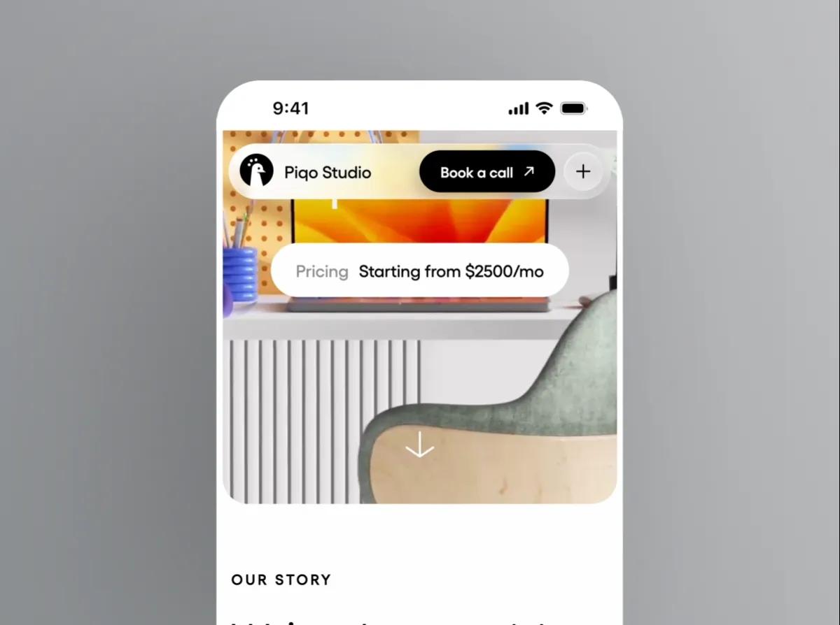
想看动起来的例子,可以看 Piqo Studio 的 Liquid Glass Design Video,工作室说这个作品是把 Liquid Glass 带到网页上;还有 Ho3ein 的 Liquid Glass Buttons hover effect。
第 1 层:所有浏览器都能用的 Liquid Glass CSS
每个访客都会看到这一层,所以它在没有折射的情况下也得是完成品:浅浅的染色,一点模糊加额外饱和度,顶边一道内阴影高光,一圈细线边框,再用伪元素加一层柔和的光泽。
.glass {
  position: relative;
  border-radius: 40px;
  color: #fff;
  background: rgb(255 255 255 / 0.10);
  -webkit-backdrop-filter: blur(6px) saturate(160%);
  backdrop-filter: blur(6px) saturate(160%);
  box-shadow:
    inset 0 1px 0 rgb(255 255 255 / 0.6),   /* lit top rim */
    inset 0 -1px 0 rgb(255 255 255 / 0.15), /* faint bottom rim */
    inset 0 0 0 1px rgb(255 255 255 / 0.2), /* hairline edge */
    0 10px 30px rgb(0 0 0 / 0.25);          /* lift off the page */
}

.glass::before {
  content: "";
  position: absolute;
  inset: 0;
  border-radius: inherit;
  pointer-events: none;
  background: radial-gradient(120% 70% at 25% 0%, rgb(255 255 255 / 0.35), transparent 55%);
}
-webkit- 那一行要留着。根据 MDN 的兼容性数据,Safari 从 Safari 9 起只支持带前缀的属性,直到 Safari 18 才支持不带前缀的写法,而旧版 Safari 现在仍有人在用。
模糊半径要小。半径一大,又回到磨砂玻璃了,第 2 层的折射也没有清晰的东西可扭。
同一个 class 放到 <button> 上也能用。我们的 Liquid Glass 按钮指南补上了 hover、按下和焦点状态。
第 2 层:SVG 折射滤镜
feDisplacementMap 会按第二张图(位移贴图)里读到的数值,移动输入图像的每个像素。Filter Effects 规范的定义是 P'(x,y) ← P(x + scale * (XC(x,y) - .5), y + scale * (YC(x,y) - .5))。红色通道控制水平移动,绿色通道控制垂直移动。通道值 128(0.5)表示「不动」,scale 是最大位移的像素数。
所以要做的事情是画一张贴图:形状平坦的中间部分是中性灰,靠近边缘的地方沿边缘法线方向推动像素。滤镜如下:
<svg width="0" height="0" aria-hidden="true" style="position:absolute">
  <filter id="lg-refract" x="0" y="0" width="100%" height="100%"
          color-interpolation-filters="sRGB">
    <feImage id="lg-map" x="0" y="0" preserveAspectRatio="none" result="map" />
    <feDisplacementMap in="SourceGraphic" in2="map" scale="60"
                       xChannelSelector="R" yChannelSelector="G" />
  </filter>
</svg>

<div class="glass">Liquid Glass</div>
别删掉 color-interpolation-filters="sRGB"。这个属性默认是 linearRGB,规范会把它作用到贴图输入(in2)上。在线性色彩空间里,中性的 128 就不再等于 0.5,玻璃下面的所有东西都会偏离中心。
贴图本身用 canvas 生成最省事。下面这个函数用的是到圆角矩形的有向距离(signed distance),所以胶囊形、卡片和圆形都能用:
function makeDisplacementMap(w, h, r, bezel) {
  const canvas = document.createElement("canvas");
  canvas.width = w;
  canvas.height = h;
  const ctx = canvas.getContext("2d");
  const img = ctx.createImageData(w, h);

  // Signed distance to a rounded rectangle: negative inside, positive outside.
  const sdf = (x, y) => {
    const qx = Math.abs(x - w / 2) - (w / 2 - r);
    const qy = Math.abs(y - h / 2) - (h / 2 - r);
    return Math.hypot(Math.max(qx, 0), Math.max(qy, 0)) + Math.min(Math.max(qx, qy), 0) - r;
  };

  for (let y = 0; y < h; y++) {
    for (let x = 0; x < w; x++) {
      const inset = -sdf(x, y); // distance in from the edge
      let dx = 0, dy = 0;
      if (inset > 0 && inset < bezel) {
        const nx = sdf(x + 1, y) - sdf(x - 1, y); // gradient points outward
        const ny = sdf(x, y + 1) - sdf(x, y - 1);
        const len = Math.hypot(nx, ny) || 1;
        const t = 1 - inset / bezel; // 1 at the rim, 0 where the flat top starts
        const strength = t * t;
        dx = (-nx / len) * strength; // sample toward the center near the rim
        dy = (-ny / len) * strength;
      }
      const i = (y * w + x) * 4;
      img.data[i] = 128 + dx * 127;
      img.data[i + 1] = 128 + dy * 127;
      img.data[i + 2] = 128;
      img.data[i + 3] = 255;
    }
  }
  ctx.putImageData(img, 0, 0);
  return canvas.toDataURL();
}
bezel 决定弯折从边缘往里延伸多远。平方衰减让中间保持平坦,最强的弯折落在边缘上。Kube.io 那篇讲用 CSS 和 SVG 做折射的文章走得更远,它按斯涅尔定律为不同的表面轮廓推导曲线;做按钮和工具栏的话,这条简化曲线已经够用。
第 3 层:只在能渲染的地方开启折射
.glass.is-refracting {
  backdrop-filter: url(#lg-refract) blur(1px) saturate(160%);
}const isChromium =
navigator.userAgentData?.brands?.some((b) => b.brand === "Chromium") ?? false;
const glass = document.querySelector(".glass");
if (isChromium) {
const { width, height } = glass.getBoundingClientRect();
const map = document.getElementById("lg-map");
map.setAttribute("width", width);
map.setAttribute("height", height);
map.setAttribute("href", makeDisplacementMap(Math.round(width), Math.round(height), 40, 24));
glass.classList.add("is-refracting");
}用脚本检测、不用 @supports,原因有两个。第一,url() 是 backdrop-filter 的合法语法(MDN 有列出),所以那些最后什么都画不出来的浏览器,解析器也照样接受它,而 @supports 只问解析器。第二,按 MDN 的说法,navigator.userAgentData 是 Chromium 独有的 API,拿 brand 来判断,成本低,结果也比较可靠。
贴图尺寸必须和元素一致。元素尺寸变了就要重新生成,并且做防抖,因为逐像素循环是有开销的。
2026 年 11 月,backdrop-filter: url() 在哪些地方能用
- 桌面端和 Android 上的 Chrome、Edge、Opera、Brave 以及其他 Chromium 浏览器能渲染。
- Safari 不行。WebKit bug 245510「backdrop-filter: url(#some-svg-filter) doesn't work with SVG filters like feDisplacementMap」从 2022 年 9 月开到现在。2026 年 7 月到 9 月之间有贡献者提交了带测试的补丁,但写这篇文章时,这个 bug 的状态还是 NEW。
- Firefox 接受
backdrop-filter里的url()滤镜(Firefox 121 修复了一个回归问题),但只限于它的 GPU 渲染器能画的滤镜。一位 Mozilla 工程师在 bug 1972363 里解释说,backdrop 这条路径「不支持绘制没有 GPU 加速的滤镜」(doesn't support drawing non-GPU-accelerated filters),feImage加feDisplacementMap正好属于这一类,所以效果会悄无声息地失效。 - iPhone 和 iPad 上的浏览器全都是 WebKit 内核,除非是 Apple 在欧盟允许的其他引擎,所以 iOS 上的 Chrome 也不会折射。
如果 Safari 和 Firefox 也要折射
用 filter: url() 把位移作用到元素自己的内容上,三个引擎都支持。只有 backdrop 这条路径限定在 Chromium。Sam Asante 的 headless React 透镜用的就是这个思路,我们的资源页把它收录为 Real liquid glass for the web;Aave 的文章「Building Glass for the Web」也是这么做的。代价是:你折射的是玻璃后面内容的一份副本(一张图片、一个 hero 区、一条滑块轨道),浮动面板下面实时的页面内容折射不到。这两个来源都提到了 Safari 专用的绕法:Safari 按滤镜 ID 缓存滤镜输出,所以每次更新都得换 ID;另外 Safari 不会对实时播放的 <video> 应用 SVG 滤镜。
我们自己的开源 React 库 Liqui 把这个思路封装成了组件。在 LiquiBackdrop 内部,每个玻璃表面在 Safari 和 Firefox 里折射这个背景的一份副本,在 Chromium 里折射实时页面;放在它外面,表面就是磨砂效果。具体怎么配置,见我们的 React 版 Liquid Glass 组件指南。
想要 Chromium 方案的现成版本,可以用 Shu Ding 那套能直接复制粘贴的 Liquid Glass SVG filters,它用 JavaScript 搭出同样的 feImage 和 feDisplacementMap 组合。如果你用 React,我们的 Liquid Glass React 库对比按实现思路把各个方案分了类。
上线前的检查清单
- 关掉折射后玻璃依然好看。所有 Safari 和 Firefox 访客只能看到第 1 层。
- 玻璃上的文字放在它可能出现的最花的背景上也能通过对比度检查,别只拿 hero 图测。
- 滤镜带有
color-interpolation-filters="sRGB"。 - 位移贴图和元素尺寸一致,在 resize 时重新生成,别每帧都生成。
- 用脚本检测来控制折射开关,别用
@supports。 - 为
prefers-reduced-transparency和prefers-contrast: more准备不透明的回退样式。网页性能与回退指南里有分级的 CSS 写法。 - 玻璃只用在少数几个控件上,别每张卡片都用。每个
backdrop-filter都要重新读取并处理它后面的内容。
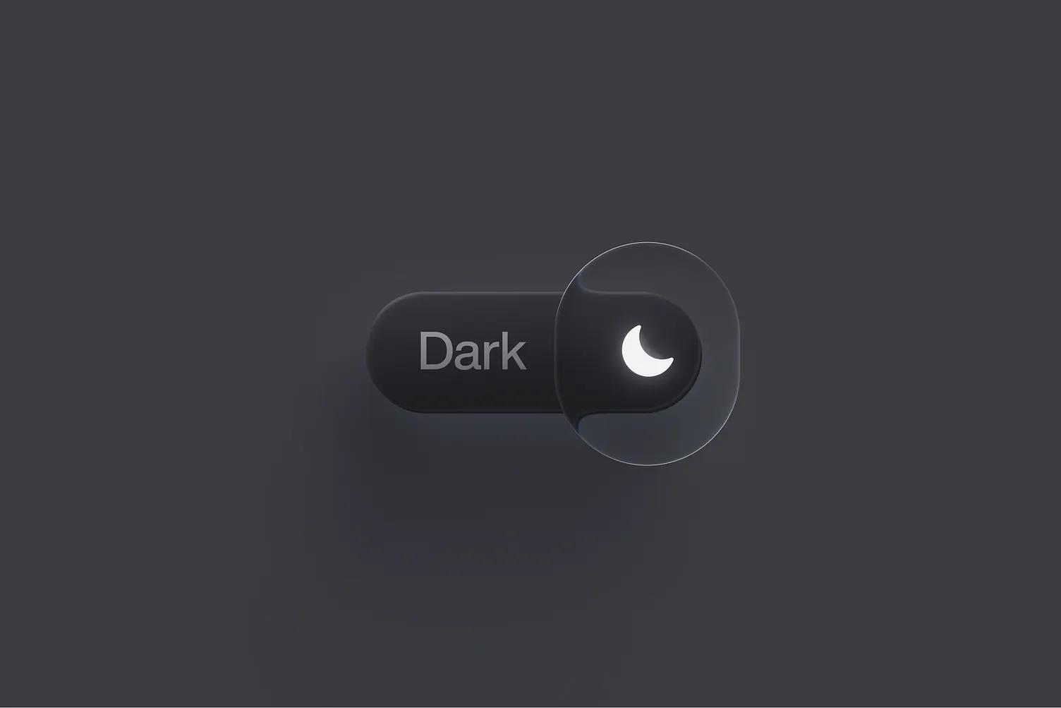
调 scale 和 bezel 之前,先看看设计师怎么处理同一个问题。Voicu Apostol 用 Figma 的 Glass 效果做了 Liquid Glass Switch,里面的滑块是一块比轨道还高的透明透镜,只有一圈细细的亮边,几乎没有染色;滑块压住轨道的地方,能明显看到轨道边缘被弯折。像这样用小 bezel 加亮边,控件中间的内容就不会变形。
版本、设置和数据核对于 2026 年 11 月 14 日。
参考来源
- https://developer.mozilla.org/en-US/docs/Web/CSS/backdrop-filter
- https://github.com/mdn/browser-compat-data/blob/main/css/properties/backdrop-filter.json
- https://github.com/mdn/browser-compat-data/blob/main/api/Navigator.json
- https://developer.mozilla.org/en-US/docs/Web/CSS/@supports
- https://drafts.csswg.org/filter-effects-1/#feDisplacementMapElement
- https://kube.io/blog/liquid-glass-css-svg/
- https://bugs.webkit.org/show_bug.cgi?id=245510
- https://bugzilla.mozilla.org/show_bug.cgi?id=1868479
- https://bugzilla.mozilla.org/show_bug.cgi?id=1972363
- https://developer.apple.com/support/alternative-browser-engines/
- https://aave.com/design/building-glass-for-the-web
- https://github.com/samasante/liquid-glass
- https://github.com/shuding/liquid-glass
更新于