
Liquid Glass DesignDev6 min read
Liquid Glass code in CSS and SVG, with real refraction
Liquid Glass code for the web: a CSS glass layer that works in every browser, plus an SVG feDisplacementMap filter that adds real refraction in Chromium.
On this page
- Why backdrop-filter blur alone looks like glassmorphism
- Layer 1: Liquid Glass CSS that works in every browser
- Layer 2: the SVG refraction filter
- Layer 3: turn refraction on only where it renders
- Where backdrop-filter: url() works in November 2026
- If you need refraction in Safari and Firefox
- A checklist before you ship
- Sources
Liquid Glass code for the web has two pieces: a CSS glass layer (blur, tint, edge highlight, sheen) that works in every browser, and an SVG feDisplacementMap filter that bends the pixels behind the element. In November 2026 the bending part only renders through backdrop-filter: url() in Chromium browsers, so treat it as an enhancement on top of the CSS layer.
Why backdrop-filter blur alone looks like glassmorphism
backdrop-filter: blur() smears everything behind the panel evenly, which is the frosted-card look designers have been calling glassmorphism since 2020. Apple's material behaves more like a thick lens: the background stays fairly sharp through the flat middle and bends at the rounded rim, and a highlight sits on the edge facing the light. Our explainer on what Liquid Glass is covers the difference in more detail, and our Liquid Glass vs glassmorphism comparison has a screenshot checklist for telling them apart. The short version for code is that blur gives you frost, while the "liquid" part comes from displacement at the edges.
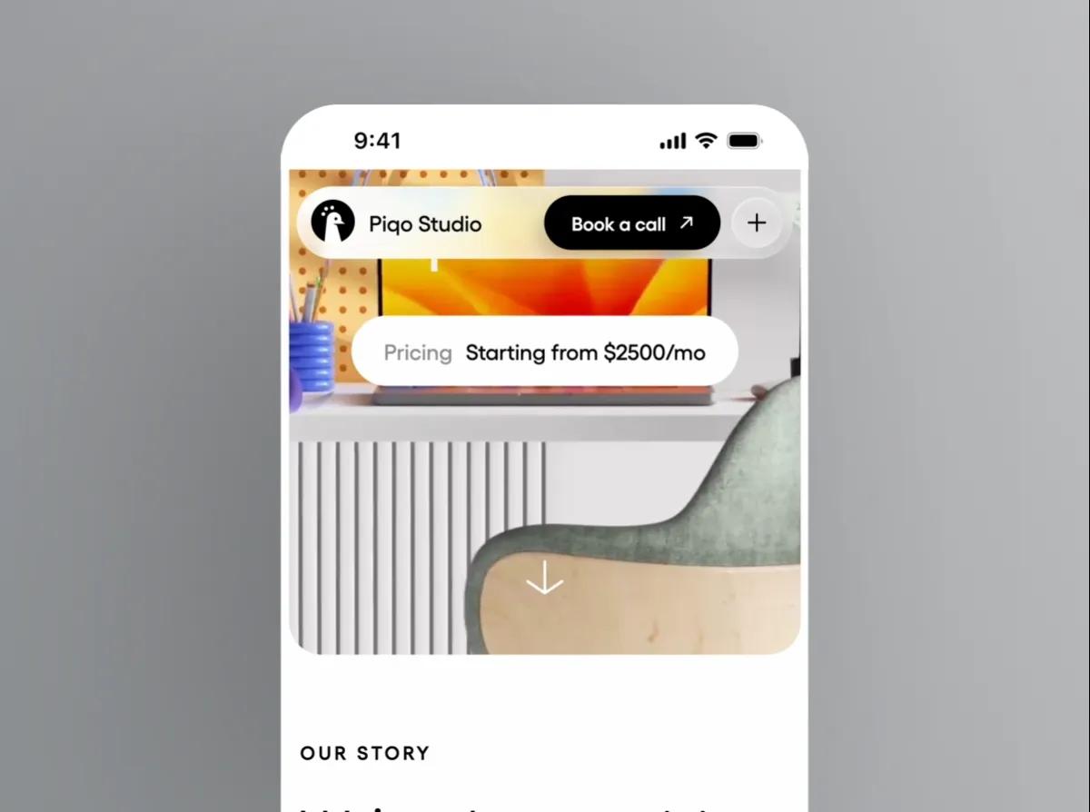
For examples in motion, see Piqo Studio's Liquid Glass Design Video, which the studio describes as bringing Liquid Glass to the web, and Ho3ein's Liquid Glass Buttons hover effect.
Layer 1: Liquid Glass CSS that works in every browser
Every visitor sees this layer, so it has to look finished without any refraction: a light tint, a small blur with extra saturation, an inset highlight along the top edge, a hairline border and a soft sheen in a pseudo-element.
.glass {
  position: relative;
  border-radius: 40px;
  color: #fff;
  background: rgb(255 255 255 / 0.10);
  -webkit-backdrop-filter: blur(6px) saturate(160%);
  backdrop-filter: blur(6px) saturate(160%);
  box-shadow:
    inset 0 1px 0 rgb(255 255 255 / 0.6),   /* lit top rim */
    inset 0 -1px 0 rgb(255 255 255 / 0.15), /* faint bottom rim */
    inset 0 0 0 1px rgb(255 255 255 / 0.2), /* hairline edge */
    0 10px 30px rgb(0 0 0 / 0.25);          /* lift off the page */
}

.glass::before {
  content: "";
  position: absolute;
  inset: 0;
  border-radius: inherit;
  pointer-events: none;
  background: radial-gradient(120% 70% at 25% 0%, rgb(255 255 255 / 0.35), transparent 55%);
}
Keep the -webkit- line. According to MDN's compatibility data, Safari supported only the prefixed property from Safari 9 until it shipped the unprefixed one in Safari 18, and older Safari versions are still in use.
Keep the blur small. With a large radius you're back to frosted glass, and the refraction in layer 2 has nothing sharp left to bend.
The same class works on a <button>. Our Liquid Glass button guide adds the hover, press and focus states.
Layer 2: the SVG refraction filter
feDisplacementMap moves each pixel of its input by an amount read from a second image, the displacement map. The Filter Effects spec defines it as P'(x,y) ← P(x + scale * (XC(x,y) - .5), y + scale * (YC(x,y) - .5)). Red controls horizontal movement and green controls vertical. A channel value of 128 (0.5) means "stay put", and scale is the largest shift in pixels.
So the job is to draw a map that is neutral grey in the flat middle of the shape and pushes pixels along the edge normal near the rim. Here is the filter:
<svg width="0" height="0" aria-hidden="true" style="position:absolute">
  <filter id="lg-refract" x="0" y="0" width="100%" height="100%"
          color-interpolation-filters="sRGB">
    <feImage id="lg-map" x="0" y="0" preserveAspectRatio="none" result="map" />
    <feDisplacementMap in="SourceGraphic" in2="map" scale="60"
                       xChannelSelector="R" yChannelSelector="G" />
  </filter>
</svg>

<div class="glass">Liquid Glass</div>
Don't drop color-interpolation-filters="sRGB". The property defaults to linearRGB, and the spec applies it to the map input (in2). In linear space your neutral 128 stops being 0.5, and everything under the glass shifts off-center.
The map itself is easiest to generate with a canvas. This function uses a signed distance to a rounded rectangle, so it works for pills, cards and circles:
function makeDisplacementMap(w, h, r, bezel) {
  const canvas = document.createElement("canvas");
  canvas.width = w;
  canvas.height = h;
  const ctx = canvas.getContext("2d");
  const img = ctx.createImageData(w, h);

  // Signed distance to a rounded rectangle: negative inside, positive outside.
  const sdf = (x, y) => {
    const qx = Math.abs(x - w / 2) - (w / 2 - r);
    const qy = Math.abs(y - h / 2) - (h / 2 - r);
    return Math.hypot(Math.max(qx, 0), Math.max(qy, 0)) + Math.min(Math.max(qx, qy), 0) - r;
  };

  for (let y = 0; y < h; y++) {
    for (let x = 0; x < w; x++) {
      const inset = -sdf(x, y); // distance in from the edge
      let dx = 0, dy = 0;
      if (inset > 0 && inset < bezel) {
        const nx = sdf(x + 1, y) - sdf(x - 1, y); // gradient points outward
        const ny = sdf(x, y + 1) - sdf(x, y - 1);
        const len = Math.hypot(nx, ny) || 1;
        const t = 1 - inset / bezel; // 1 at the rim, 0 where the flat top starts
        const strength = t * t;
        dx = (-nx / len) * strength; // sample toward the center near the rim
        dy = (-ny / len) * strength;
      }
      const i = (y * w + x) * 4;
      img.data[i] = 128 + dx * 127;
      img.data[i + 1] = 128 + dy * 127;
      img.data[i + 2] = 128;
      img.data[i + 3] = 255;
    }
  }
  ctx.putImageData(img, 0, 0);
  return canvas.toDataURL();
}
bezel is how far in from the edge the bending reaches. The squared falloff keeps the middle flat and puts the strongest bend right at the rim. Kube.io's article on refraction with CSS and SVG goes further and derives the curve from Snell's law for different surface profiles; this simpler curve is enough for buttons and bars.
Layer 3: turn refraction on only where it renders
.glass.is-refracting {
  backdrop-filter: url(#lg-refract) blur(1px) saturate(160%);
}const isChromium =
navigator.userAgentData?.brands?.some((b) => b.brand === "Chromium") ?? false;
const glass = document.querySelector(".glass");
if (isChromium) {
const { width, height } = glass.getBoundingClientRect();
const map = document.getElementById("lg-map");
map.setAttribute("width", width);
map.setAttribute("height", height);
map.setAttribute("href", makeDisplacementMap(Math.round(width), Math.round(height), 40, 24));
glass.classList.add("is-refracting");
}There are two reasons for a script check instead of @supports. First, url() is valid syntax for backdrop-filter (MDN lists it), so the parser accepts it in browsers that then draw nothing, and @supports only asks the parser. Second, navigator.userAgentData is a Chromium-only API per MDN, which makes the brand check a cheap and fairly honest signal.
The map has to match the element's size. If the element resizes, regenerate it, and debounce that work, because the per-pixel loop isn't free.
Where backdrop-filter: url() works in November 2026
- Chrome, Edge, Opera, Brave and other Chromium browsers on desktop and Android render it.
- Safari doesn't. WebKit bug 245510, "backdrop-filter: url(#some-svg-filter) doesn't work with SVG filters like feDisplacementMap", has been open since September 2022. A contributor posted patches with tests between July and September 2026, but the bug was still marked NEW when this was written.
- Firefox accepts
url()filters inbackdrop-filter(a regression fix landed in Firefox 121), but only for filters its GPU renderer can draw. A Mozilla engineer explained in bug 1972363 that the backdrop path "doesn't support drawing non-GPU-accelerated filters", andfeImageplusfeDisplacementMapfall into that group, so the effect fails silently. - Every browser on iPhone and iPad is WebKit unless it's one of the alternative engines Apple allows in the EU, so Chrome on iOS won't refract either.
If you need refraction in Safari and Firefox
Displacement works in all three engines when you apply it with filter: url() to content the element owns. Only the backdrop path is limited to Chromium. That's the approach behind Sam Asante's headless React lens, listed on our resources page as Real liquid glass for the web, and Aave's write-up "Building Glass for the Web". The trade-off is that you refract a copy of what sits behind the glass (an image, a hero, a slider track) and not the live page under a floating panel. Both sources describe Safari-specific workarounds: Safari caches filter output by filter ID, so the ID has to change on updates, and Safari won't run an SVG filter over a live <video>.
Our own open-source React library, Liqui, packages this approach as components. Inside a LiquiBackdrop, every glass surface refracts a copy of that backdrop in Safari and Firefox and the live page in Chromium; outside it, the surface frosts. Our guide to Liquid Glass components for React covers the setup.
For a ready-made version of the Chromium path, Shu Ding's copy-paste Liquid Glass SVG filters builds the same feImage and feDisplacementMap pair from JavaScript. If you're in React, our comparison of Liquid Glass React libraries sorts the options by approach.
A checklist before you ship
- The glass reads well with refraction turned off. Every Safari and Firefox visitor sees only layer 1.
- Text on the glass passes contrast over the busiest background it can sit on, not just your hero image.
- The filter has
color-interpolation-filters="sRGB". - The displacement map matches the element size and is regenerated on resize, not on every frame.
- Refraction is switched on by a script check, not
@supports. - There is a solid fallback for
prefers-reduced-transparencyandprefers-contrast: more. The web performance and fallback guide has the tiered CSS for that. - Glass is used on a few controls, not every card. Each
backdrop-filterre-reads and filters what's behind it.
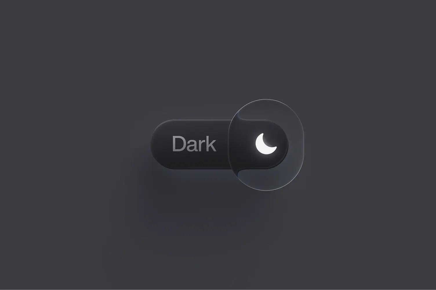
Before you tune scale and bezel, look at how a designer handled the same problem. In Voicu Apostol's Liquid Glass Switch, made with Figma's Glass effect, the knob is a clear lens taller than the track, with only a thin bright rim and almost no tint, and the track's edge visibly bends where the knob overlaps it. A small bezel and a bright rim like that keep anything in the middle of the control undistorted.
Versions, settings and figures checked on 14 November 2026.
Sources
- https://developer.mozilla.org/en-US/docs/Web/CSS/backdrop-filter
- https://github.com/mdn/browser-compat-data/blob/main/css/properties/backdrop-filter.json
- https://github.com/mdn/browser-compat-data/blob/main/api/Navigator.json
- https://developer.mozilla.org/en-US/docs/Web/CSS/@supports
- https://drafts.csswg.org/filter-effects-1/#feDisplacementMapElement
- https://kube.io/blog/liquid-glass-css-svg/
- https://bugs.webkit.org/show_bug.cgi?id=245510
- https://bugzilla.mozilla.org/show_bug.cgi?id=1868479
- https://bugzilla.mozilla.org/show_bug.cgi?id=1972363
- https://developer.apple.com/support/alternative-browser-engines/
- https://aave.com/design/building-glass-for-the-web
- https://github.com/samasante/liquid-glass
- https://github.com/shuding/liquid-glass
Updated