
Liquid Glass DesignDesign7 min read
Apple glassmorphism vs Liquid Glass: telling them apart
How to tell Apple's Liquid Glass from glassmorphism in a screenshot, where Apple says each belongs, and when a web product should stick with frosted glass.

On this page
The fastest way to tell Apple's Liquid Glass from glassmorphism in a screenshot is to look at the edges. Glassmorphism frosts the background evenly and outlines the panel with a thin light border; Liquid Glass bends whatever sits behind its rim, the way a lens or a water droplet would, and its highlight is brighter on one side than the other.
Our explainer on what Liquid Glass is covers the definitions and the naming history.
Liquid Glass blurs too
"Glassmorphism blurs, Liquid Glass refracts" is a good one-line summary, but read literally it is wrong. Apple's own SwiftUI documentation describes Liquid Glass as "a material that blurs content behind it, reflects color and light of surrounding content, and reacts to touch and pointer interactions in real time." The Human Interface Guidelines say the regular variant, which most system components use, "blurs and adjusts the luminosity of background content to maintain legibility."
What it adds on top is refraction at the edges, specular highlights that respond to light and motion, and adaptive behavior: small elements like tab bars switch between a light and dark look depending on the content underneath. Glassmorphism, the term Michal Malewicz coined in November 2020, describes a fixed recipe: a translucent fill, a background blur, a hairline border, usually over a colorful gradient. It does not change with what scrolls under it.
Liquid Glass vs glassmorphism: a screenshot checklist
Run these in order. Two or three hits on one side usually settle it.
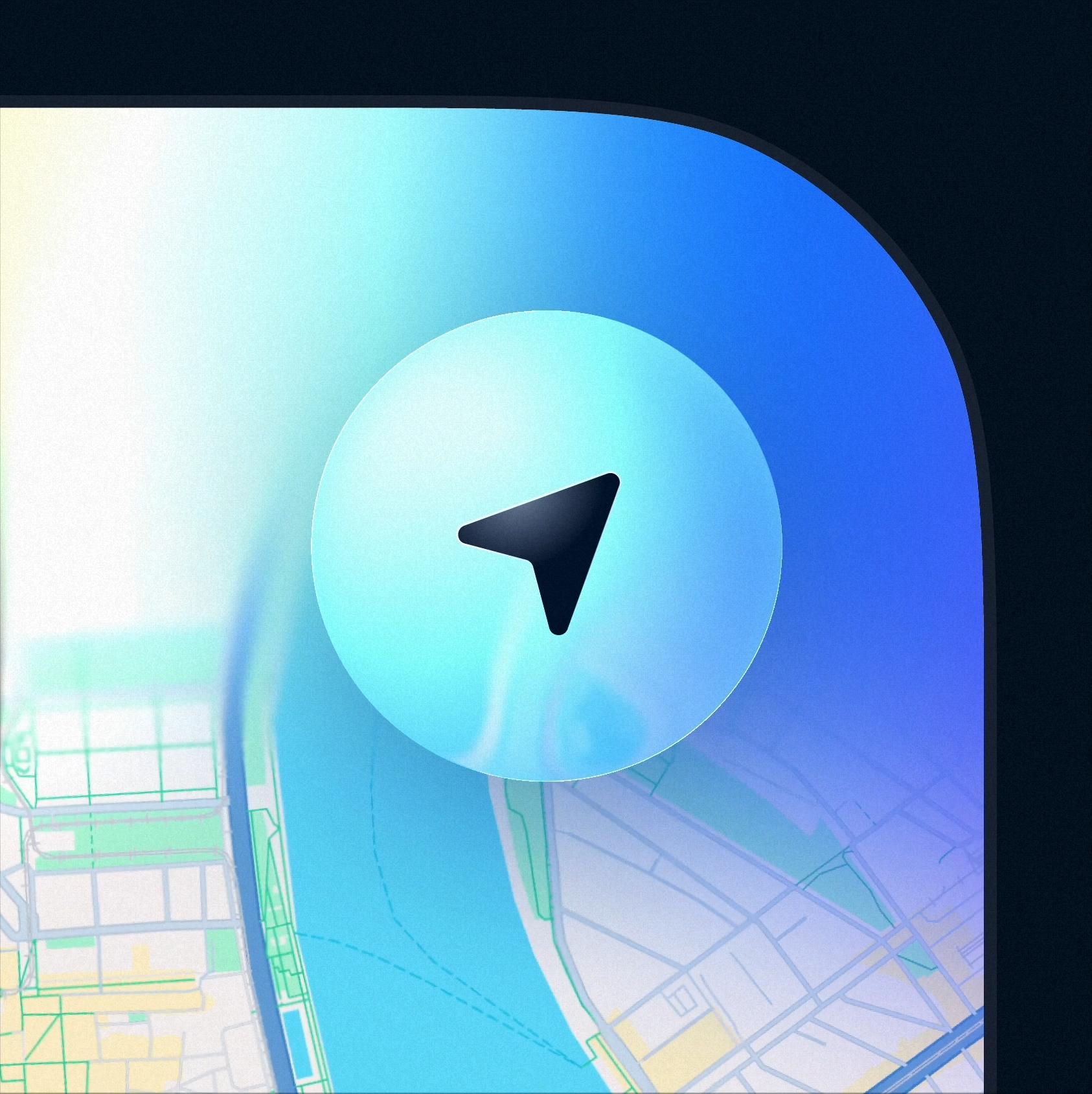
- Find a straight line behind the panel's edge, such as a street on a map, a line of text, or a horizon. If it kinks or curves as it crosses the rim and runs straight through the middle, you are looking at refraction. If it just fades into blur, it is glassmorphism.
- Look at the border. A uniform 1px semi-white stroke of the same weight all the way around is the glassmorphism signature. A highlight that is thick and bright on one side and thin or absent on the other is a specular highlight with a light direction.
- Check whether the blur is even. Classic glassmorphism frosts the whole panel to the same degree, so the background survives only as color. A refraction-led shot is often clearer in the center and distorted toward the rim.
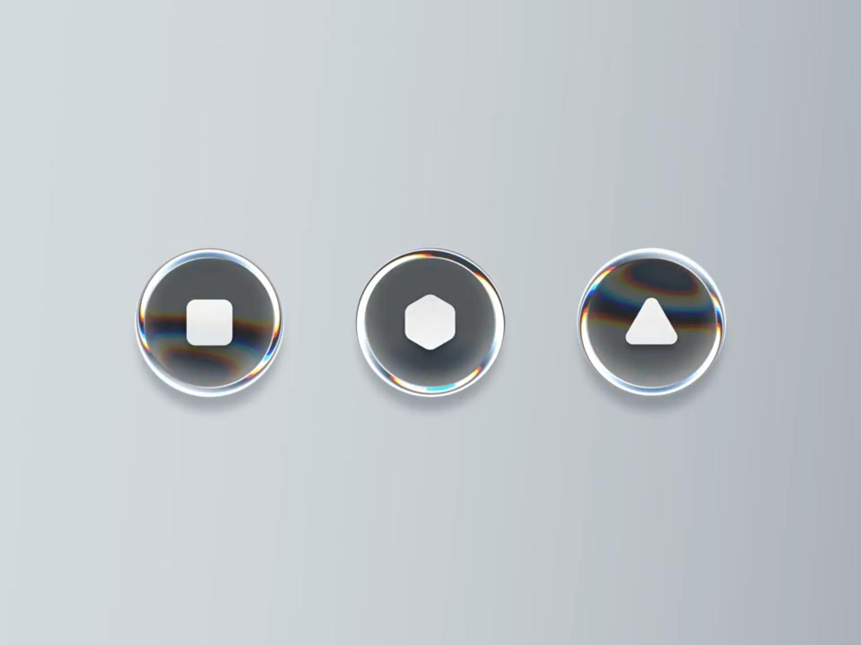
- Look for a rainbow fringe at the edge. Chromatic dispersion is a refraction setting in Figma's Glass effect and in most shaders, so it points to a lens-style imitation. The classic glassmorphism recipe has no equivalent.
- Ask what the glass is attached to. Whole cards, dashboards and app backgrounds made of glass are glassmorphism thinking. Glass reserved for floating controls (a tab bar, a toolbar, a button over a map) follows Apple's Liquid Glass model.
- Watch the motion if the shot is a video. Liquid Glass elements merge, split and morph into menus. Glassmorphism panels slide or fade but keep their shape.
- Check the tint against the background. On Apple platforms, symbols on small glass elements get darker over light content and lighter over dark content. A glassmorphism panel keeps one text color everywhere.
Labelled examples from the gallery
Glassmorphism
LB* Frosted Glass Card Design by Lukáš Miško is the textbook case. An orange card sits behind a frosted card with an even blur, a thin light outline and nothing bending at the edges. The author's caption is "Just trying glass efect in Figma."

Glassmorphism Dashboard by Leon Abramovic puts every surface on frosted panels: navigation, stat cards, tables and message lists. That is glass in the content layer, which is exactly what Apple tells you not to do with Liquid Glass.
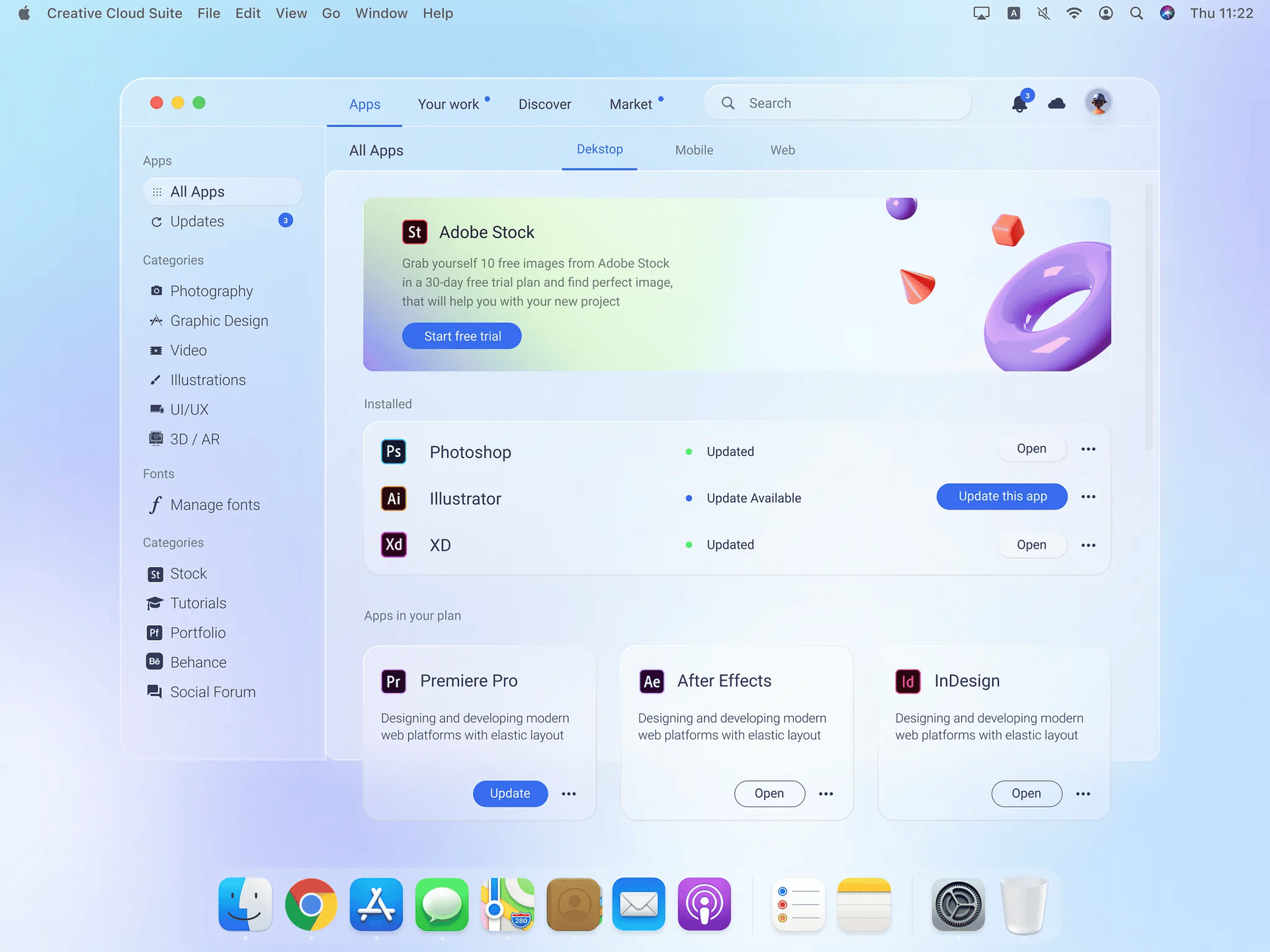
Glassmorphism Big Sur Creative Cloud App Redesign by Mikołaj Gałęziowski is a period piece: a macOS Big Sur style window from the year the term took off, with a translucent sidebar and frosted cards.
Liquid Glass
Liquid Glass Button closeup by Aymeric Delpeuch is the clearest refraction example we have. A round location button floats over a map, and the river and street lines visibly bend as they pass under its lower rim while the center stays readable.
Shader Glass Buttons by Tran Mau Tri Tam is a motion study of shader parameters (depth, RGB split, scale, angle, offset). The thick rims and rainbow edges come from refraction and dispersion, with almost no frost at all.
Edge cases
Liquid Glass Frosted Edition by Gaston Morixe uses the Liquid Glass shape language (stacked capsule notifications, soft rounded depth) with heavy frost. It is close to what the tinted end of the iOS 27 transparency slider looks like, and it shows that frost level alone does not decide the category.

Plenty of shots labelled "Liquid Glass" online are glassmorphism with rounder corners, so trust the edges over the caption.
Where each belongs on Apple platforms
Apple's answer to "glassmorphism or Liquid Glass?" is both, in different layers. The HIG Materials page splits the interface into a functional layer and a content layer.
Liquid Glass "forms a distinct functional layer for controls and navigation elements, like tab bars and sidebars, that floats above the content layer," and the page says plainly: "Don't use Liquid Glass in the content layer." The one exception is controls like sliders and toggles, whose knob takes on a Liquid Glass look while someone is dragging it.
For the content layer, Apple points you to standard materials (UIBlurEffect, UIVibrancyEffect and the SwiftUI Material types), which in iOS come in ultra-thin, thin, regular and thick. Those are blur materials without lens refraction, so on Apple platforms the glassmorphism look lives on, under a different name, inside the content.
Two more rules from the same page:
- Use the clear variant only over visually rich backgrounds such as photos and video. If that content is bright, Apple suggests a dark dimming layer at 35% opacity behind the glass.
- Use the regular variant for components with a lot of text, like alerts, sidebars and popovers.
A short lineage
- Windows Vista's Aero Glass (2007) put blurred, translucent borders on desktop windows.
- iOS 7 (2013) made background blur part of the iPhone's identity; the new Control Center smudged the Home Screen behind it like frosted glass.
- macOS Big Sur (released November 2020) redesigned the Mac with full-height sidebars and a new Control Center. Malewicz's article named the glassmorphism trend the same month.
- visionOS (announced 2023) gave windows a system glass material that adapts to the room behind it.
- Liquid Glass (announced June 2025, released that September) arrived across Apple's platforms. Apple's announcement says it was "inspired by the depth and dimensionality of visionOS" and that it "reflects and refracts its surroundings."
- iOS 27 (September 2026) tuned it toward legibility, with a transparency slider, more diffusion of busy backgrounds and a darker edge.
When to pick plain glassmorphism for a web product
Most web products should use plain glassmorphism, or something more opaque, and keep refraction for a few hero moments. Here is the decision rule we would use.
- If the glass holds paragraphs, tables or form fields, use a blur panel with a high-opacity fill. Refraction distorts exactly the edge pixels your users are trying to read, and NN/g's glassmorphism guidance already warns that translucent text surfaces need strong blur and contrast checks.
- If the glass is a small floating control over imagery (a player bar, a map button, a hero CTA), refraction earns its cost.
- If you need it to look the same in every browser with the least code, use glassmorphism.
backdrop-filterwithblur()works in current Chrome, Firefox and Safari. Real refraction on the web means SVG displacement filters or WebGL, more code and more cross-browser testing. Our SVG filter resource and the React lens in Real liquid glass for the web show what that involves. - If the product is a dashboard, the answer is almost always glassmorphism, used sparingly. Dashboards are content, and Apple's own rule puts content on standard materials.
- If you are mocking up a native iOS or macOS app, design with Liquid Glass for controls and navigation, because that is what the system will render.
If you want to generate either look for moodboards, every gallery item has a copy-ready style prompt, and the prompts page collects them in one place. Prompts that say "frosted glass panels" will give you glassmorphism; ask for "refraction at the edges" and "specular highlight" if you want the lens.
Sources
- https://developer.apple.com/design/human-interface-guidelines/materials
- https://developer.apple.com/design/human-interface-guidelines/color
- https://developer.apple.com/documentation/swiftui/applying-liquid-glass-to-custom-views
- https://www.apple.com/newsroom/2025/06/apple-introduces-a-delightful-and-elegant-new-software-design/
- https://www.nngroup.com/articles/glassmorphism/
- https://hype4.academy/articles/design/glassmorphism-in-user-interfaces
- https://en.wikipedia.org/wiki/Windows_Aero
- https://www.theregister.com/2013/09/19/review_apple_ios_7/
- https://www.apple.com/newsroom/2020/11/macos-big-sur-is-here/
- https://developer.apple.com/videos/play/wwdc2020/10104/
- https://macrumors.com/2026/06/10/how-liquid-glass-is-changing-in-ios-27
- https://help.figma.com/hc/en-us/articles/360041488473-Apply-effects-to-layers
- https://github.com/mdn/browser-compat-data