
Liquid Glass DesignDev7 min read
Liquid Glass components for React, installed with shadcn
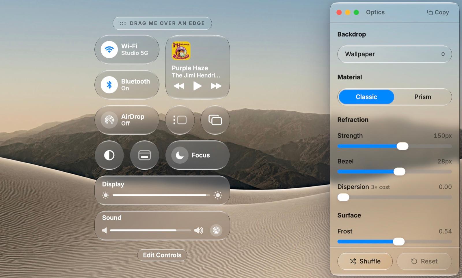
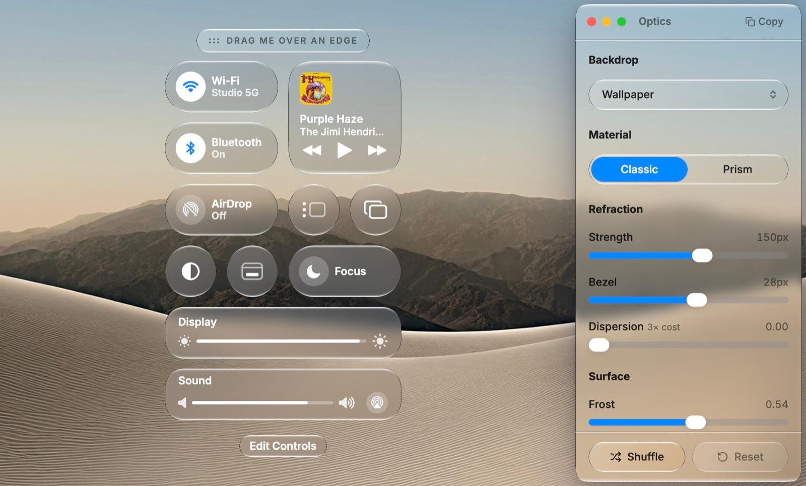
Liquid Glass components for React: 38 open-source Base UI components that refract in every modern browser, installed with the shadcn CLI.
On this page
The quickest way to get Liquid Glass components into a React app is one shadcn command: npx shadcn@latest add https://liqui.design/r/button.json. That installs a button from Liqui, a set of 38 glass components built on Base UI that bend the page behind them without WebGL, in Chromium, Safari and Firefox.
Liqui is our own project. It grew out of this gallery, it is MIT-licensed, and the source is on GitHub. Its limits are in the last section, in case they rule it out for you.
What you get
The library has 38 components: buttons, menus, selects, dialogs, a drawer, sliders, switches, tabs, toasts, an iOS-style floating tab bar and the form controls around them. Each one is a Base UI primitive with a glass surface under it, so focus handling, keyboard support and ARIA come from Base UI.
They arrive the way shadcn/ui components do. The CLI writes the component file into your repo as plain TSX, and you edit it like any other file. The only part that stays a dependency is the refraction kernel, the npm package @liqui-design/glass. It holds the displacement-map maths, a shared SVG filter registry and the browser fallbacks, which is the code you would not want to maintain by hand.
Install Liquid Glass components with shadcn
You need React 18 or 19 and Tailwind CSS v4. Liqui uses the same Base UI base as shadcn/ui (shadcn init -b base), so an existing components.json, cn() helper and token setup carry over.
Add one component by URL:
npx shadcn@latest add https://liqui.design/r/button.jsonThat writes components/ui/button.tsx, adds the glass tokens to your globals.css and installs @liqui-design/glass. If you plan to add several, register the namespace once in components.json:
{
  "registries": {
    "@liqui-design": "https://liqui.design/r/{name}.json"
  }
}npx shadcn@latest add @liqui-design/button @liqui-design/select@liqui-design/button is a registry item resolved by the shadcn CLI. npm i @liqui-design/button will fail, because the only package published to npm is @liqui-design/glass, and the CLI installs it for you.
Using it looks like any shadcn component:
import { Button } from '@/components/ui/button';

export default function Page() {
  return (
    <main className="min-h-dvh bg-[url(/wallpaper.jpg)] bg-cover p-10">
      <Button>Skip</Button>
      <Button variant="accent">Continue</Button>
    </main>
  );
}
Give the glass something to refract
Note the wallpaper behind those buttons. A lens over a flat fill shows you the flat fill, so a glass button on a plain white page looks like a slightly grey box, which is easy to mistake for a bug. Put glass over photography, video, a gradient with hard edges, or content that scrolls underneath. If the design really does sit on a flat colour, set material="clear" and rely on the tint.

sanoj sunny's slider concept is a good picture of the setup the material wants: a photo with strong shapes and contrast behind the control, so the glass has edges to work with. Our Liquid Glass explainer covers why the rim is where the bending happens.
Which Liquid Glass UI components are glass
Liqui follows the line Apple draws. Glass is for a surface you act through, and a solid fill is for a control that carries a value.
- Buttons, popups, menus, toolbars, sheets and dialogs are glass. They float over your content, and letting that content through is the point of the material.
- Checkbox, Radio, Toggle and Switch are flat. They use
--lq-controlwith a hairline at rest and--lq-accentwhen on. - Button sits on both sides. The default variant is glass.
accentanddangerare solid fills, because a tinted lens changes colour with whatever is behind it, and a brand colour that looks different over a night photo and a bright one stops doing its job.
The same test works on your own designs: if you are tempted to make a checkbox out of glass, ask what the user reads from it. If the answer is "on or off", make it solid.
The iOS floating tab bar
The Tab Bar copies the floating tab bar from iOS 26. It floats over the page, refracts the list scrolling under it, and puts a second lens under your finger when you press a tab.
npx shadcn@latest add https://liqui.design/r/tab-bar.json'use client';
import { useState } from 'react';
import { Heart, House } from 'lucide-react';
import { TabBar, TabBarItem } from '@/components/ui/tab-bar';
export function BottomBar() {
const [tab, setTab] = useState('home');
return (
<TabBar value={tab} onValueChange={setTab}>
<TabBarItem value="home" icon={<House fill="currentColor" strokeWidth={0} />}>Home</TabBarItem>
<TabBarItem value="saved" icon={<Heart fill="currentColor" strokeWidth={0} />} badge={3}>Saved</TabBarItem>
</TabBar>
);
}Frost decides how it looks. It adds blur and tint together, and blur is what kills a lens nested inside another lens, because it removes the edges before the inner pill can bend them. The documentation walks through the trade-off: at frost 0.35 the labels sit well but the selection pill is a smudge, at 0 the pill works but the page runs straight through the labels, and the bar ships at 0.16.

Mahdi Sourabh's navbar concept shows the same balance from the design side: a light pane over a scrolling list, with labels that stay legible as rows pass under them.
Safari and Firefox
Refraction on the web is backdrop-filter: url(#filter), and as of November 2026 only Chromium draws it. Safari drops the whole backdrop-filter value when it references an SVG filter, and Firefox ignores it. WebKit bug 245510 has patches under review but is still open. Our CSS and SVG guide goes through the browser details.
Both engines do draw an SVG filter on an element's own content. Liqui uses that: wrap an area in LiquiBackdrop, and every glass surface inside it refracts a copy of that backdrop when the page itself can't be refracted.
import { LiquiBackdrop, LiquiGlass } from '@liqui-design/glass';

<LiquiBackdrop
  backdrop={<img src="/wallpaper.jpg" className="absolute inset-0 size-full object-cover" />}
>
  <LiquiGlass radius={20}>…</LiquiGlass>
</LiquiBackdrop>
Each surface picks a rendering tier when it mounts, with nothing to configure:
- Backdrop refraction: the live page behind the surface, displaced. Chromium only.
- Copy refraction: a copy of the known backdrop, displaced. Safari and Firefox, inside a
LiquiBackdrop. - Frost: blur, tint and the baked rim light. Everywhere else.
- Clear: tint and rim, no backdrop filter, when you ask for
material="clear".
The copy only works for surfaces sitting directly on the backdrop. A surface nested inside another surface, or a popup portalled out of the box, falls back to frost with the rim intact. So check your UI in Safari: a surface tuned to frost: 0 can be hard to read on the frost tier, because the lens was doing the job the tint now has to do alone. The accessibility guide has the contrast checks worth running at that point.
Theming
Colour is fourteen --lq-* custom properties that the CLI writes into globals.css. Change --lq-accent or --lq-tint there and every component follows, including popups portalled to document.body. Dark mode is keyed on both .dark and [data-theme='dark'], so write overrides under both.
The optics can't be CSS variables, because they feed a canvas-generated map and an SVG filter. They come through LiquiThemeProvider instead. Most dials (frost, finish, dispersion) are defaults a component can override, while radiusScale, refractionScale, bezelScale and blurScale multiply each component's own values. Asking for thicker glass then thickens a scrollbar thumb and a drawer in proportion; a single global refraction value would turn the thumb into a smear.
<LiquiThemeProvider theme={{ glass: { frost: 0.2, refractionScale: 1.25 } }}>
  {children}
</LiquiThemeProvider>
The theme editor sets both halves with dials and exports the CSS and provider code. It keeps your theme in the browser and only exports what you changed.
Performance
The expensive parts are the displacement map and the backdrop-filter chain. Maps are generated on a canvas once and cached by size and optics, so ten buttons of the same size share one map. Filters live in a single hidden SVG registry, which is why a menu refracts on its first frame when it reopens. Two things will still cost frames: dispersion above 0 roughly triples the filter work, and a dozen large backdrop-filtered surfaces on one screen cost more than one big one.
When to use something else
Liqui is React only and needs Tailwind v4, so it won't drop into a Vue app or a Tailwind 3 project. Refraction over arbitrary live content in Safari isn't possible for any library until WebKit ships the fix. If you want a single glass panel with no component system around it, the plain CSS and SVG approach is less to carry. Our comparison of Liquid Glass React libraries covers the other options and how each one renders.
If you want to see the components first, the docs show each one on a real backdrop, and the Media Player template installs a whole screen with npx shadcn@latest add https://liqui.design/r/media-player.json. For design references to aim at, the UI section of the gallery collects Liquid Glass interfaces from designers on Dribbble and elsewhere.
Versions, settings and figures checked on 20 November 2026 (@liqui-design/glass 0.8.0).
Sources
- https://liqui.design/docs
- https://liqui.design/docs/handbook/glass
- https://liqui.design/docs/handbook/theming
- https://liqui.design/docs/components/tab-bar
- https://liqui.design/docs/components/button
- https://liqui.design/llms-full.txt
- https://github.com/leefanv/liqui-design
- https://www.npmjs.com/package/@liqui-design/glass
- https://base-ui.com
- https://ui.shadcn.com/docs/cli
- https://bugs.webkit.org/show_bug.cgi?id=245510