
Liquid Glass DesignDev6 min read
Liquid Glass on the web: support, performance, fallbacks
Liquid Glass on the web: which browsers draw blur and refraction, what makes glass slow, and a three-tier CSS fallback that ends in a solid panel.

On this page
Build Liquid Glass for the web in three tiers: a solid panel, a blurred glass panel, and SVG refraction on top. Choose the tier from what the browser can actually draw and what the user has asked for, because @supports can't tell you whether refraction will render. Performance mostly comes down to how much screen area sits under glass, how many glass layers there are, and whether the content underneath is moving.
Which browsers support Liquid Glass in November 2026
backdrop-filterwithblur()and the other filter functions works in Chrome 76+, Firefox 103+ and Safari 18+. MDN marks it Baseline since September 2024.- Safari supported only
-webkit-backdrop-filterfrom Safari 9 until Safari 18, so keep the prefixed line for older iPhones. - Before Firefox 123, Firefox turned the property off on systems with an unknown GPU vendor. A Firefox user on an old build can get no glass at all.
backdrop-filter: url(#svg-filter), the refraction path, renders in Chromium browsers only. Safari's bug for it (WebKit 245510) is still open, and Firefox fails silently onfeImageandfeDisplacementMapin the backdrop path. Our CSS and SVG Liquid Glass tutorial has the details and the filter code.prefers-reduced-transparencyis supported in Chrome and Edge 118+. Firefox has it behind thelayout.css.prefers-reduced-transparency.enabledpref, and Safari doesn't support it at all.prefers-contrastis supported in Chrome 96+, Firefox 101+ and Safari 14.1+.
Safari also has a private -apple-visual-effect property with values like -apple-system-glass-material, which sometimes gets shared as native Liquid Glass CSS. Websites can't use it. The September 2025 post on alastair.is that documented the property says it doesn't work on the web, and inside a WKWebView it needs a private WKPreferences setting that could get an app rejected from the App Store.
Why @supports can't pick the tier
@supports asks whether the parser accepts a declaration. url() is part of backdrop-filter's grammar (MDN lists it in the syntax), so @supports (backdrop-filter: url(#x)) passes in browsers that then draw nothing. The same goes for CSS.supports() in JavaScript. That's why the code below keeps url() out of the blur rule entirely and only adds it through a class.
So use @supports for the blur tier, where parsing and rendering line up, and switch on refraction with a script check. navigator.userAgentData only exists in Chromium (MDN lists no Firefox or Safari support), so checking its brands for "Chromium" is a reasonable test. On iPhone and iPad every browser is WebKit, except the alternative engines Apple permits in the EU, so Chrome on iOS can't refract the backdrop either.
What makes glass expensive
The Filter Effects Level 2 draft explains the cost. For each element with backdrop-filter, the browser paints everything between that element and its nearest "Backdrop Root" into a flat buffer, runs the filters on a copy, clips the result to the element's rounded border box, and composites it. In practice that leads to a handful of rules.
- Area counts as much as the number of elements. One full-width glass header can cost more than three small buttons, because the filter runs over every pixel under the glass.
- Each glass element is its own backdrop read. A dock of twelve separately blurred icons does twelve reads, so put one glass bar behind the icons instead.
- Moving content under glass forces the work again every frame. Glass over autoplay video, a parallax hero, or a list that scrolls underneath is the expensive case. Over a still background the browser has much less to redo.
- Large blur radii widen the area each output pixel samples. Keep blur small for Liquid Glass anyway, since refraction needs a fairly sharp backdrop to bend.
- Don't animate the blur radius or the displacement
scaleon hover across many elements. Animatetransformandopacityon the glass and leave the filter alone. - Refraction adds a displacement map, which is a per-pixel image you generate in script. Regenerate it when the glass changes shape, never when it only moves. Aave's "Building Glass for the Web" and Sam Asante's liquid-glass library both follow this rule. Asante's browser notes add that Safari drops the costlier filter passes if the map keeps changing during a drag.
The same draft explains a common "my blur is empty" bug. An element with filter, opacity below 1, a mask, clip-path, mix-blend-mode or its own backdrop-filter becomes a Backdrop Root. If you put glass inside a parent that fades in with opacity, the glass only sees that parent's content, and the blur looks empty. Glass nested in glass behaves the same way, which is one more reason to avoid stacking it.
The web.dev article on backdrop-filter warns that the property "may harm performance" and tells you to test before deploying. Profile on a mid-range Android phone in Chrome DevTools, not on the laptop you build on.
A three-tier strategy with code
Tier 0 is a solid panel and the default for everyone. Tier 1 adds blur where backdrop-filter parses. Tier 2 adds refraction, from script, in Chromium only. User preferences override every tier.
/* Tier 0: solid. Readable everywhere, no GPU filter work. */
.glass {
  color: #fff;
  background: rgb(28 28 32 / 0.94);
  border: 1px solid rgb(255 255 255 / 0.12);
  border-radius: 24px;
}

/* Tier 1: blur glass where the property exists. */
@supports (backdrop-filter: blur(1px)) or (-webkit-backdrop-filter: blur(1px)) {
  .glass {
    background: rgb(255 255 255 / 0.12);
    -webkit-backdrop-filter: blur(8px) saturate(160%);
    backdrop-filter: blur(8px) saturate(160%);
    box-shadow:
      inset 0 1px 0 rgb(255 255 255 / 0.5),
      inset 0 0 0 1px rgb(255 255 255 / 0.18),
      0 8px 24px rgb(0 0 0 / 0.2);
  }
}

/* Tier 2: refraction. The class is only added by script in Chromium. */
.glass.is-refracting {
  backdrop-filter: url(#lg-refract) blur(1px) saturate(160%);
}

/* The user's settings win over all of the above. */
@media (prefers-reduced-transparency: reduce), (prefers-contrast: more) {
  .glass,
  .glass.is-refracting {
    -webkit-backdrop-filter: none;
    backdrop-filter: none;
    background: rgb(28 28 32 / 0.97);
    border-color: rgb(255 255 255 / 0.4);
  }
}const solidQuery = matchMedia(
"(prefers-reduced-transparency: reduce), (prefers-contrast: more)"
);
const isChromium =
navigator.userAgentData?.brands?.some((b) => b.brand === "Chromium") ?? false;
function applyTier() {
const refract = isChromium && !solidQuery.matches;
for (const el of document.querySelectorAll(".glass")) {
el.classList.toggle("is-refracting", refract);
}
}
applyTier();
solidQuery.addEventListener("change", applyTier);The #lg-refract filter and its displacement map come from the CSS and SVG tutorial. If you animate the lens, wrap that motion in prefers-reduced-motion: no-preference as well.
Safari doesn't support prefers-reduced-transparency, so an iPhone user who turned on Reduce Transparency in iOS settings still gets tier 1 on your site. You can't detect that, so design tier 1 to pass contrast on its own: enough tint behind text, and text kept off the clearest part of the glass. A visible "reduce transparency" toggle in your site settings that forces tier 0 is a cheap addition. Our Liquid Glass accessibility guide has a test matrix for these settings.
Design choices that make the tiers easier
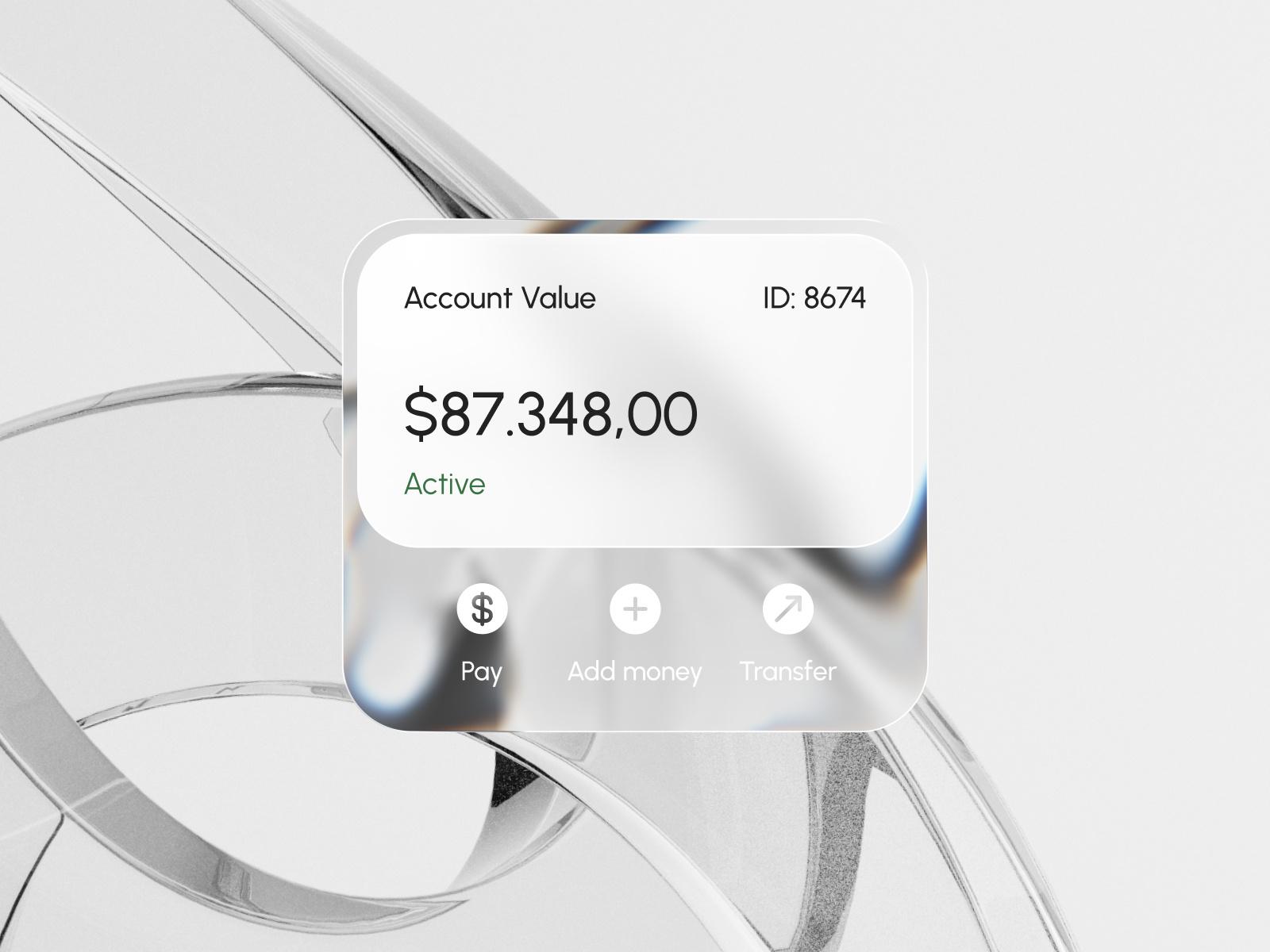
Jack R.'s Payrix SaaS web finance dashboard is a useful pattern. The account value and balance sit on a near-opaque white inner panel, and only the action row sits on the clear, refracting glass. Your important numbers stay readable in every tier, and the glass decorates the controls. The white action labels over light glass are the weak spot, and that pairing is the first thing to fail contrast when the background behind the card gets lighter.
Badr Rehman's Liquid Glass UI card goes further: the glass is in the large letterforms behind a solid white card. On the web that costs almost nothing per frame, since decorative glass behind content can be a static image.
If you'd rather not write the filter yourself, our comparison of Liquid Glass React libraries sorts the options by approach and browser support. For WebGL versions, Liquid Glass Studio is a good place to see what a shader can do beyond SVG filters, though a shader can only refract what it draws, not live DOM. The explainer on what Liquid Glass is covers the design side.
Versions, settings and figures checked on 14 November 2026.
Sources
- https://developer.mozilla.org/en-US/docs/Web/CSS/backdrop-filter
- https://github.com/mdn/browser-compat-data/blob/main/css/properties/backdrop-filter.json
- https://github.com/mdn/browser-compat-data/blob/main/css/at-rules/media.json
- https://github.com/mdn/browser-compat-data/blob/main/api/Navigator.json
- https://developer.mozilla.org/en-US/docs/Web/CSS/@media/prefers-reduced-transparency
- https://developer.mozilla.org/en-US/docs/Web/CSS/@media/prefers-contrast
- https://developer.mozilla.org/en-US/docs/Web/CSS/@supports
- https://drafts.csswg.org/filter-effects-2/
- https://web.dev/articles/backdrop-filter
- https://bugs.webkit.org/show_bug.cgi?id=245510
- https://bugzilla.mozilla.org/show_bug.cgi?id=1972363
- https://alastair.is/apple-has-a-private-css-property-to-add-liquid-glass-effects-to-web-content/
- https://developer.apple.com/support/alternative-browser-engines/
- https://aave.com/design/building-glass-for-the-web
- https://github.com/samasante/liquid-glass/blob/main/BROWSERS.md