
Liquid Glass DesignDesign7 min read
Liquid Glass background and wallpaper: what works
How to choose a Liquid Glass background that lets the glass show, how to present glass UI in mockups, and where Apple's iOS 26 and 27 wallpapers come from.
On this page
- Why glass depends on the background
- How to choose a Liquid Glass background
- Keep detail at the right scale
- Limit the contrast range under text
- Gradients versus photos
- Dark backgrounds need light sources
- Liquid glass texture: grain on gradients
- Presenting glass UI in mockups and Dribbble shots
- Examples from the art side of the gallery
- Apple's own Liquid Glass wallpapers
- Sources
A Liquid Glass background needs visible shapes and color under the glass, with moderate contrast and not too much fine detail. Glass has no color of its own. What you see is the background bent, blurred and lit at the edges, so a flat or empty background makes even a perfect glass component look like a gray pill.
If you came for the wallpaper itself rather than design advice, Apple's iOS 26 and iOS 27 wallpapers are covered at the end.
Why glass depends on the background
Apple describes Liquid Glass as a material for controls and navigation that floats above content and lets that content "peek through". Most of what you see in it comes from what's underneath:
- Refraction is only visible where an edge or shape in the background crosses the rim of the glass.
- The tint comes from the colors behind it. A colorful background gives colorful glass.
- Blur only reads as blur if there was detail to soften.
The clearest demonstration in our gallery is Type & Distortion by Ben Fearnley, an experimental type and glass project. Clear glass droplets sit over a white ampersand on a black background. Where a droplet crosses the white letterform, you see it magnified and bent, with a thin color fringe at the rim. Where a droplet sits over pure black, almost nothing shows except the edge highlight.

How to choose a Liquid Glass background
Keep detail at the right scale
Think of background detail by size. Large shapes (a horizon, a portrait, big color fields) refract well and stay calm under the blur. Very fine detail (grass, gravel, small text, tight patterns) turns into noise behind a frosted panel and fights any text on it. No detail at all leaves the glass with nothing to do.
A quick check: blur your background at the same radius as your glass and look at it at the size of the panel. If it turns into soft color regions, it'll work. If it turns into gray mush, or still shows busy texture, change it.
Limit the contrast range under text
What hurts legibility is the brightness range directly under the text. A panel that sits half over bright sky and half over dark buildings will have text that's readable in one half and gone in the other. Position glass so that the area directly behind its text has fairly even brightness, or add a dimming layer. Apple's Human Interface Guidelines suggest a dark dimming layer of about 35 percent opacity behind clear glass when the content underneath is bright.
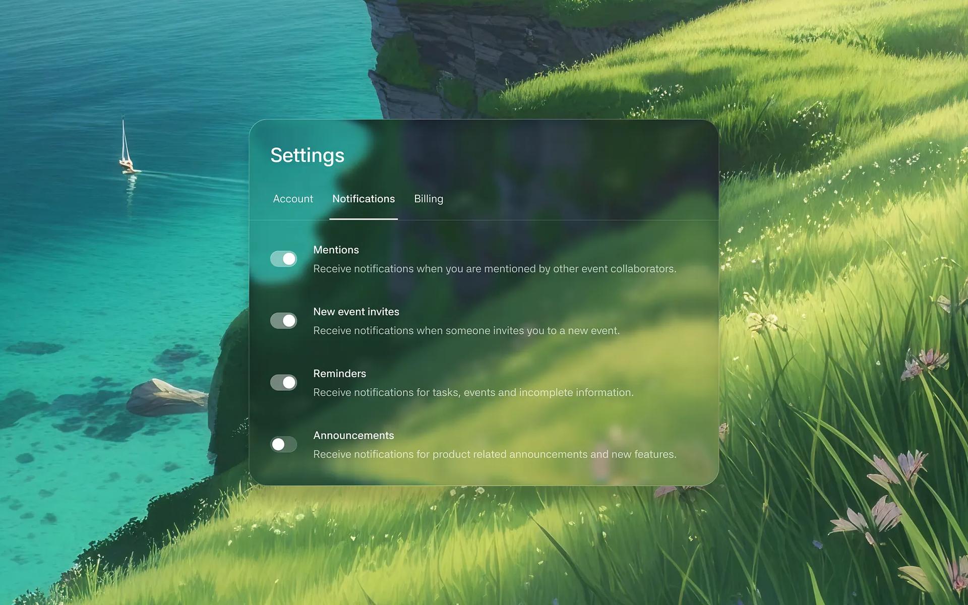
Settings - iOS Liquid Glass by Sithum Lahiru shows the trade-off well. The panel sits over a grassy cliff and a turquoise sea. The titles read fine, but the small gray descriptions fade where the brightest grass sits behind them. That's the spot a production version would darken.
Gradients versus photos
Gradients are the safe default and a common choice on Dribbble, but a smooth gradient gives refraction nothing to bend. If you use one, add a few defined shapes (blobs, rings, a large letterform) that cross the edges of your glass elements, because that's where the material shows.
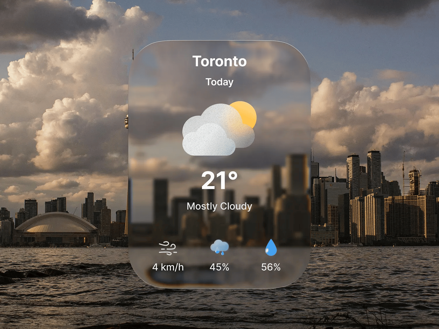
Photos give the most convincing glass because they have real depth and edges. Pick ones with a shallow depth of field or large simple forms. Weather Widget Liquid Glass by Rener Aljustyo puts a weather card over a city skyline with heavy clouds. The skyline continues, softened, through the card, which sells the material, and the clouds behind the text are mid-tone, so the white type holds up.
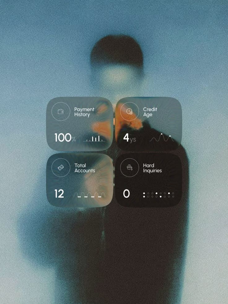
A soft-focus photo is the middle ground. App Store Page UI Design for Fintech App by Rondesignlab lays four glass stat cards over what its description calls a moody double-exposure portrait. The portrait is out of focus and cool-toned with one warm accent, so the cards pick up color without any detail competing with the numbers.
Dark backgrounds need light sources
Dark is the hardest case, which is worth knowing if you landed here looking for a dark Liquid Glass wallpaper. Glass over near-black has little to refract and almost no tint to pick up, so it disappears. What makes dark glass work is light in the scene: colored glows, a bright object, a few saturated highlights that the glass can catch at its rim. On dark backgrounds the specular highlight and edge ring do most of the work, so make them slightly stronger than in light mode.
Liquid glass texture: grain on gradients
A little noise or film grain on a gradient background stops color banding when the glass blurs it, and gives the blur something to soften. Keep it subtle; heavy grain looks like dirt on the glass.
Presenting glass UI in mockups and Dribbble shots
When a glass shot looks flat, the fix is usually in the background. A few things that help:
- Let something cross the edge. Position the component so a strong shape or color boundary in the background runs under its rim. That's the one place a still image can show refraction.
- Show it moving if you can. Glass reads far better in motion, as the background slides under it. Short video posts make the material obvious where a still frame doesn't.
- Use the background as content. A glass music player over album art or a weather card over a sky explains itself. A glass card over an abstract gradient asks the viewer to imagine the context.
- Show light and dark. If both modes work, show both. If only one does, the shot will be judged on the weaker one eventually.
- Don't let the background outshine the UI. A spectacular 3D render behind a small component makes people remember the render.
Examples from the art side of the gallery
The art section of the gallery collects glass as an object rather than as UI, and it's useful for background ideas. Glassy Gradients - N°2 "Helix" by Roman Bratschi is the opposite approach to UI glass: a twisted iridescent ribbon on a flat, pale background, where the glass carries all the color itself. That works for hero art and wallpapers. It doesn't work for UI, where glass is supposed to take its color from content.

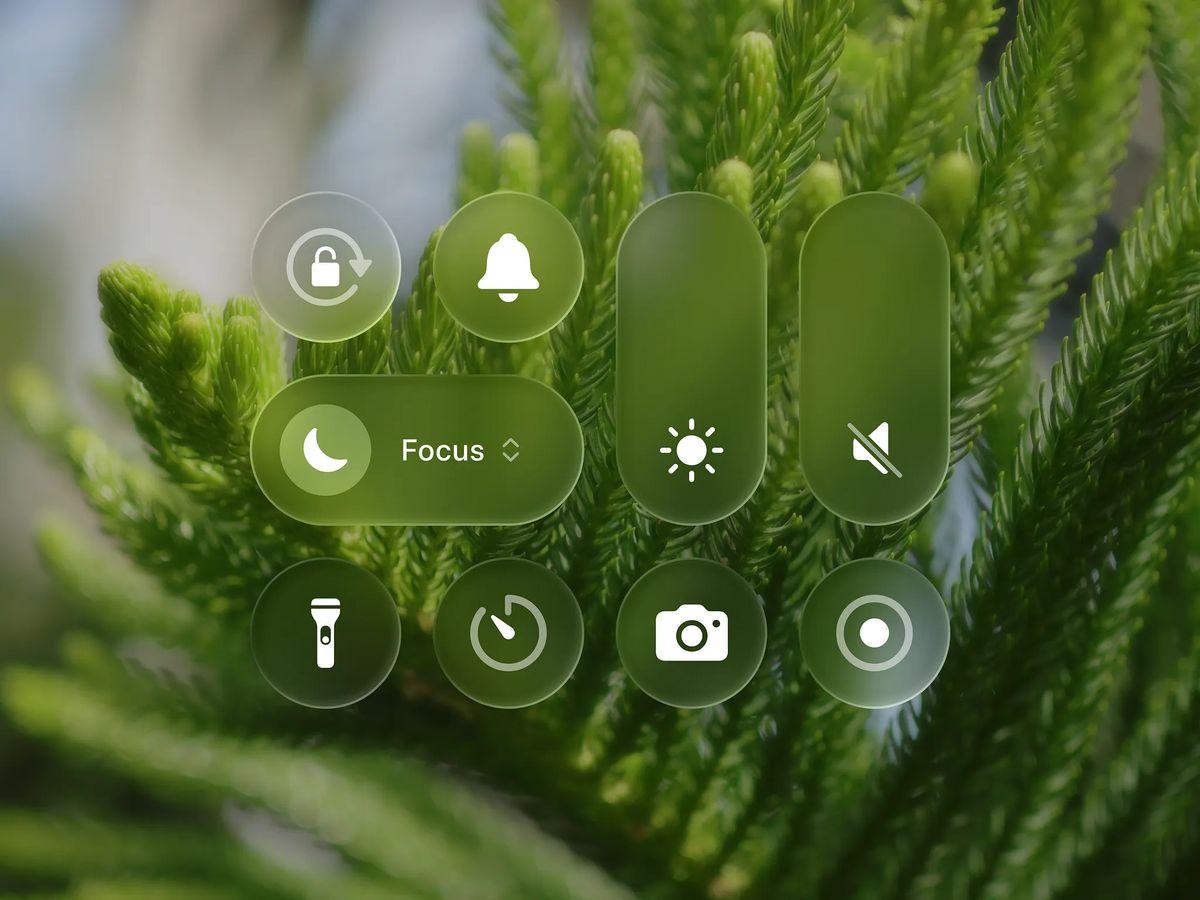
Glass on image shows Control Center style glass buttons over a close-up of green foliage. The photo is out of focus, so the glass turns green and the white icons stay readable. It's a good reference for picking a wallpaper to show off iOS glass controls.
Apple's own Liquid Glass wallpapers
The official wallpapers come with the OS. The download links that circulate come from Apple news sites that post the files.
- iOS 26 shipped with a new default wallpaper. Its original blue version is called Sky. iOS 26 beta 3 added Shadow, Halo and Dusk (a purple and pink option), and beta 4 added a Dynamic option that cycles through the color variants. 9to5Mac and AppleInsider covered each addition.
- iOS 27 has new wallpapers built from shapes that form a stylized "27", in default light and dark versions plus blue, orange and pink. 9to5Mac posted the static files on June 10, 2026 and noted Apple also made versions that move with the device.
- iOS 27 also lets you generate a wallpaper with Image Playground directly from the wallpaper picker: Settings > Wallpaper > Add New Wallpaper, then the Image Playground option in the top row.
Both sets are abstract color fields with large, clear shapes, which also makes them good backgrounds for your own iOS mockups.
To set one on iPhone, save the image to Photos, then long press the Lock Screen, tap the plus button, and choose Photos. For more on the material itself, see what Liquid Glass is.
Versions, settings and figures checked on 14 November 2026.
Sources
- https://developer.apple.com/design/human-interface-guidelines/materials
- https://9to5mac.com/2025/07/07/ios-26-beta-3-adds-new-color-options-for-default-iphone-wallpaper/
- https://appleinsider.com/articles/25/07/07/whats-new-in-ios-26-beta-3-wallpaper-color-options-stronger-blur-effects-and-more
- https://appleinsider.com/articles/25/07/23/whats-new-in-ios-26-beta-4-silence-unknown-callers-dynamic-wallapers-camera-app
- https://9to5mac.com/2026/06/10/download-the-new-ios-27-and-ipados-27-wallpapers-here/
- https://9to5mac.com/2026/09/24/ios-27-lets-you-create-your-own-iphone-wallpapers/