
Liquid Glass DesignDesign8 min read
Liquid Glass icon pack ideas: 11 icons to study
Apple has no official Liquid Glass icon pack. See how clear, tinted and Shortcuts icons work on iOS 26 and 27, and 11 glass icon designs to learn from.
On this page
- How to get glass icons on iPhone
- Character and object icons
- Droppy by ktnr.23
- Anvil by Igor Radivojevic
- Mirrors by ktnr.23
- Chess, credited to Apple
- Glass as a layer over flat color
- QR Code Cards Wallet by Igor Radivojevic
- Fitting Room by Slava Korziuk
- Liquid Glass Style Icon by Boto
- Apple icons, redrawn
- Safari and Maps by Nicolas Prieto
- Finder by Michael Flarup
- Beyond the app grid
- NewCore logomark by Moty Weiss
- What these icons have in common
- Sources
There is no official Liquid Glass icon pack from Apple. On iPhone, the glass look comes from the system: since iOS 26 you can switch your Home Screen icons to Clear or Tinted, and in iOS 27 a single slider controls how clear or tinted Liquid Glass looks across the system. If you want custom artwork on your Home Screen, Apple's documented route is a Shortcuts icon with your own image.
Below are 11 glass icon designs from our gallery, with notes on how each designer handled light, layering, tint and small-size legibility. If you are making your own icon, our separate guide covers building Liquid Glass app icons in Icon Composer.
How to get glass icons on iPhone
These steps come from Apple's iPhone User Guide for iOS 27.
- Touch and hold an empty part of the Home Screen until the icons jiggle, tap the edit button, then choose Customize.
- Pick Dark (or Auto to switch with the time of day), Clear to make icons translucent, or Tinted to pick a color with sliders or with an eyedropper from your wallpaper. Clear and Tinted each offer Light, Dark or Auto.
- Optionally switch to large icons. In that size the app names disappear.
In iOS 27, Apple also added a system-wide control: Settings, then Appearance, then Liquid Glass. Dragging the slider right adds tint and dragging it left makes the glass clearer. Apple notes that Reduce Transparency and Increase Contrast must be off in Accessibility settings before you can change the look. From iOS 26.1 until iOS 27, the setting lived under Display & Brightness and offered two choices, Clear or Tinted, instead of a slider.
For your own artwork, Apple's Shortcuts guide describes the route: open a shortcut, open Details, tap Add to Home Screen, then tap the icon to take a photo, choose one from Photos or pick an image from Files. That is how iPhone icon packs sold as image sets are applied, one app at a time. Apple's guide doesn't say whether these photo icons follow the Clear or Tinted settings, so try one before you redo a whole screen.
Searching for "liquid glass icon pack" also turns up Android launcher packs and "MOD APK" mirror sites. If you buy a pack, buy it from the designer's own store page. Apple's documented ways to change icons are the Customize menu and Shortcuts, so be wary of anything that asks you to install something else to restyle your iPhone.
Character and object icons
Droppy by ktnr.23
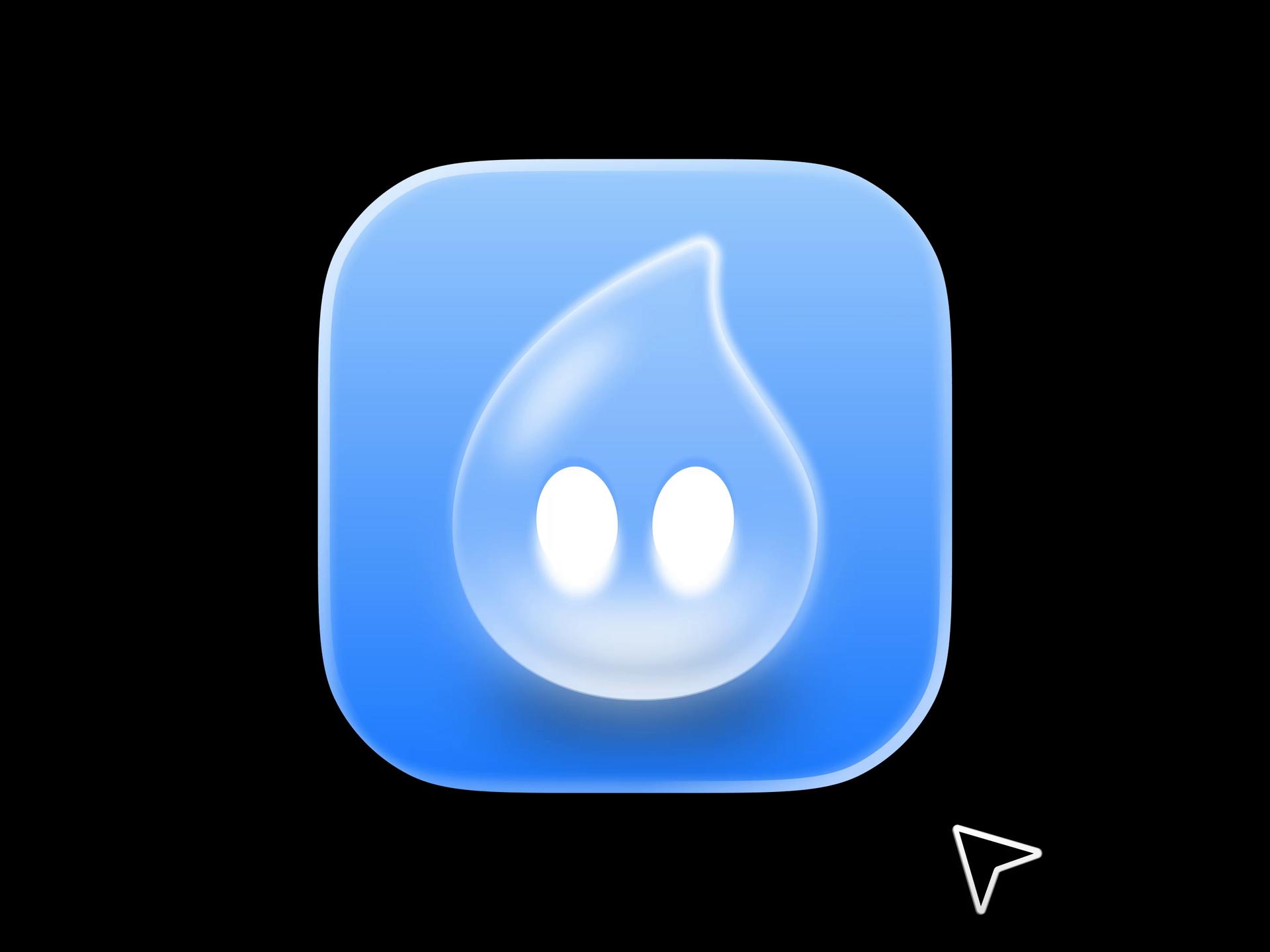
App Icon Design | Droppy is a macOS app icon by ktnr.23, whose post credits Katya N. as designer, with the tagline "Making app icons people actually want to tap." A frosted water drop with two glowing white eyes sits on a blue gradient squircle. The drop is lighter and more translucent than the ground behind it, with a thin specular streak along its upper edge, and the squircle has a bright rim along the top. The whole icon stays in one hue, and that restraint is what makes the drop read as glass.
Anvil by Igor Radivojevic
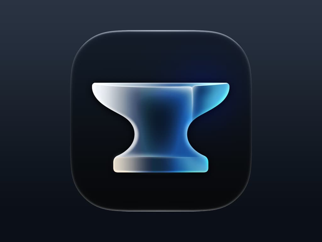
Anvil App Icon puts a frosted glass anvil on a near-black navy squircle. The anvil fades from white on its left face to cyan on its right, as if lit from the left, and the dark center of its waist lets the background show through. A heavy, solid object rendered in glass is a nice contradiction, and the dark ground gives the light edges all the contrast they need.
Mirrors by ktnr.23
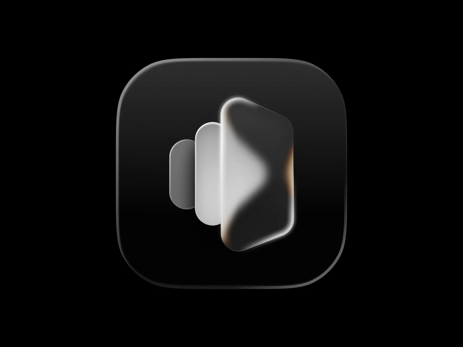
ktnr.23 posted this icon twice, as Mirror app icon design and as App icon design | Liquid glass | Minimal. Three frosted panels step forward in size on a black squircle, and the largest catches warm amber reflections on its edges. The second post shows it on an iPhone Home Screen under a "Mirrors" label, and the stepped silhouette still reads at that size. Showing an icon at real size next to the large render is a habit worth copying.
Chess, credited to Apple
Chess App Icon is the one first-party icon here. Its source describes it as "the updated Chess app icon for macOS 27 Beta 5" with "a silver chrome knight piece on a dark rounded square background." The background is split into four dark checkerboard squares, so the board is implied with almost no detail and the knight carries all the highlights. It is a useful reference for how far Apple pushes metal and glass on a dark ground.

Glass as a layer over flat color
QR Code Cards Wallet by Igor Radivojevic
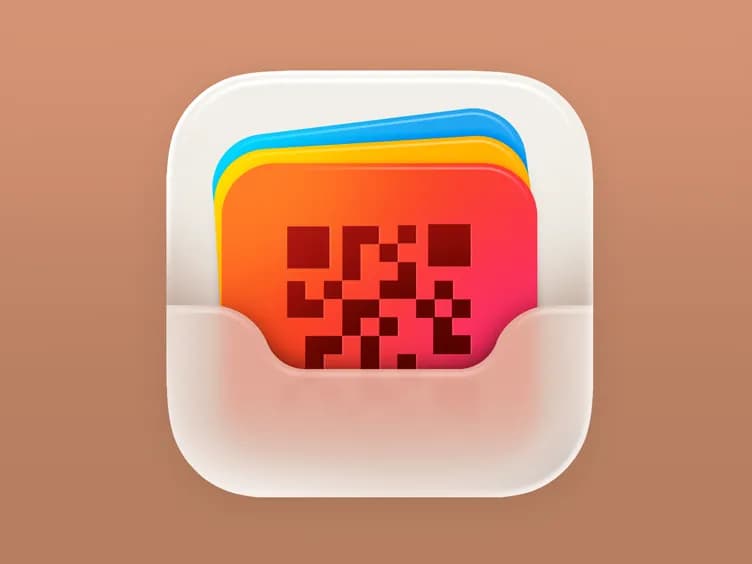
QR Code Cards Wallet App Icon is the clearest example of layering in the set. Blue, yellow and orange cards (the front one carrying a QR pattern) slide into a frosted pocket on an off-white squircle. The pocket blurs the lower half of the cards, so you get depth from three planes: background, colored cards, frosted front layer. If you are learning to think in Icon Composer layers, start by rebuilding this one.
Fitting Room by Slava Korziuk
Fitting Room Icon uses three translucent hangers in green, red and blue on a frosted white squircle. Where they overlap, the colors mix, red over green turning orange and yellow, and the outer hangers run off the edge of the icon. The color mixing is what sells the material, and the light ground makes it a useful counterpart to the dark icons above.

Liquid Glass Style Icon by Boto
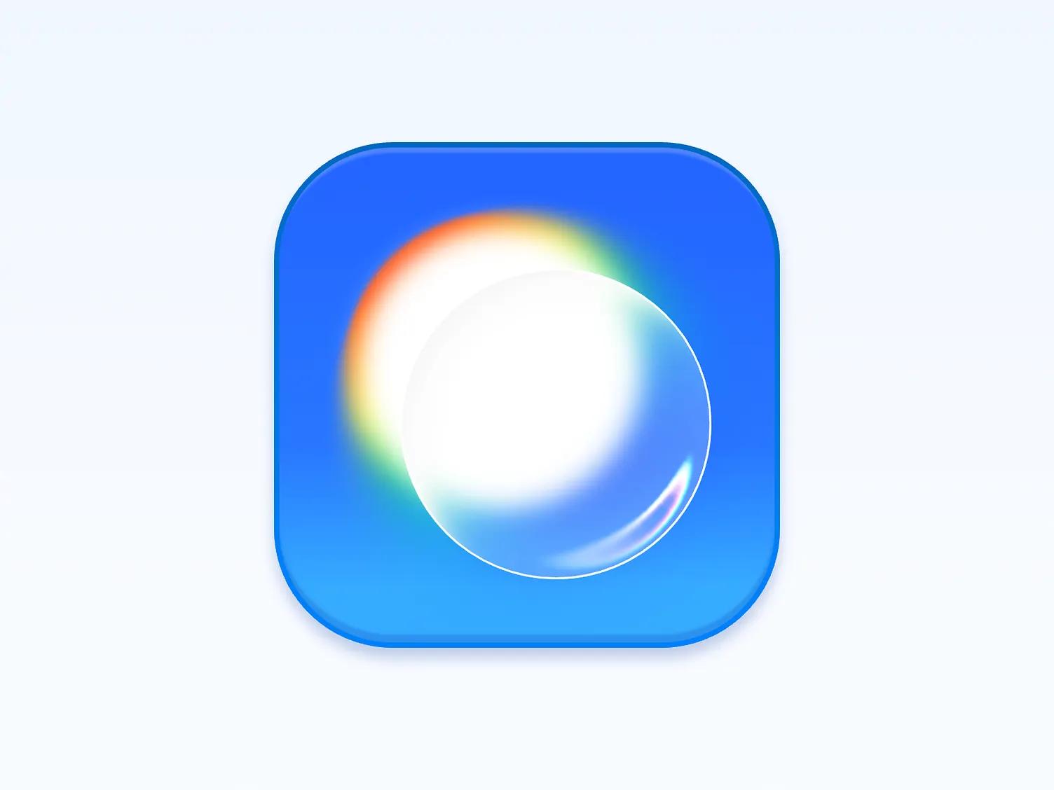
Liquid Glass Style Icon is almost abstract: a clear glass sphere on a blue squircle, overlapping a white glow with a red, orange and green fringe on one side and a small specular highlight on the other. It is a good study in chromatic fringing used sparingly, on one edge only.
Apple icons, redrawn
Safari and Maps by Nicolas Prieto
Nicolas Prieto redrew two Apple icons. In Safari macOS Liquid Glass icon, the compass becomes a thick frosted disc over a blue squircle with a faint world map, and the red and white needle stays fully opaque on top. In Maps Icon Liquid Glass, a glass ring surrounds the blue navigation puck, and the green, pink and yellow map areas bend at the ring's rim. In both, the glass holds the symbol and the symbol itself stays solid, which keeps them recognizable.

Finder by Michael Flarup
Liquid Glass Finder comes with a short opinion from Flarup: "Wish they had gone in this direction with the new macOS Finder icon. Still liquid glass but with the classic colors and no border." The two-tone blue face stays flat and bright, the eyes and smile get a glossy black finish, and the glass shows up only as a bright edge along the top.

Beyond the app grid
NewCore logomark by Moty Weiss
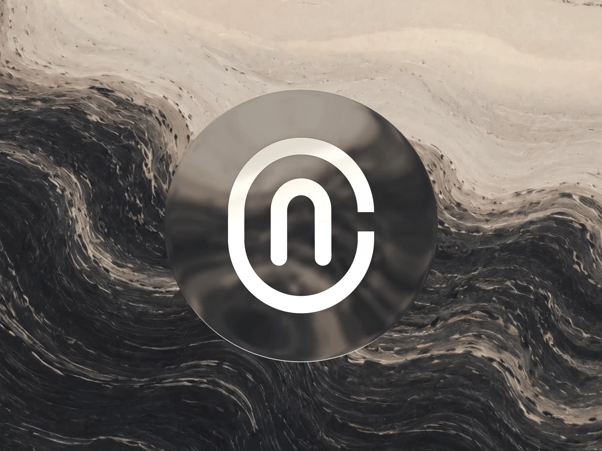
NewCore Logomark is a brand mark that uses the same ideas as the app icons above. Weiss describes it as pairing "migmatite-inspired stone textures with a soft liquid-glass effect", made for "a security-first identity platform". The frame shows a smoked glass disc with a white monogram over a swirling stone texture. If a client wants their logo to match a glass app icon, this is a good reference.
What these icons have in common
- Droppy, Anvil and Boto each put one glass object on a single-color or two-color ground, so the glass has something even to sit on.
- Most of them light the object from one direction, with a brighter top or left edge, and the specular highlight agrees with that light.
- The symbol itself stays solid: Prieto's compass needle and navigation arrow are opaque, and Flarup keeps the Finder face flat.
- Layering gives depth more reliably than blur, as the QR wallet's frosted pocket shows.
- Mirrors is shown on a Home Screen at real size, which is where fine glass detail tends to disappear, so check yours there too.
Remember that on iOS 26 and 27, people may view your icon in Dark, Clear or Tinted mode. How icon layers turn into those variants is covered in the Icon Composer guide. For more icons and glass UI, browse the UI gallery, and each item's style prompt is collected on the prompts page.
Versions, settings and figures checked on 14 November 2026.
Sources
- https://support.apple.com/guide/iphone/customize-apps-and-widgets-on-the-home-screen-iph385473442/ios
- https://support.apple.com/guide/iphone/adjust-iphone-display-and-text-settings-iphd6804774e/ios
- https://support.apple.com/guide/iphone/adjust-iphone-display-and-text-settings-iphd6804774e/26/ios/26
- https://support.apple.com/guide/shortcuts/add-a-shortcut-to-the-home-screen-apd735880972/10.0/ios/27
- https://support.apple.com/guide/shortcuts/modify-shortcut-icons-apd5ad5a2128/ios
- https://developer.apple.com/videos/play/wwdc2025/278/
- https://www.apple.com/newsroom/2026/09/major-updates-for-apples-software-platforms-are-now-available/
- https://dribbble.com/shots/27647513-App-Icon-Design-Droppy-MacOS-app
- https://dribbble.com/shots/27756856-Anvil-App-Icon
- https://dribbble.com/shots/27470983-Mirror-app-icon-design-Liquid-Glass-Minimal-design
- https://dribbble.com/shots/27477796-App-icon-design-Liquid-glass-Minimal
- https://recent.design/i/qlwb6b3-chess-app-icon
- https://dribbble.com/shots/26663632-QR-Code-Cards-Wallet-App-Icon
- https://dribbble.com/shots/26792146-Fitting-Room-Icon
- https://dribbble.com/shots/27285080-Liquid-Glass-Style-Icon
- https://dribbble.com/shots/26959764-Safari-macOS-Liquid-Glass-icon
- https://dribbble.com/shots/26959768-Maps-Icon-Liquid-Glass
- https://dribbble.com/shots/26136343-Liquid-Glass-Finder
- https://dribbble.com/shots/27474308-NewCore-Logomark