
Liquid Glass DesignDesign7 min read
Liquid Glass icons: six appearances in Icon Composer
How to design Liquid Glass app icons: what to draw in your design tool, what to set in Icon Composer, and how one layered file becomes six appearances.
On this page
A Liquid Glass app icon is a single layered .icon file built in Icon Composer. You draw flat, opaque artwork in your usual design tool, export the layers, and do everything glassy in Icon Composer: background fills, blur, shadows, specular highlights, translucency and, on iOS 27 and later, refraction. You annotate three looks there (Default, Dark and Mono), and the system renders the six appearances people can pick on iPhone, iPad and Mac: Default, Dark, Clear light, Clear dark, Tinted light and Tinted dark.
This guide is for designers making app icons. If you came here for a home screen icon pack, the UI section of the gallery has plenty of icon work to browse.
Six appearances, three annotations
The HIG specification table lists six appearances for iOS, iPadOS and macOS icons. You do not draw six icons. Icon Composer gives you Default, Dark and Mono; the clear and tinted variants come from the Mono annotation. Apple's WWDC25 session "Create icons with Icon Composer" put it this way: "we renamed these to default, dark and mono, with the artwork producing all the appearances for clear and for tinted."
To check clear and tinted, select Mono in the canvas, click Options, then choose Light or Dark and toggle Tinted on or off with a tint color. Apple's Xcode documentation also shows how to load your own background image, such as a screenshot, so you can judge the clear variants over something busy. watchOS has no appearances to preview.
For Mono, the session's advice is to set at least one element to white, "usually the most prominent or recognizable part," and map the other colors to greys. Icon Composer converts automatically, but the automatic result is a starting point; tune it for contrast.
If you ship alternate app icons, the HIG notes that each one needs its own dark, clear and tinted variants too.
What to do in your design tool
Apple's templates for Figma, Sketch, Photoshop and Illustrator have the current grid, shape and canvas. If you start from your own file:
- Use a 1024 x 1024 px canvas for iPhone, iPad and Mac, and 1088 x 1088 px for Apple Watch.
- Keep the artwork flat and opaque. Remove blurs, shadows, specular highlights, opacity and translucency; Icon Composer adds those as live effects.
- Leave out background colors and gradients. Icon Composer handles solid and gradient backgrounds itself.
- Convert text to outlines, because SVG does not keep fonts.
- Export each layer at the full canvas size as SVG. Use PNG for mesh gradients, raster art or anything SVG cannot describe.
- Do not export the rounded rectangle or circle mask. The system applies it, and a baked-in mask makes the specular edge look jagged.
- Name layers with numbers from back to front so they land in the right order.
The HIG also asks for clearly defined edges in foreground shapes. Soft, feathered edges fight the system's highlights and shadows.
What to do in Icon Composer
Drag the exported files or folders into the sidebar. Folders become groups, and Apple's documentation says to organize layers into a maximum of four groups. Groups matter more than layers: they become the depth planes the system renders, and they are where most glass settings live.
For each group you choose a mode. Individual applies the glass to each layer separately; Combined treats the group as one object. Then you set specular (Off, Automatic, Inside or Outside), blur, refraction, translucency and shadow. A single layer can have its Liquid Glass effects switched off entirely, which is useful for pre-rendered art that already has its own lighting.
Color settings (fill, opacity, blend mode) vary per appearance by default, which is how you build Dark and Mono. Liquid Glass and layout settings apply to all appearances unless you add a variant for a specific appearance or platform. In the WWDC25 session, Apple's example is Calendar, where finer control meant switching off specular on a group or turning Liquid Glass off on a single layer.
When you are done, drag the .icon file into Xcode and make sure the App Icon name in the target's General settings matches the file name. The Icon Composer file replaces any existing AppIcon asset catalog. For older OS versions in your deployment range, Xcode generates flattened images at build time. Icon Composer can also export flat images for marketing.
What changed with iOS 27 and Icon Composer 2
Apple released Icon Composer 2 in beta at WWDC26, and iOS 27's own icons moved to more layers with sharper edges. The changes that affect your workflow:
- Refraction is now a per-layer setting, "from a subtle edge bend to lens-like distortion," in Apple's words.
- Specular highlights can sit inside or outside each layer, and a vertical light angle shines from above.
- Files made in the earlier version render with the sharper material automatically.
- The canvas has 26 and 27 effects buttons, so you can compare both renderings side by side.
- On iOS, iPadOS, macOS and watchOS versions earlier than 27, Inside or Outside specular just shows as on, and refraction has no visible effect. If many of your users are still on 26, do not let the design depend on refraction.
MacRumors also reported that the gyroscope-driven highlight that moved as you tilted an iOS 26 phone was gone in the first iOS 27 beta.
Liquid Glass icon design checklist
- Start from Apple's icon template for your tool, not from an old 1024 px PNG.
- Reduce the concept to a few filled, overlapping shapes. The HIG warns that fine detail turns busy under system highlights and shadows.
- Export flat, opaque, unmasked layers at canvas size, SVG first.
- Plan your groups before importing, four at most.
- Set the background as a solid or gradient fill inside Icon Composer.
- Add translucency to foreground layers on purpose; varied opacity is where the depth comes from.
- Base Dark on your default colors, more subdued and without very bright areas.
- Tune Mono so one recognizable element is white.
- Preview Clear light, Clear dark, Tinted light and Tinted dark over a real wallpaper screenshot.
- Compare 26 and 27 rendering, and decide whether refraction is decoration or load-bearing.
- Keep the icon's core features identical across appearances so people can find it after switching modes.
- Add the
.iconfile to Xcode and check it on a device or in Device Hub at small sizes.
Six gallery icons and what they get right
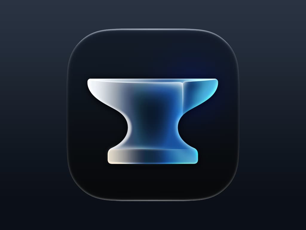
Anvil App Icon by Igor Radivojevic is a single bold silhouette on a dark background, with the glass gradient inside the shape. One shape is the easiest possible Mono conversion, and a silhouette like this stays readable at small sizes.
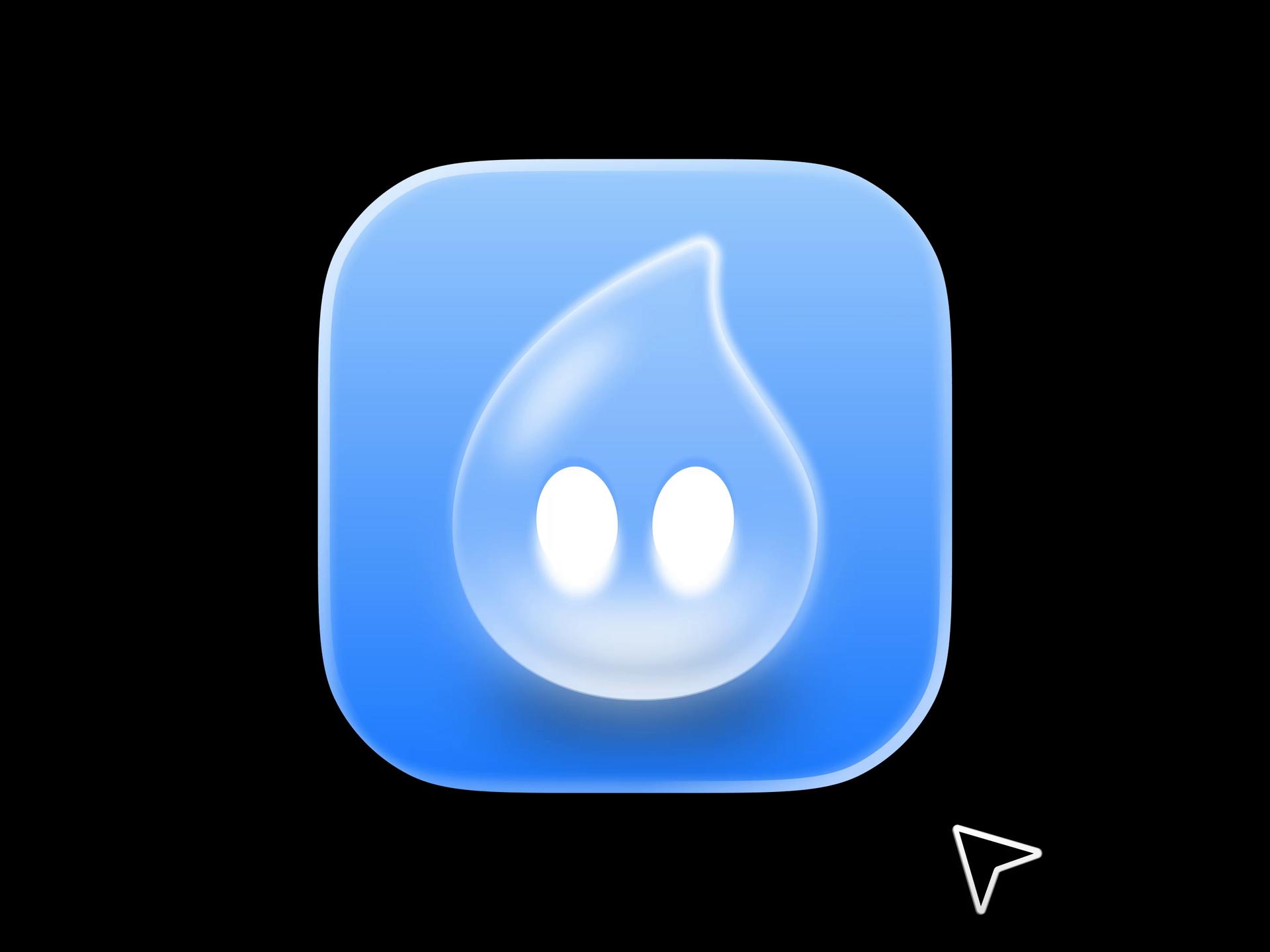
Droppy by ktnr.23 (brand designer Katya N., for a macOS app) puts a translucent droplet character on a plain blue gradient. The background follows the HIG's advice to keep it simple, and the two white eyes are the obvious element to keep white in Mono.
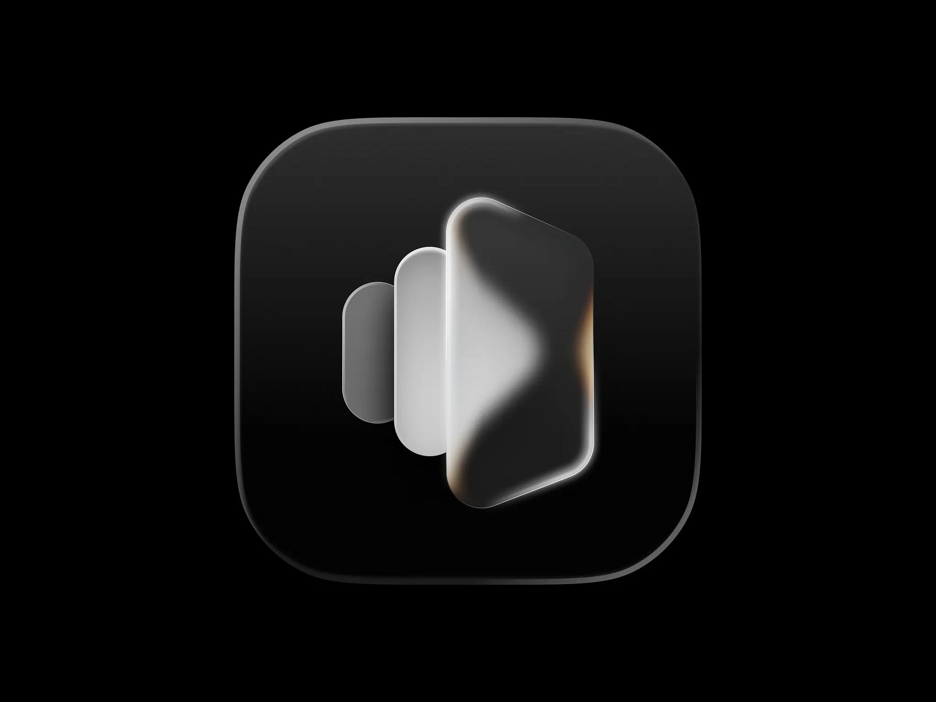
Mirror app icon, also by ktnr.23, stacks three rounded panels with the front one frosted so the others show through. It is the HIG's "vary opacity in foreground layers" advice in one picture, and it maps neatly onto three groups.
Safari macOS Liquid Glass icon by Nicolas Prieto turns the compass face into a lens that magnifies the world map behind it. That is the kind of effect Icon Composer 2's per-layer refraction is for, and the kind that disappears on 26.

Maps Icon, Nicolas Prieto's companion piece, uses a glass disc that bends the blue route line where it crosses the rim, while the arrow inside stays crisp.

Chess App Icon is Apple's own, from the macOS 27 beta 5: a rendered silver knight on a dark, four-tone checkerboard. Detailed, pre-lit art like this would come into Icon Composer as a PNG layer, and you would likely switch its glass effects off so they do not fight the rendering.

For a different take on the same brief, Michael Flarup's Liquid Glass Finder keeps the classic Finder colors and drops the border; in his words it "keeps more of its original personality."

Apple's full app icon guidance is linked from our HIG resource page.
Versions, settings and figures checked on 14 November 2026.
Sources
- https://developer.apple.com/design/human-interface-guidelines/app-icons
- https://developer.apple.com/documentation/xcode/creating-your-app-icon-using-icon-composer
- https://developer.apple.com/icon-composer/
- https://developer.apple.com/videos/play/wwdc2025/361/
- https://developer.apple.com/design/whats-new/
- https://developer.apple.com/design/resources/
- https://macrumors.com/2026/06/16/ios-27-revamps-app-icons
- https://www.apple.com/newsroom/2026/09/major-updates-for-apples-software-platforms-are-now-available/