
Liquid Glass DesignDesign10 min read
Liquid Glass website examples: 15 designs to study
15 Liquid Glass website examples from our gallery: glass nav bars, hero cards, WebGL lenses and app shells, with notes on what to reuse on your own site.
On this page
- Glass navigation bars
- Roman Vasylovskyi: a header pill over a landscape
- Piqo Studio: glass on a mobile site
- @rpavlini: a portfolio with a glass lens
- Pranjay: a SaaS dropdown
- Tanvir Ahammed Tamim: a sidebar over a photo
- Hero glass cards and conversion panels
- Serhii Antoniuk: one form, one button
- sanoj sunny: a single saturated button
- Badr Rehman: glass around the card, solid inside it
- Roobinium: a dark sign-in modal
- Interactive lenses and hero effects
- Alessandro Gori: accessible glass in WebGL2
- Victoria®: a lens over a photo in Framer
- vaibhav aggarwal: a lens over a wordmark
- Avevn: glass as the navigation itself
- Glass in web apps and dashboards
- RonDesignLab: Payrix on desktop
- Pooja Hooda: a gallery grid
- A Liquid Glass website design checklist
- Sources
The best Liquid Glass websites use glass in one or two places, usually the navigation bar or a single hero card, and keep everything people read on solid surfaces. Below are 15 web examples from our gallery, grouped by pattern, with notes on what each designer did with tint, edge light, layering and contrast, followed by a short checklist you can apply to your own site.
Every example links to its page on liquidglassdesign.com, which credits the designer, links to the original post and includes a copy-ready style prompt. Where a shot is animated, the notes describe the cover frame shown here.
Glass navigation bars
The floating pill nav is the most common Liquid Glass pattern on the web, and the easiest to get right. These five show how much the background decides the result.
Roman Vasylovskyi: a header pill over a landscape
In Liquid glass navigation, a single rounded bar holds a logo, a thin divider, four text links, a sun and moon theme toggle and a "Get Started" button. The bar sits across the ridge of a dark dune with pale sky above, and you can see the ridge line shift where it passes under the glass, which is the refraction doing its job. The one fully opaque thing in the bar is the white "Get Started" pill, so the call to action reads first even though the rest of the bar is see-through.

Piqo Studio: glass on a mobile site
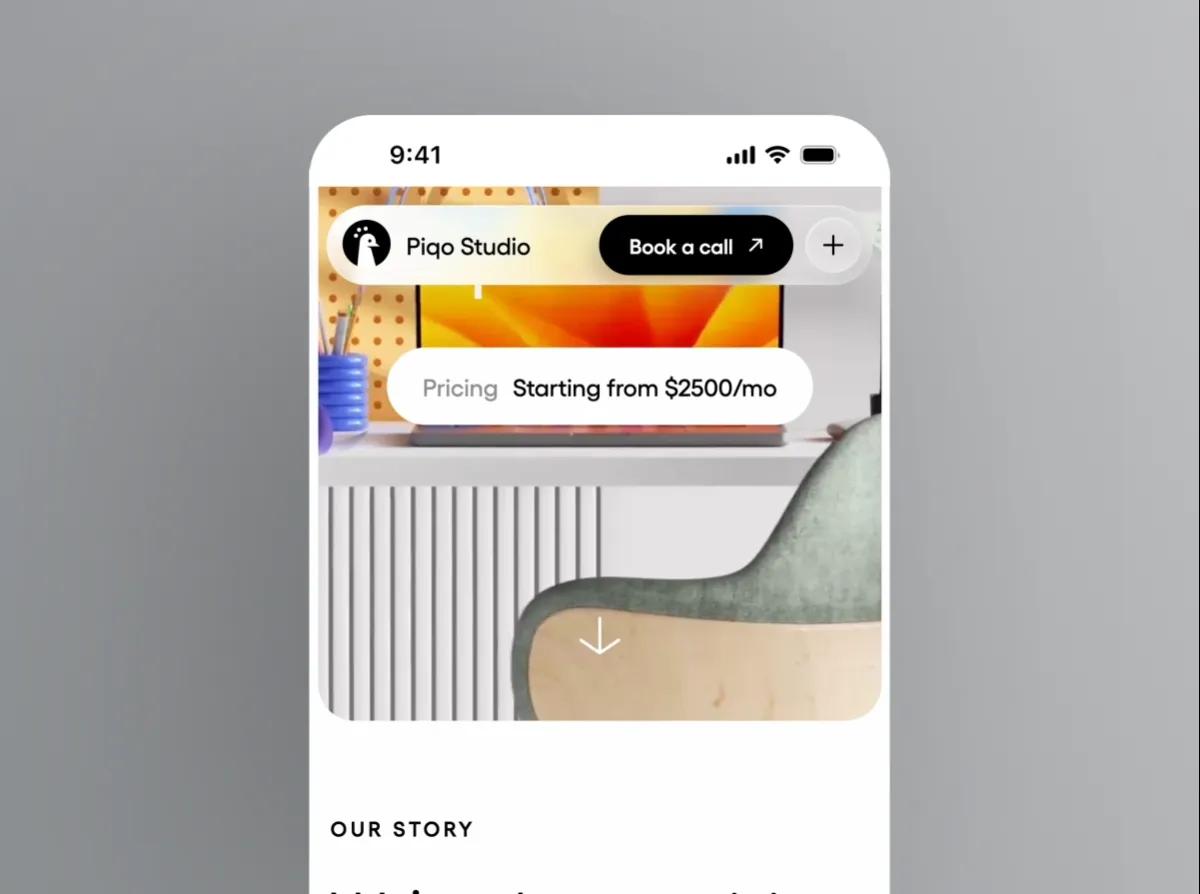
Piqo Studio's caption for Liquid Glass Design Video is one line: "We brought Liquid Glass to the web." The frame shows a phone-width site with a glass pill nav holding the studio name, a black "Book a call" button and a round plus button, all floating over a desk photo. A second glass pill below it reads "Pricing Starting from $2500/mo". Putting the price in its own floating chip is a neat idea for agency sites, and the black button inside the light glass keeps the main action legible over a busy photo.
@rpavlini: a portfolio with a glass lens
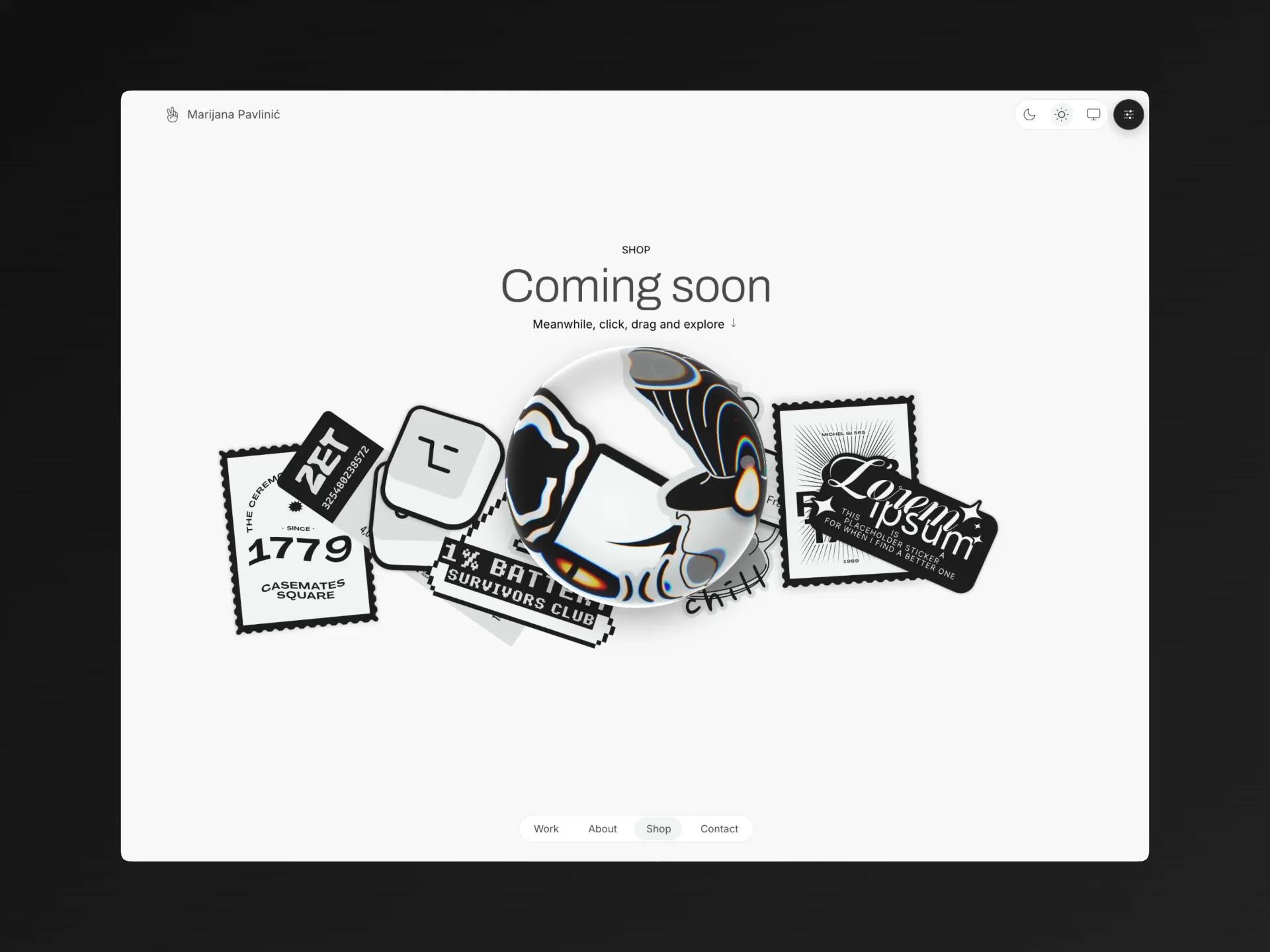
html-in-canvas, posted by @rpavlini, is a portfolio page for Marijana Pavlinić. Most of the page is plain off-white. A glass sphere sits in the middle of a pile of black-and-white stickers under a "Coming soon" headline and the line "Meanwhile, click, drag and explore", and the sphere bends the sticker graphics behind it. The bottom nav (Work, About, Shop, Contact) is a small pill with the current page marked by a slightly darker pill. On a white page glass has nothing to show, so the designer gave it high-contrast artwork to refract.
Pranjay: a SaaS dropdown
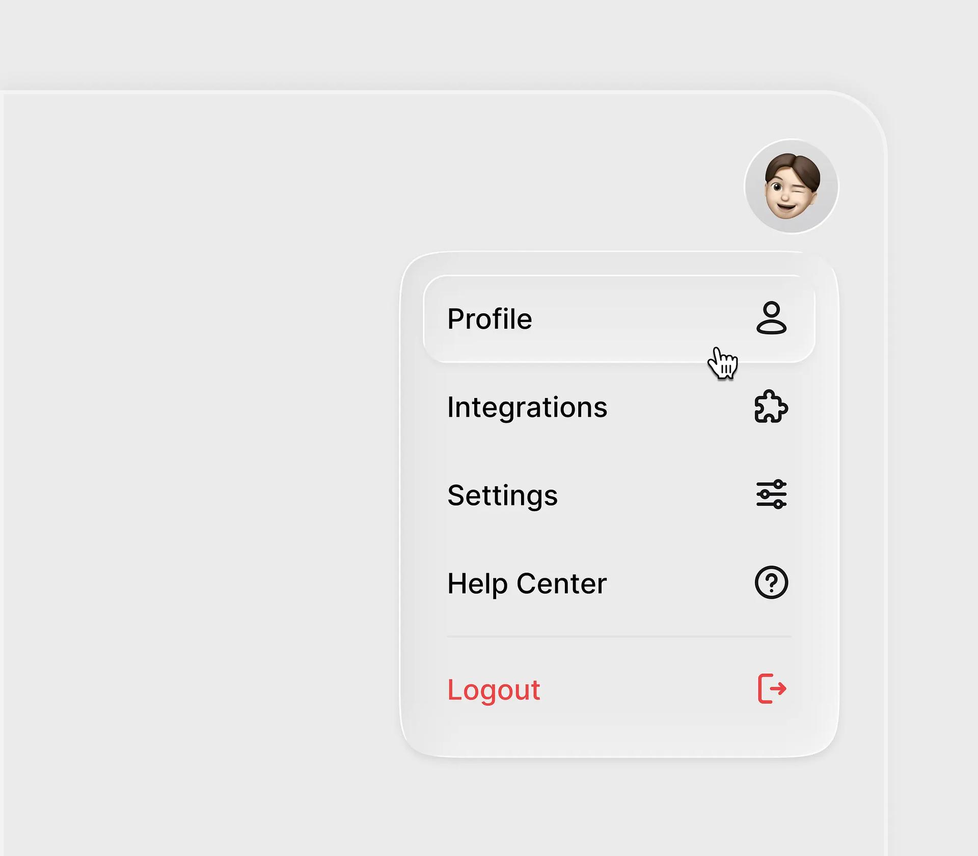
Liquid Glass SAAS Dropdown Component is the opposite case: light gray on light gray. The menu panel is defined almost entirely by its edge, a faint inner highlight and a soft shadow. The hovered "Profile" row rises as a lighter pill inside the panel, and "Logout" is set apart in red under a divider. When there is nothing colorful behind the glass, this edge treatment is what makes it read as glass at all.
Tanvir Ahammed Tamim: a sidebar over a photo
Liquid Glass Effect Sidebar UI floats a rounded sidebar over a photo of rice terraces, and the terrace lines visibly warp inside the panel. The active "Dashboard" item is a lighter pill. It looks great in a still, but the small white labels sit on a mid-tone, high-detail photo, which is the hardest background for text. Test a pattern like this with the photo you will really ship.
Hero glass cards and conversion panels
A glass card in the hero works when the card holds one task and the background has been chosen to support it.
Serhii Antoniuk: one form, one button
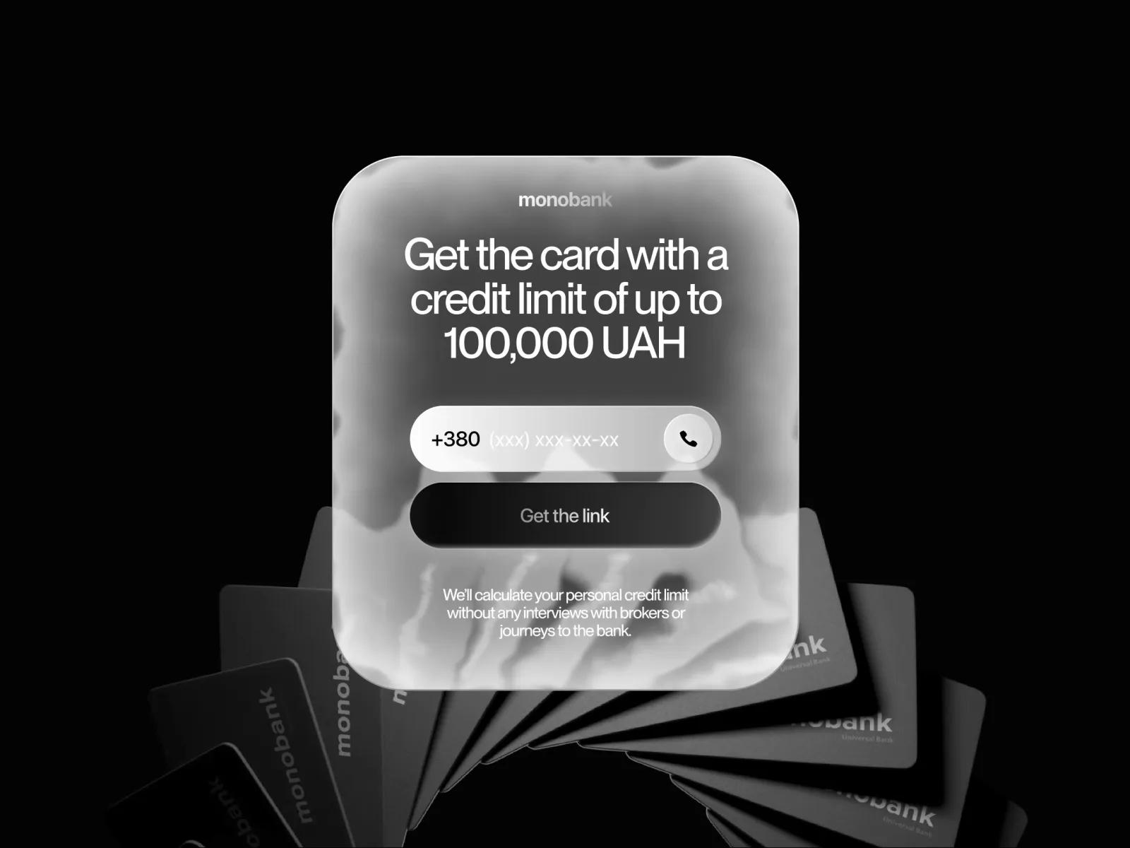
Liquid glass animation is a card offer for monobank. The designer says the goal was "a frictionless and visually appealing user experience while maintaining focus on the CTA." The whole frame is grayscale: a frosted panel with a white headline, a white phone-number field and a dark "Get the link" button, over a fan of black bank cards. With no color anywhere, contrast does all the work, and the input and button are solid shapes laid on top of the glass.
sanoj sunny: a single saturated button
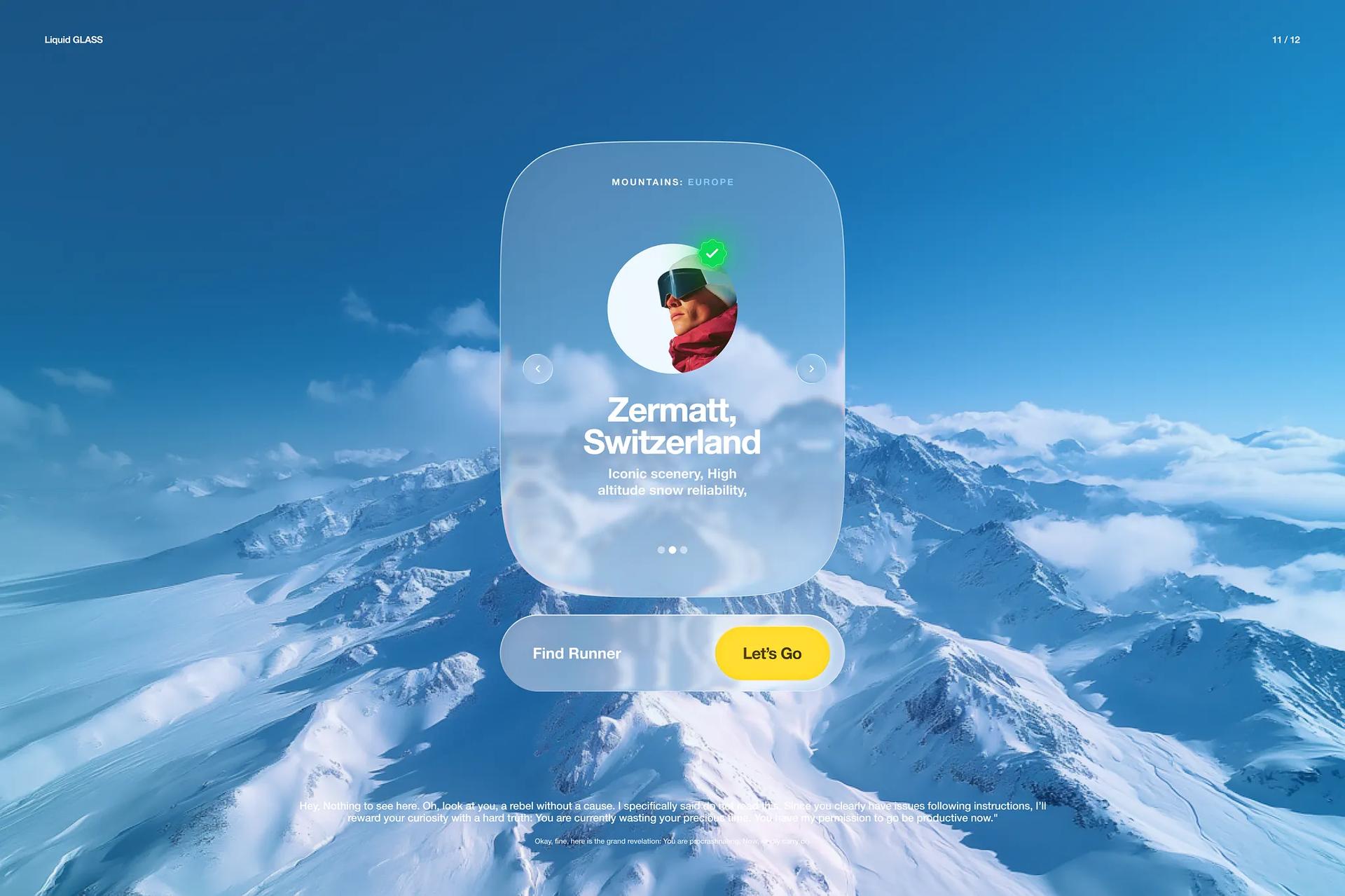
Concepts, tiles and buttons by sanoj sunny looks like a slide from a travel site. A tall glass card for "Zermatt, Switzerland" with a round portrait floats over snowy peaks, and below it a glass bar reads "Find Runner" next to a yellow "Let's Go" pill. Everything else is blue and white, so the yellow button is the only saturated element on the page and the eye goes straight to it.
Badr Rehman: glass around the card, solid inside it
Badr Rehman describes Liquid Glass UI Card Design as a card "designed for modern web interfaces" with "strong visual hierarchy & readability", aimed at fintech, referral and SaaS products. Look closely and the referral card itself is close to opaque white. The glass lives in the oversized "UI CARD" letters behind it and in the header strip at the top of the card. The instructions and the "Copy Link" button stay on a solid surface. For anything people need to read step by step, copy this approach.

Roobinium: a dark sign-in modal
Liquid Glass UI Modal Window is a dark frosted sign-in modal with Sign In and Join tabs, an orange underline on the active tab, two input fields and four social login buttons. The glass sits over chrome 3D shapes, which blur where they pass behind the panel. Roobinium pitches it at "fintech, Web3 or SaaS products". The useful idea is the background: decorative objects behind a modal give the glass something to refract without competing with page content.
Interactive lenses and hero effects
These are showpieces, the kind of thing you put above the fold once.
Alessandro Gori: accessible glass in WebGL2
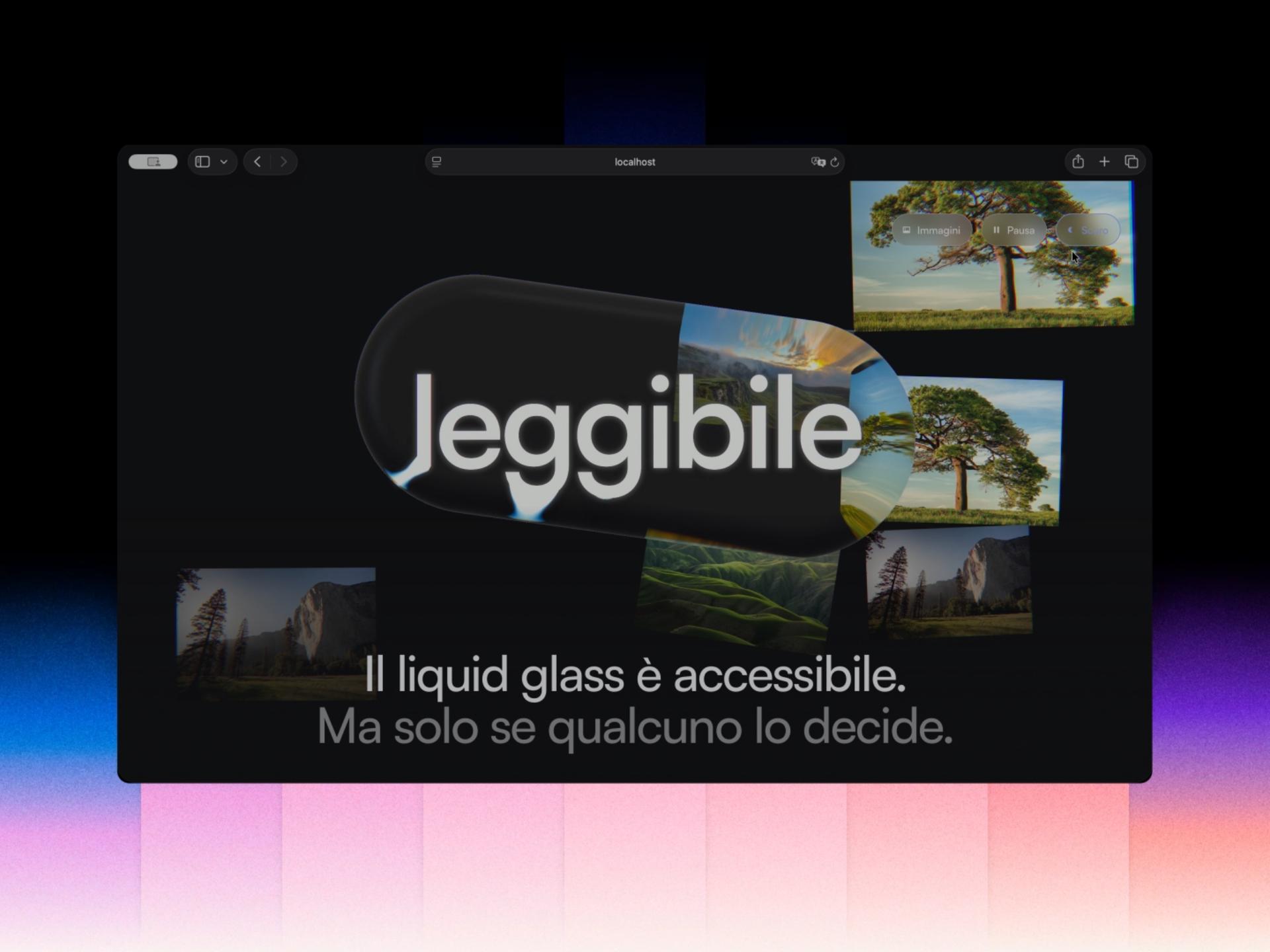
Liquid Glass component for Dynamo Caffeina is the most thoughtful web example in the gallery. Gori built "a rounded glass slab, rendered in raw WebGL2", with no three.js and nothing loaded at runtime. Each color of light bends by a slightly different amount, so "the rainbow-split only shows up exactly where the shape actually curves: the flat centre stays perfectly clear." The slab resizes to fit its content and swaps that content only when it is turned edge-on. The Italian headline in the frame translates to "Liquid glass is accessible. But only if someone decides it is", and the description backs that up: motion can be paused, and the headline is "real selectable DOM text (not baked into the effect)."
Victoria®: a lens over a photo in Framer
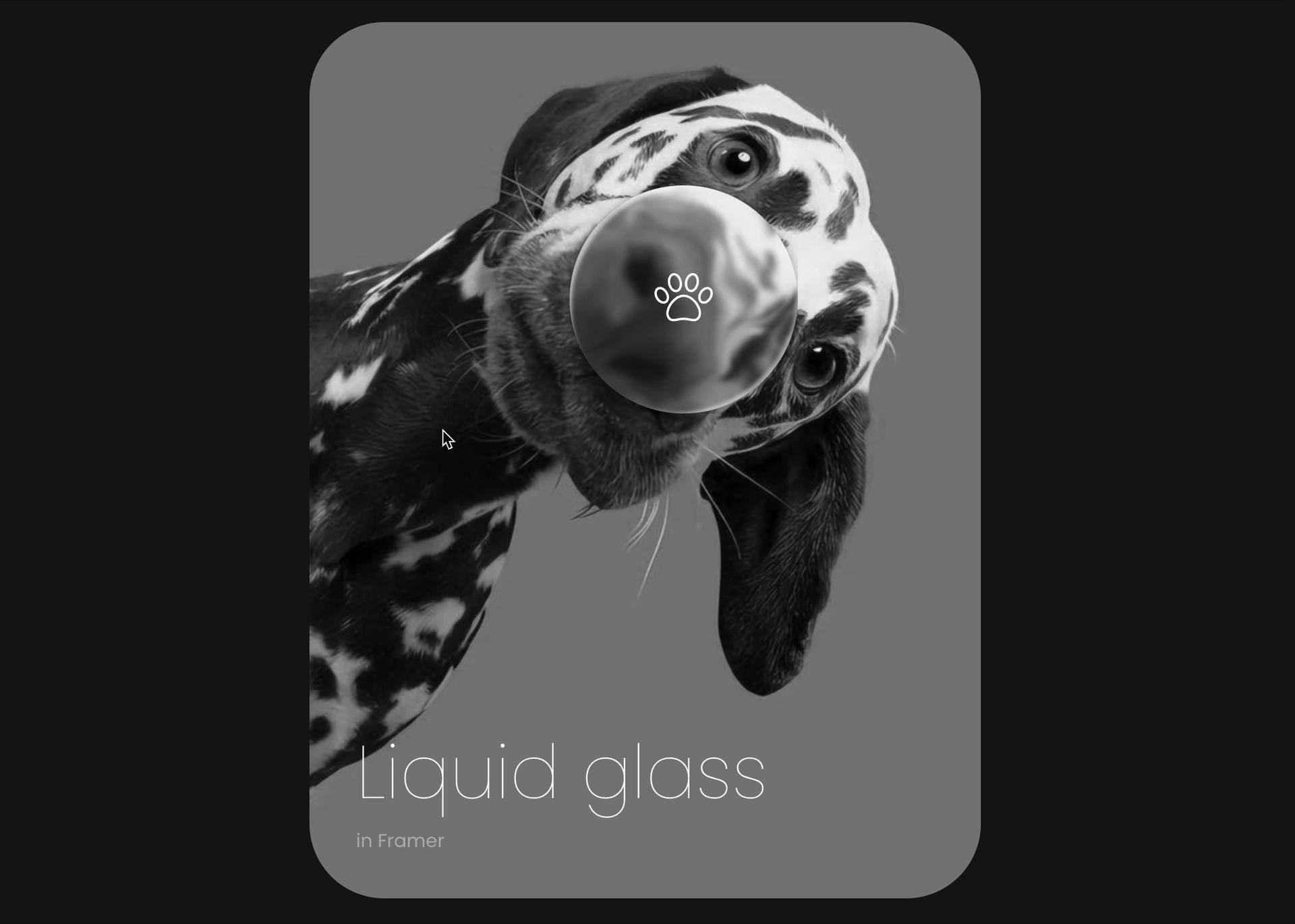
Liquid glass effect in Framer is a black-and-white card with a Dalmatian looking into the camera and a round glass lens with a paw icon over its nose, labeled "Liquid glass in Framer". A cursor is visible in the frame. Using a monochrome photo means the lens's magnification is the only thing happening on the card, which is why it reads so clearly.
vaibhav aggarwal: a lens over a wordmark
Liquid Glass animation in Vercel logo is a screen capture of a browser editor (the address bar shows unicorn.studio) with a round lens over the black Vercel wordmark on white. Where the lens bends the letter edges you get thin blue fringes. Black type on white is the clearest possible background for showing refraction, and a wordmark is something visitors already recognize, so the distortion reads as intentional.
Avevn: glass as the navigation itself
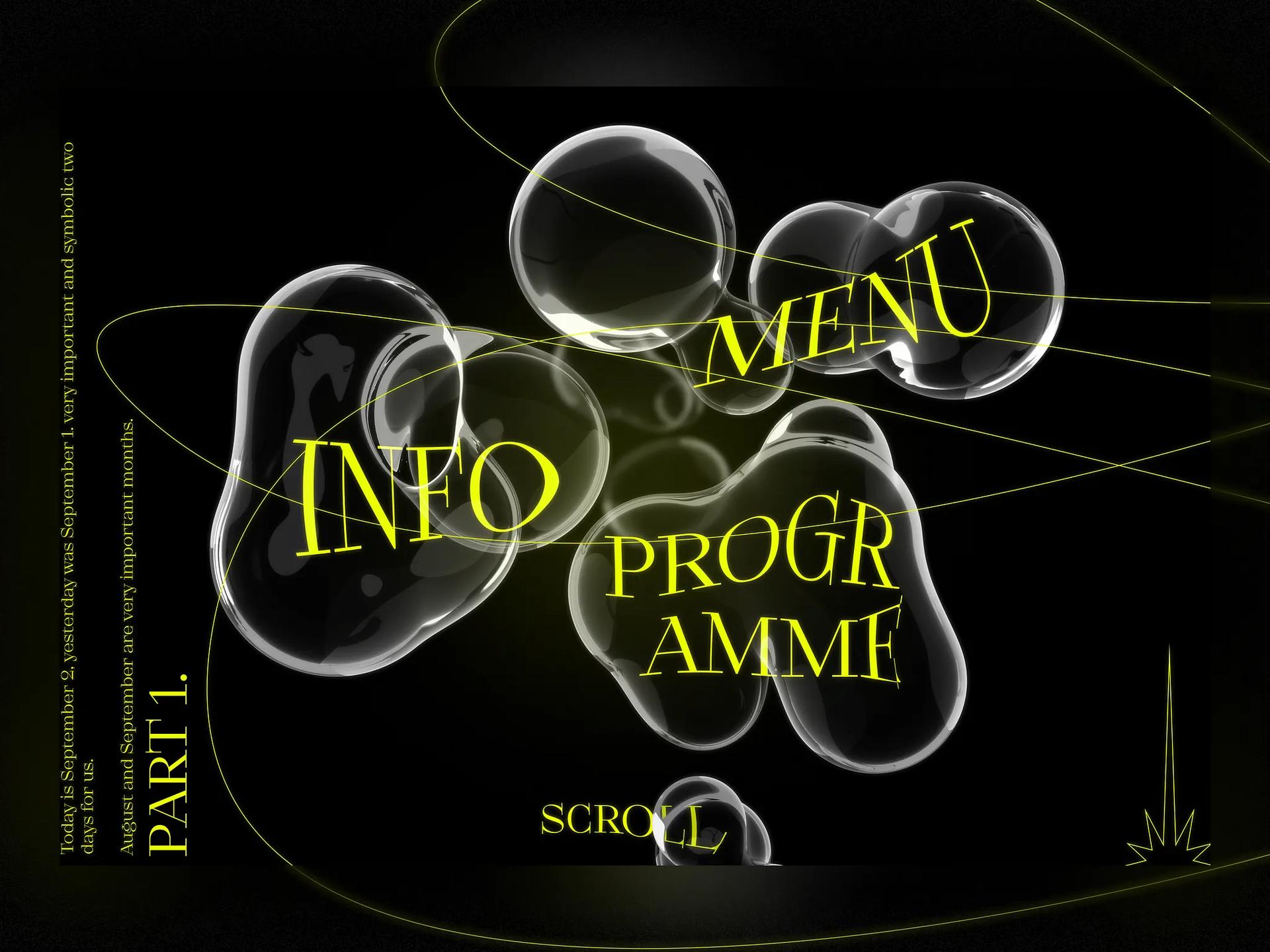
In Web Design | 3D Glass | Landing Page, clear glass blobs on a black page carry the menu: "INFO", "MENU" and "PROGRAMME" are set in acid-yellow serif type across the blobs, with thin yellow orbit lines and a rotated "PART 1." in the margin. On pure black, the glass is visible only through its bright rims and reflections, so the labels sit on top in the hottest color on the page. This only works for a small number of items, but for an event or studio site it is memorable.
Glass in web apps and dashboards
RonDesignLab: Payrix on desktop
In Payrix SaaS Web Finance Dashboard, the brief quoted on the shot says users found it "difficult to quickly interpret financial data due to cluttered visuals and rigid layouts." The answer on screen: a glass "Account Value" card in the hero over teal and orange 3D shapes, and below it data cards (Spending Overview, Transaction Activity) that are nearly opaque white, so the numbers never sit on glass.
Pooja Hooda: a gallery grid
Liquid Glass Gallery is a grid of thick, rounded glass tiles over photos of sea and clouds, with titles like "Wet Season" and "Long Exposure" and a caption calling it "a reimplementation study". The photos warp around each tile's bevel, so the glass reads from the edges inward while the center of each image stays clean, which suits a portfolio grid.
A Liquid Glass website design checklist
Apple's own guidance from the WWDC25 session "Meet Liquid Glass" is that "Liquid Glass is best reserved for the navigation layer". The web examples that hold up follow the same rule, whether or not their designers meant to.
- Put glass on navigation, toolbars and one hero element, and keep forms, tables and long text on solid or nearly solid surfaces.
- Make the call to action the one opaque or saturated thing in a glass bar (Vasylovskyi's white pill, sunny's yellow button).
- Give the glass something to refract: a photo, a 3D object or bold type. Over a flat background, rely on edge highlights and shadow instead, as Pranjay does.
- Check label contrast against the busiest part of the background. WCAG 2.2 asks for 4.5:1 for normal text and 3:1 for large text and for the visual boundaries of controls.
- Keep text as real HTML, and let people pause motion, as Gori does.
- Ship a fallback. Use
@supportsfor browsers withoutbackdrop-filterandprefers-contrast: moreto swap in solid fills.prefers-reduced-transparencyhelps too, but MDN's compatibility data lists it for Chromium only, so it cannot be the only switch. - Limit live effects. Each blur, displacement filter or WebGL lens costs GPU time, so keep one or two on screen at once.
backdrop-filter is supported unprefixed in Chrome 76+, Firefox 103+ and Safari 18+ according to caniuse, so a frosted look is safe almost everywhere. For true refraction you need SVG displacement filters or WebGL; our resource pages on SVG filter Liquid Glass and real liquid glass for the web are good starting points, and our Liquid Glass explainer covers how it differs from glassmorphism.
To browse more, the UI gallery has every web and app example we have collected, and the prompts page collects the style prompts if you want to generate a moodboard first.
Versions, settings and figures checked on 14 November 2026.
Sources
- https://developer.apple.com/videos/play/wwdc2025/219/
- https://www.w3.org/WAI/WCAG22/Understanding/contrast-minimum.html
- https://www.w3.org/WAI/WCAG22/Understanding/non-text-contrast.html
- https://developer.mozilla.org/en-US/docs/Web/CSS/backdrop-filter
- https://caniuse.com/css-backdrop-filter
- https://github.com/mdn/browser-compat-data/blob/main/css/at-rules/media.json
- https://dribbble.com/shots/26155046-Liquid-glass-navigation
- https://dribbble.com/shots/26135455-Liquid-Glass-Design
- https://www.inspora.design/posts/9-8
- https://dribbble.com/shots/27618592-Liquid-Glass-SAAS-Dropdown-Component
- https://dribbble.com/shots/26138509--Liquid-Glass-Effect-Sidebar-UI
- https://dribbble.com/shots/26181430-Liquid-glass-animation
- https://dribbble.com/shots/26916101-Liquid-Glass-Concepts-tiles-and-buttons
- https://dribbble.com/shots/26891816-Liquid-Glass-UI-Card-Design-Modern-Web-UI-Concept
- https://dribbble.com/shots/26536796-Liquid-Glass-UI-Modal-Window
- https://dribbble.com/shots/27636654-Liquid-Glass-component-Dynamo-Caffeina
- https://dribbble.com/shots/26137448-Liquid-glass-effect-in-Framer
- https://dribbble.com/shots/26155125-Liquid-Glass-animation-in-Vercel-logo
- https://dribbble.com/shots/19672219-Web-Design-3D-Glass-Landing-Page
- https://dribbble.com/shots/26550987-Payrix-SaaS-Web-Finance-Dashboard
- https://dribbble.com/shots/27662476-Liquid-Glass-Gallery