
Liquid Glass DesignDesign9 min read
Liquid Glass button design: anatomy, code and examples
How a Liquid Glass button is built and how it behaves at rest, on hover, press and when disabled, with SwiftUI and CSS code and 17 gallery examples.
On this page
- Liquid Glass button anatomy
- Fill: how much background comes through
- Tint: reserve it for the primary action
- Rim light: the edge does most of the work
- Specular highlight and depth
- Shadow
- Label contrast
- States
- Rest
- Hover
- Press
- Toggles and selected states
- Disabled
- Focus
- Liquid Glass button code
- SwiftUI (iOS 26 and later)
- CSS (frosted, for photo or dark backgrounds)
- Sources
A Liquid Glass button is a translucent shape built from six parts: a fill that lets the background through, an optional tint, a rim of edge light, a specular highlight, a shadow and a label that has to stay readable over whatever passes behind it. On iOS 26 and later you get all of that from SwiftUI's .glass and .glassProminent button styles. On the web you approximate it with backdrop-filter, a border and a few shadows, and the code for that is further down.
This post breaks the button into those parts using 17 examples from our gallery, then covers states and code. Each example links to its gallery page, where you'll find the designer's credit, the original post and a style prompt.
Liquid Glass button anatomy
Fill: how much background comes through
The fill decides how much the button borrows from its surroundings. In iOS 26 Liquid Glass Buttons, Rahul Goyal puts a "Button" pill on a pink and purple gradient, and the pill takes on the purple of the area behind it with a slightly brighter magenta rim. Outline's Liquid Glass Button iOS 26, Light and Dark makes the point more directly: one "+ Button" pill straddles a light purple and orange background on the left and a dark blue one on the right. The same button reads pale violet on one side and nearly black on the other, and the white label works on both. Outline shares the Figma file and invites people to "remix, reuse, or share feedback".

Tint: reserve it for the primary action
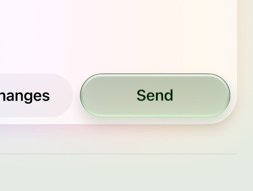
Tint is how you say "this one". Enrico's glass green button shows a pale sage "Send" pill with a dark green label next to a neutral, untinted pill. In Amirreza Taghavi's iOS 26 Liquid Glass Buttons new, a shopping screen pairs a frosted white "Size: 12" pill with a saturated red "Add to Cart" pill, both floating over product photos. That matches Apple's guidance in the WWDC25 session "Meet Liquid Glass": "Tinting should only be used to bring emphasis to primary elements and actions in the UI," and "When every element is tinted, nothing stands out."

Tinting the whole surface is a different look. UX GLASS MORPHISM, credited to NASIR SHAEL'S INVENTIONS, puts red glass buttons ("redomedia" and a round asterisk button) on a red panel. Shape and edge light separate the buttons from the panel, since color can't.
Rim light: the edge does most of the work
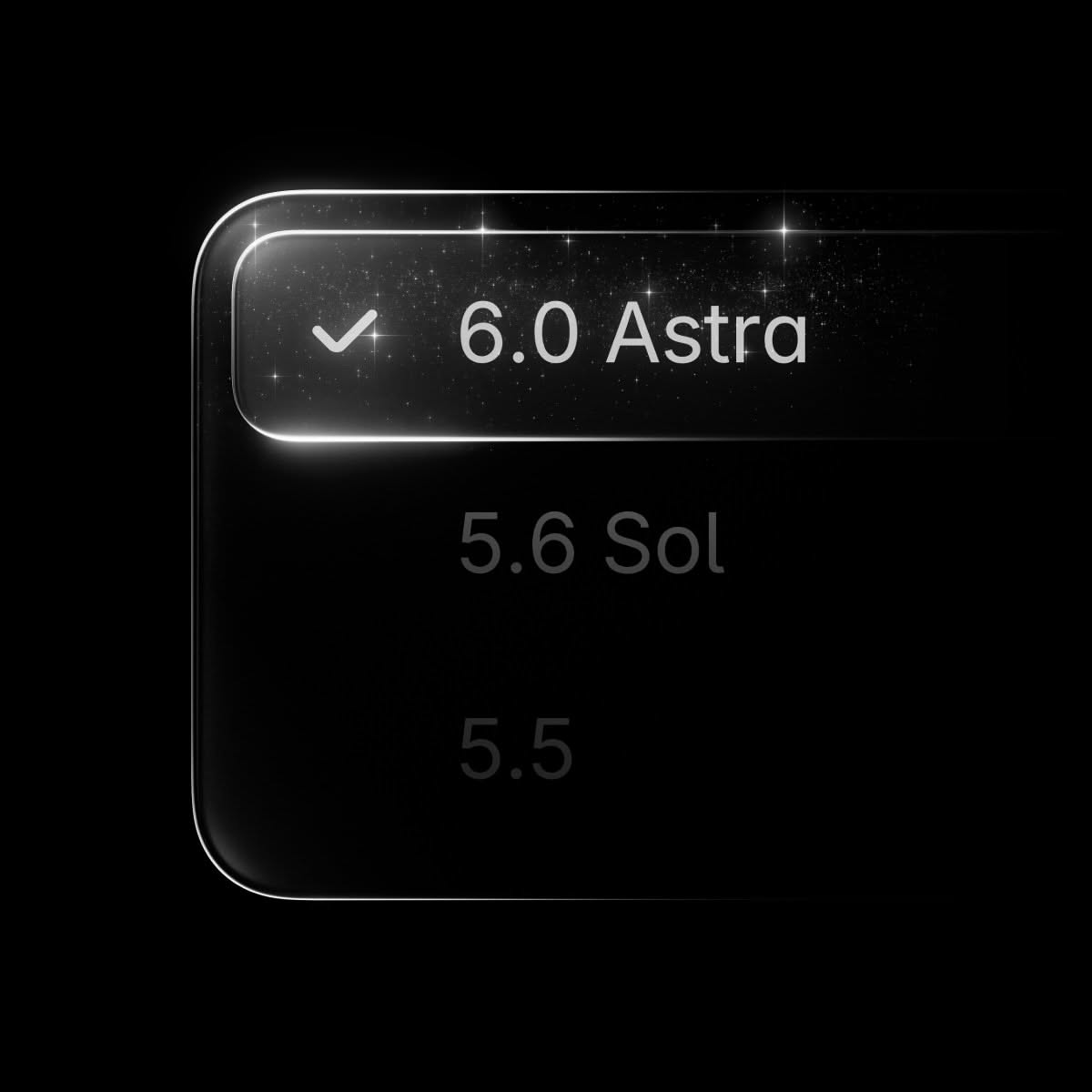
On a flat or dark background, the rim is the only thing that says "glass". In the uncredited Pinterest pin we keep as dark-button-glass, a selected "6.0 Astra" row in a black menu gets a bright white rim that peaks at the top-left corner, while the unselected rows below fade to dark gray. Mobile App Vision's Home Button Liquid ui Web3 goes further, wrapping a round home icon in an iridescent rim that runs from orange through blue.
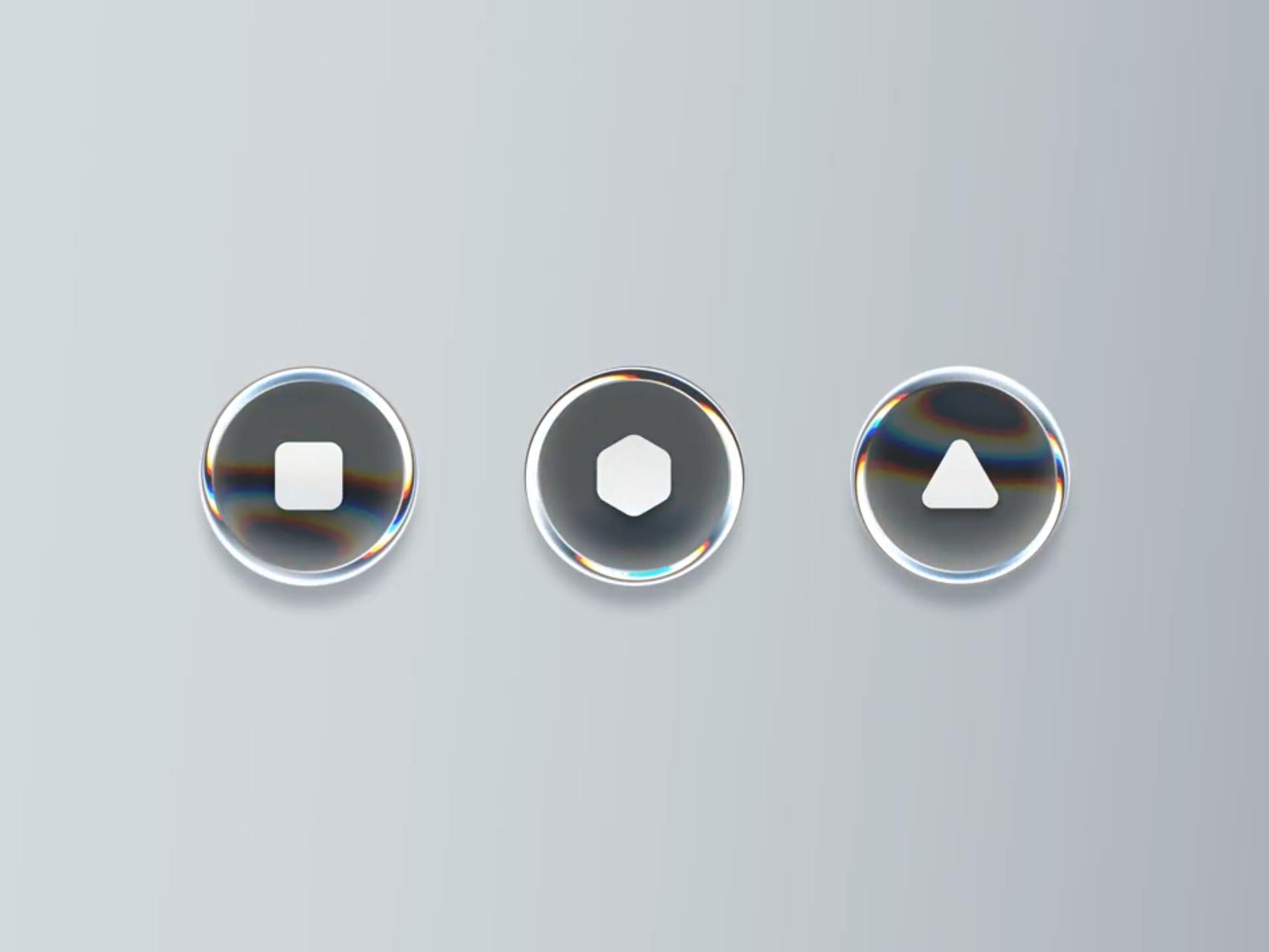
Tran Mau Tri Tam's Shader Glass Buttons is the reference for rims with chromatic aberration. It is "a motion study showing how shader parameters like depth, RGB split, scale, angle, and offset animate glassmorphic circular buttons." The still shows three round buttons with stop, hexagon and play glyphs, each with a thick clear rim and rainbow fringes where the edge curves.
Specular highlight and depth
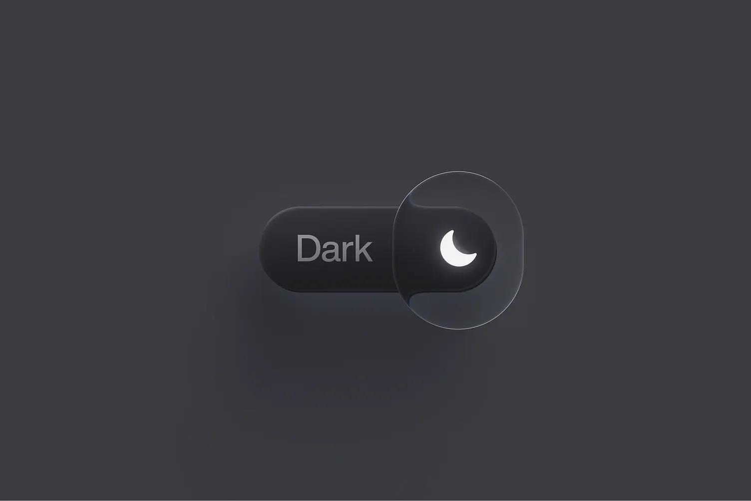
Shaheer Malik's Liquid Glass Button in Framer is a light gray "Get Now" pill with a strong highlight along the top edge and a darker band at the bottom, so it reads as a thick, rounded slab. Voicu Apostol's Liquid Glass Switch, "designed in Figma and animated using Figma's Prototype mode with Smart Animate", uses a clear lens as the switch knob. The lens is taller than the dark "Dark" track it slides along and magnifies the moon icon under it, which is about as literal as glass gets.
Shadow
Shadow separates the button from the content under it. Apple describes Liquid Glass as increasing "the opacity of its shadow when it is over text" and lowering it "when it is over a solid light background." For a static design, that means darker shadows over busy content and very soft ones over white.
Label contrast
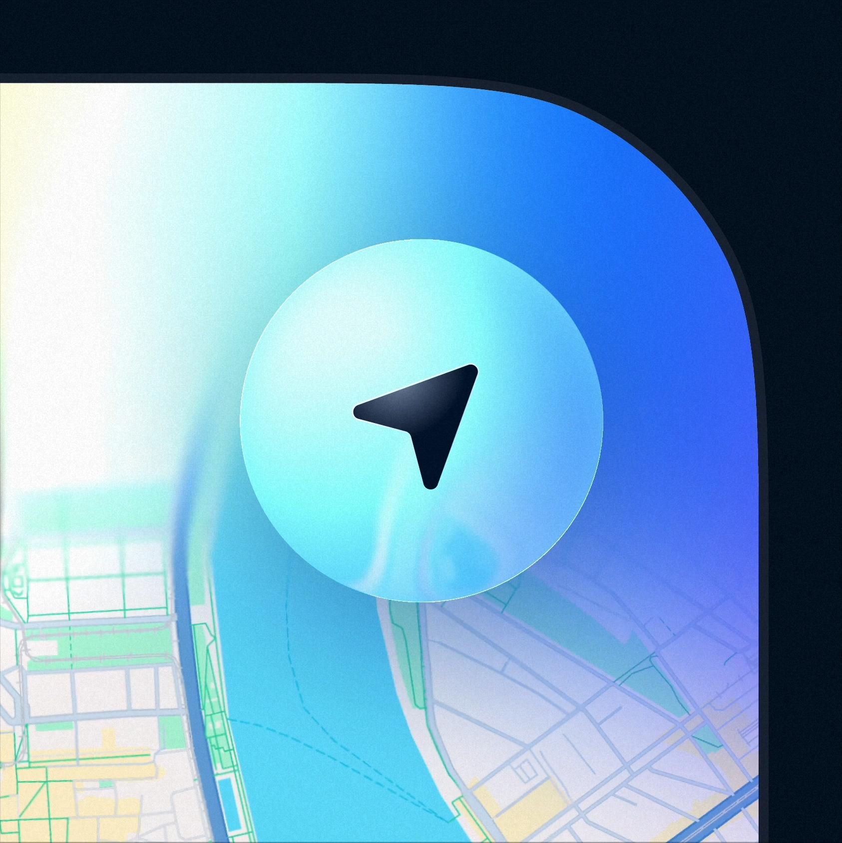
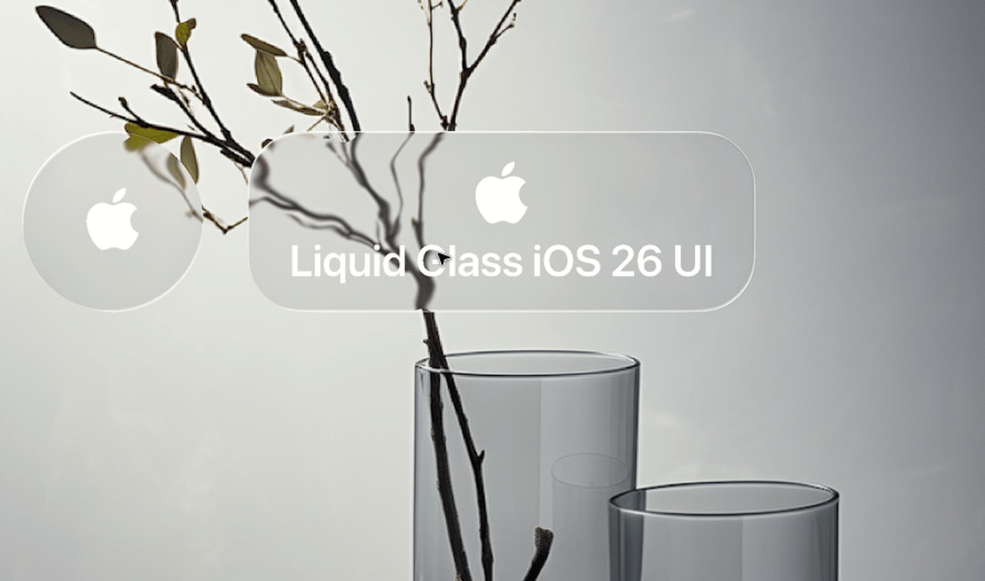
Check the label before anything else. Aymeric Delpeuch's Liquid Glass Button closeup gets it right: a light cyan glass circle over a map holds a solid dark navigation arrow, so the glyph stays sharp while map lines bend at the button's edge. Lukas Horak's Voice AI Assistant: Liquid Glass Button, described as "a gentle glow animation for an AI-driven interface," is a white glass disc with a pink and violet glow and a light gray microphone. It is calm, and if this were the only control on screen you'd want a darker glyph. Shuvro Roy Suvashish's Liquid Glass iOS 26 Button UI shows the risk on photos: the branches of a still life run straight through the white label "Liquid Glass iOS 26 UI".
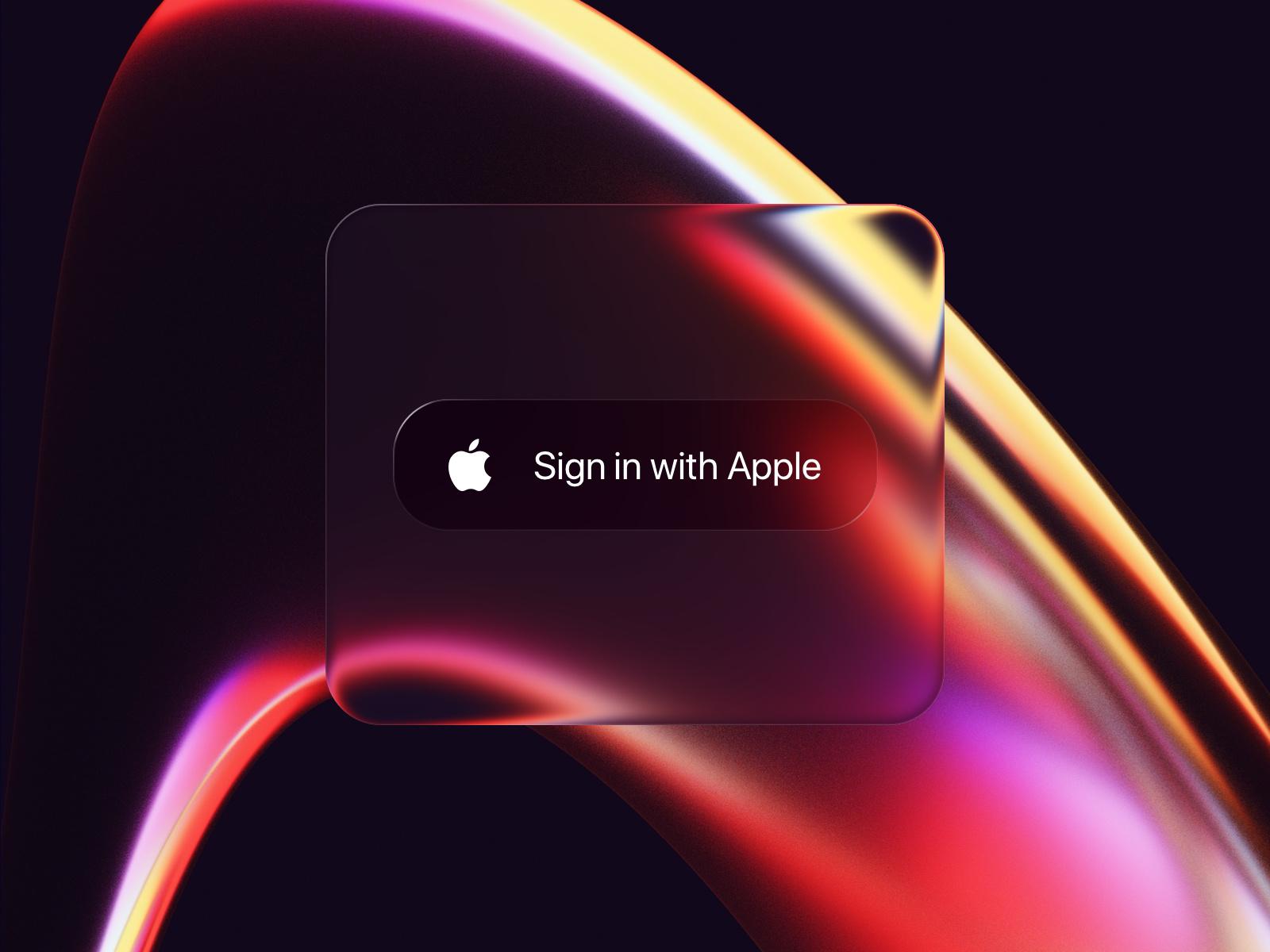
Mike Deraco's Liquid Glass Button, "Apple's iOS 26 liquid glass effect button", puts a dark "Sign in with Apple" pill inside a larger glass square over red and orange light ribbons. It is a lovely render, but in a real interface you would drop the outer slab: Apple's session advises against placing glass "within or on top of other glass elements".
States
Rest
Apple describes the resting state as deliberately calm: elements "can even lift up into Liquid Glass temporarily, such as when you interact with a component. This lets the resting state stay visually quiet, while it comes to life on touch." A resting glass button can be quieter than a solid one, as long as its outline is visible against the background (WCAG's non-text contrast criterion asks for 3:1 for the visual information that identifies a control).
Hover
Hover only exists on pointer devices. Ho3ein's Liquid Glass Buttons, Hover Effect is a pale blue "Start Now" pill whose description promises "a smooth hover effect that creates a subtle sense of immersion". A small increase in fill opacity or highlight brightness is enough. On the web, wrap hover styles in @media (hover: hover) so touch screens don't get stuck hover states.
Press
This is where Apple's glass behaves differently from older button styles. In the "Meet Liquid Glass" session: "When you interact with Liquid Glass, the material illuminates from within as a form of feedback. Starting right under your fingertips, the glow spreads throughout the element and onto any Liquid Glass elements nearby." The same session says the material "responds to interaction by instantly flexing and energizing with light." In SwiftUI, adding .interactive() to a custom glass effect "applies the same responsive and fluid reactions that glass provides to standard buttons," according to Apple's documentation. On the web, a slight scale-down and a tighter shadow is the honest approximation.
Toggles and selected states
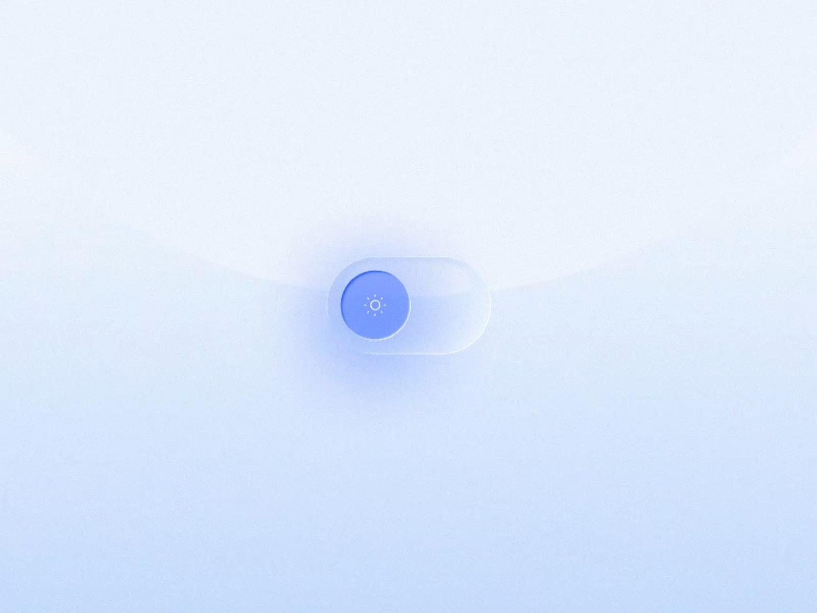
Several gallery pieces are two-state buttons. Expert App Devs' Dark Light Button UI Animation is a frosted pill with a solid blue knob carrying a sun glyph and a soft blue glow under it. Sol Mombrú's sun glass button is a round glass knob on a white track, with yellow and blue light bleeding through it around a sun icon. In both, the selected state is carried by a color glow, which makes it easy to read at a glance.
Disabled
Apple's documentation doesn't describe a separate disabled look for Liquid Glass, so treat it like any other control. WCAG says text in "an inactive user interface component" has no contrast requirement, but people still need to see that the button exists. Lower the fill and label opacity, remove the shadow and keep the shape.
Focus
For keyboard users, add a visible focus ring outside the glass. A 2px solid outline with an offset reads over any background, where a glow can disappear into the blur.
Liquid Glass button code
SwiftUI (iOS 26 and later)
These APIs are available from iOS 26, iPadOS 26 and macOS 26. .glass and .glassProminent are the standard button styles; Apple describes .glassProminent as "similar to the borderedProminent style." For a custom component, the tint and interactive example comes from Apple's "Applying Liquid Glass to custom views" article.
Button("Skip") { }
    .buttonStyle(.glass)

Button("Continue") { }
    .buttonStyle(.glassProminent)

// A custom view that reacts to touch like a glass button
Text("Hello, World!")
    .font(.title)
    .padding()
    .glassEffect(.regular.tint(.orange).interactive())
When several glass buttons sit together, wrap them in a GlassEffectContainer, which Apple recommends "for the best rendering performance" and which lets nearby shapes blend and morph.
CSS (frosted, for photo or dark backgrounds)
This gives you a frosted glass button with a rim, a top highlight, a lift shadow and all the states above. It blurs the background; it does not refract it. For real lensing you need SVG displacement filters or WebGL, and our SVG filters resource is a good place to start.
<button class="glass-btn">Skip</button>
<button class="glass-btn is-primary">Continue</button>.glass-btn {
--tint: 255 255 255;
padding: 0.75rem 1.5rem;
border: 1px solid rgb(255 255 255 / 0.45);
border-radius: 999px;
background: rgb(var(--tint) / 0.18);
-webkit-backdrop-filter: blur(12px) saturate(160%);
backdrop-filter: blur(12px) saturate(160%);
box-shadow:
inset 0 1px 0 rgb(255 255 255 / 0.6),
inset 0 -1px 0 rgb(0 0 0 / 0.1),
0 6px 20px rgb(0 0 0 / 0.18);
color: #fff;
font: 600 1rem/1.2 system-ui, sans-serif;
text-shadow: 0 1px 2px rgb(0 0 0 / 0.35);
cursor: pointer;
transition: transform 160ms ease, background-color 160ms ease, box-shadow 160ms ease;
}
.glass-btn.is-primary { --tint: 10 132 255; background: rgb(var(--tint) / 0.6); }
@media (hover: hover) {
.glass-btn:hover { background: rgb(var(--tint) / 0.3); }
.glass-btn.is-primary:hover { background: rgb(var(--tint) / 0.72); }
}
.glass-btn:active {
transform: scale(0.97);
box-shadow: inset 0 1px 0 rgb(255 255 255 / 0.4), 0 2px 8px rgb(0 0 0 / 0.2);
}
.glass-btn:focus-visible { outline: 2px solid #fff; outline-offset: 3px; }
.glass-btn:disabled {
background: rgb(var(--tint) / 0.08);
color: rgb(255 255 255 / 0.55);
box-shadow: none;
cursor: not-allowed;
transform: none;
}
@supports not ((backdrop-filter: blur(1px)) or (-webkit-backdrop-filter: blur(1px))) {
.glass-btn { background: rgb(40 40 48 / 0.9); }
}
@media (prefers-contrast: more), (prefers-reduced-transparency: reduce) {
.glass-btn {
-webkit-backdrop-filter: none;
backdrop-filter: none;
background: #1c1c1e;
border-color: #fff;
}
}
@media (prefers-reduced-motion: reduce) {
.glass-btn { transition: none; }
.glass-btn:active { transform: none; }
}A few notes on it:
backdrop-filteris unprefixed in Chrome 76+, Firefox 103+ and Safari 18+ per caniuse. The-webkit-line covers older Safari.- The white label assumes a dark or photographic background. On a light page, switch
colorto a near-black and drop thetext-shadow. prefers-reduced-transparencyis only supported in Chromium according to MDN's compatibility data, which is whyprefers-contrast: moreshares the same block.- Don't put the button inside an ancestor with
opacitybelow 1 or afilter. MDN notes those stop the backdrop at their boundary, and the blur will look like it isn't working.
If you build in Framer, our resource on making a Liquid Glass button with Framer's AI agent walks through that workflow, and Apple's iOS and iPadOS 27 Figma kit has the system button components for mockups. Every example above also has a style prompt on the prompts page.
Versions, settings and figures checked on 14 November 2026.
Sources
- https://developer.apple.com/videos/play/wwdc2025/219/
- https://developer.apple.com/documentation/swiftui/applying-liquid-glass-to-custom-views
- https://developer.apple.com/documentation/swiftui/glass/interactive(_:)
- https://developer.apple.com/documentation/swiftui/primitivebuttonstyle/glassprominent
- https://www.w3.org/WAI/WCAG22/Understanding/non-text-contrast.html
- https://www.w3.org/WAI/WCAG22/Understanding/contrast-minimum.html
- https://developer.mozilla.org/en-US/docs/Web/CSS/backdrop-filter
- https://caniuse.com/css-backdrop-filter
- https://github.com/mdn/browser-compat-data/blob/main/css/at-rules/media.json
- https://qclay.design/
- https://www.behance.net/gallery/227814117/iOS-26-Liquid-Glass-Buttons
- https://dribbble.com/shots/26133226-Liquid-Glass-Button-iOS-26-Light-Dark
- https://dribbble.com/shots/26231218-iOS-26-Liquid-Glass-Buttons
- https://www.pinterest.com/pin/763078730655269272/
- https://www.pinterest.com/pin/777433954470887365/
- https://recent.design/i/b5tfl45-shader-animated-glass-buttons
- https://dribbble.com/shots/26187995-Liquid-Glass-Button-in-Framer
- https://dribbble.com/shots/26295473-Liquid-Glass-Switch
- https://dribbble.com/shots/26363625-Liquid-Glass-Button-closeup
- https://dribbble.com/shots/27070369-Voice-AI-Assistant-Liquid-Glass-Button
- https://dribbble.com/shots/26142354-Liquid-Glass-iOS-26-Button-UI
- https://dribbble.com/shots/26398190-Liquid-Glass-Button
- https://dribbble.com/shots/26811892-Liquid-Glass-Buttons-Hover-Effect
- https://dribbble.com/shots/26453320-Dark-Light-Button-UI-Animation
- https://www.pinterest.com/pin/1024920827729884853/