
Liquid Glass DesignDev6 min read
SwiftUI Liquid Glass: glassEffect, containers and morphing
SwiftUI Liquid Glass code checked against Apple's docs: glassEffect, GlassEffectContainer, glassEffectID morphing, glass buttons and an iOS 18 fallback.
On this page
In SwiftUI you add Liquid Glass to a custom view with .glassEffect(), group nearby glass shapes in a GlassEffectContainer so they blend, and give each shape a glassEffectID(_:in:) so SwiftUI can morph one into another. Standard bars, sheets and controls already use the material when you build with the iOS 26 SDK or later, so these APIs are for your own controls.
Apple's documentation lists the glass APIs for iOS, iPadOS, Mac Catalyst, macOS, tvOS and watchOS 26.0. visionOS isn't on that list.
The SwiftUI Liquid Glass API in one place
glassEffect(_ glass: Glass = .regular, in shape: some Shape = DefaultGlassEffectShape())draws the material behind a view. The default shape is aCapsule.Glasshas three variants:.regular,.clearand.identity, which leaves the content as if no glass were applied..tint(_:)and.interactive(_:)return modified copies.GlassEffectContainer(spacing:content:)renders several glass shapes together so they can merge and morph.glassEffectID(_:in:)ties a glass shape to an identity in a@Namespacefor transitions.glassEffectUnion(id:namespace:)merges shapes into one piece of glass even at rest.glassEffectTransition(_:)picks.matchedGeometry,.materializeor.identityfor shapes that appear and disappear..buttonStyle(.glass)and.buttonStyle(.glassProminent)are the button styles..buttonStyle(.glass(.clear))takes a variant or tint.
Basic glassEffect usage
Text("Hello, World!")
    .font(.title)
    .padding()
    .glassEffect()

Text("Hello, World!")
    .font(.title)
    .padding()
    .glassEffect(in: .rect(cornerRadius: 16))

Text("Hello, World!")
    .font(.title)
    .padding()
    .glassEffect(.regular.tint(.orange).interactive())
Modifier order matters. Apple's article "Applying Liquid Glass to custom views" says glassEffect captures the content it sends to the container, so apply it after the modifiers that change how the view looks. Padding and frame go first. The glass fills the view's bounds, padding included.
Use .interactive() on things people tap. It gives a custom control the same press response that the glass button styles have.
Choose between .regular and .clear the way the Human Interface Guidelines describe. Regular blurs and adjusts the luminosity of what's behind it and is right for anything with real text. Clear is "highly translucent" and meant for controls floating over photos and video. If you're unsure, use regular. The HIG resource page links to the full guidance.
Containers and spacing
A GlassEffectContainer does two jobs. It renders the glass inside it together, which Apple says gives the best performance when several views use glass. It also lets shapes blend into each other.
The spacing value controls when that happens. Glass shapes closer together than the container's spacing start to merge. If the container's spacing is larger than the spacing of the HStack inside it, the shapes will look joined even at rest.
GlassEffectContainer(spacing: 40) {
    HStack(spacing: 40) {
        Image(systemName: "scribble.variable")
            .frame(width: 80, height: 80)
            .font(.system(size: 36))
            .glassEffect()

        Image(systemName: "eraser.fill")
            .frame(width: 80, height: 80)
            .font(.system(size: 36))
            .glassEffect()
            .offset(x: -40) // pulled close enough to blend
    }
}
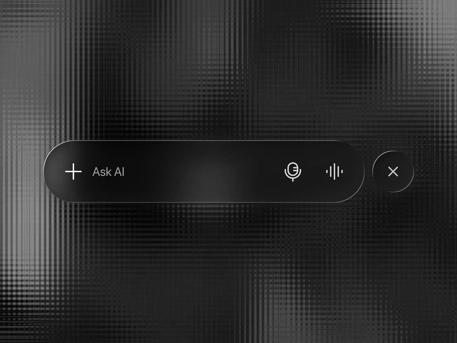
Shamnad's Liquid Glass Tab Bar UI in our gallery is a good layout to build this way: a wide "Ask AI" capsule with mic and waveform icons, and a separate circular close button next to it. Put both in one container with its spacing equal to the gap between them and give each a glassEffectID. At rest they stay separate, and when the close button appears it grows out of the capsule, because Apple's matched-geometry transition kicks in when a new shape's nearest edge is within the container's spacing.
Morphing with glassEffectID
Morphing happens when glass shapes appear, disappear or move inside a container during an animation. Give each shape an ID in a shared namespace:
struct EditTools: View {
    @State private var isExpanded = false
    @Namespace private var glassNamespace

    var body: some View {
        GlassEffectContainer(spacing: 20) {
            HStack(spacing: 20) {
                Button {
                    withAnimation { isExpanded.toggle() }
                } label: {
                    Image(systemName: "pencil")
                        .font(.system(size: 24))
                        .frame(width: 56, height: 56)
                }
                .buttonStyle(.plain)
                .glassEffect(.regular.interactive())
                .glassEffectID("pencil", in: glassNamespace)

                if isExpanded {
                    Image(systemName: "eraser.fill")
                        .font(.system(size: 24))
                        .frame(width: 56, height: 56)
                        .glassEffect()
                        .glassEffectID("eraser", in: glassNamespace)
                }
            }
        }
    }
}
When the eraser appears within the container's spacing of the pencil, the default .matchedGeometry transition grows it out of the pencil's shape. For shapes that appear farther away, Apple recommends .glassEffectTransition(.materialize), which fades the content and animates the material in without matching another shape's geometry. The IDs and transitions only do anything during animated view changes, so wrap the state change in withAnimation.
Apple's own buttons use this kind of morph to grow into menus and popovers. Angel Zhelyazkov's context menu study, which he also published as a Figma component, is a useful picture of the end state to design toward.
Merging at rest with glassEffectUnion
Sometimes you want separate views to share one piece of glass all the time, for example a segmented group built with ForEach. glassEffectUnion(id:namespace:) combines every effect with the same ID, shape and glass into one shape:
@Namespace private var namespace
let symbols = ["cloud.bolt.rain.fill", "sun.rain.fill", "moon.stars.fill", "moon.fill"]

var body: some View {
    GlassEffectContainer(spacing: 20) {
        HStack(spacing: 20) {
            ForEach(symbols.indices, id: \.self) { index in
                Image(systemName: symbols[index])
                    .frame(width: 80, height: 80)
                    .font(.system(size: 36))
                    .glassEffect()
                    .glassEffectUnion(id: index < 2 ? "weather" : "night", namespace: namespace)
            }
        }
    }
}
That produces two capsules, one around the first two icons and one around the last two.
Glass buttons
Button("Save") { save() }
    .buttonStyle(.glassProminent)

Button("Cancel") { dismiss() }
    .buttonStyle(.glass)
Apple's docs describe the glass styles as similar to .bordered and .borderedProminent. On tvOS, Apple notes that both styles show glass whether or not the button has focus. The GlassButtonStyle(_:) initializer that takes a Glass value is marked iOS 26.1 in the docs, so check your deployment target if you construct the style directly.
Amirreza Taghavi's iOS 26 Liquid Glass Buttons shot shows the usual pairing: a frosted glass "Size: 12" button for the secondary action next to a red tinted "Add to Cart" button, which is roughly what .glass and .glassProminent with a red tint give you.

Availability gating with a material fallback
If your app still supports iOS 18 or earlier, wrap the glass calls. Standard materials have been available since iOS 15, so they make a reasonable stand-in:
extension View {
    @ViewBuilder
    func glassOrMaterial<S: Shape>(in shape: S) -> some View {
        if #available(iOS 26.0, *) {
            self.glassEffect(.regular, in: shape)
        } else {
            self.background(.ultraThinMaterial, in: shape)
        }
    }

    @ViewBuilder
    func glassButtonStyleIfAvailable() -> some View {
        if #available(iOS 26.0, *) {
            self.buttonStyle(.glass)
        } else {
            self.buttonStyle(.bordered)
        }
    }
}

// Usage
Label("Share", systemImage: "square.and.arrow.up")
    .padding()
    .glassOrMaterial(in: Capsule())
This is written for an iOS app. If the target also builds for macOS or watchOS, add those versions to #available. A morphing container has no material equivalent, so on older systems let the views appear without the morph.
What iOS 27 changed for developers
Apple's SwiftUI release notes for June and September 2026 list no new glass modifiers. The changes are in the material itself: MacRumors' WWDC coverage lists a transparency slider in Settings that runs "from ultra clear to fully tinted", darker edges, brighter specular highlights and better diffusion of busy content. Apps already using Liquid Glass get many of these improvements on iOS 27 without being recompiled. Our roundup of what iOS 27 changed in Liquid Glass covers the design side.
Two things do affect your code:
- The
UIDesignRequiresCompatibilityInfo.plist key, which let apps keep the old look, is ignored when you build for iOS 27, iPadOS 27, macOS 27 or tvOS 27 and later. If you were using it to delay the redesign, that option ends with the new SDK. - People can now pick how much glass they see, in addition to Reduce Transparency and Increase Contrast. Apple's "Adopting Liquid Glass" guide asks you to test custom elements under these settings. Text that only works over the clearest setting will break for someone.
Gotchas from Apple's own guidance
- Too many containers, or many glass effects outside containers, can hurt performance. Apple's advice is to limit how many glass effects are on screen at once.
- Glass belongs to the controls and navigation layer. The HIG says not to use it in the content layer, and the adoption guide says to avoid layering glass elements on top of each other.
- Custom backgrounds on tab bars, toolbars and split views can interfere with the system glass and the scroll edge effect. Remove them before adding your own glass.
For the bigger picture of the material, our explainer on what Liquid Glass is covers its history. Designers on your team can use the iOS and iPadOS 27 Figma kit for exact components. If you also ship on the web or in Flutter, see our guides to Liquid Glass in CSS and SVG and Flutter Liquid Glass packages.
Versions, settings and figures checked on 14 November 2026.
Sources
- https://developer.apple.com/documentation/swiftui/view/glasseffect(_:in:)
- https://developer.apple.com/documentation/swiftui/glass
- https://developer.apple.com/documentation/swiftui/glasseffectcontainer
- https://developer.apple.com/documentation/swiftui/view/glasseffectid(_:in:)
- https://developer.apple.com/documentation/swiftui/view/glasseffectunion(id:namespace:)
- https://developer.apple.com/documentation/swiftui/glasseffecttransition
- https://developer.apple.com/documentation/swiftui/glassbuttonstyle
- https://developer.apple.com/documentation/swiftui/primitivebuttonstyle/glass(_:)
- https://developer.apple.com/documentation/swiftui/applying-liquid-glass-to-custom-views
- https://developer.apple.com/documentation/technologyoverviews/adopting-liquid-glass
- https://developer.apple.com/documentation/updates/swiftui
- https://developer.apple.com/documentation/bundleresources/information-property-list/uidesignrequirescompatibility
- https://developer.apple.com/design/human-interface-guidelines/materials
- https://www.macrumors.com/2026/06/10/how-liquid-glass-is-changing-in-ios-27/